Home 3D Art Showcase & Critiques

[WIP] Time Knight

polycounter lvl 13
Offline / Send Message
Nolt polycounter lvl 13
A new project where I am trying to work a bit more with characters as I don't typically work on them. He's a Time Knight with a gear blade to slash through the fabric of time in which to travel. Any critiques would be much appreciated to get a bit better with refining characters.
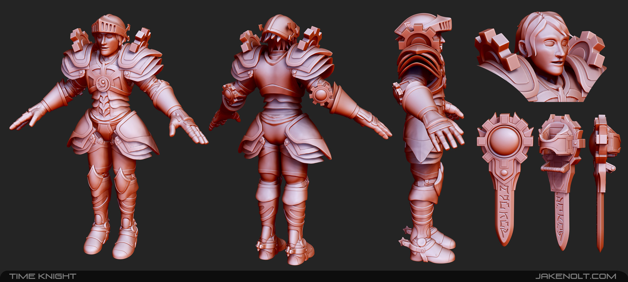


time_knight_by_9thknight-d6ycbjq.jpg

Replies

  • NegevPro
    Offline / Send Message
    NegevPro polycounter lvl 4
    I suck at characters so I can't give any advice but it looks great! I especially love the blade design.
  • DWalker
    He seems rather squat; he's about 5 heads tall. If you are going for a realistic look, I'd check the proportions.

    The gear behind his elbow should be moved to the outer side; it's there to protect the elbow joint.
    DSC_0216_640.jpg

    The armor at his waist is exceptionally odd, and would make walking awkward. I'd recommend looking at actual armor; the shapes evolved over millennia to provide a compromise between maneuverability and protection.

    Spurs don't really belong on a footman's armor.
  • Nolt
    Offline / Send Message
    Nolt polycounter lvl 13
    NegevPro wrote: »
    I suck at characters so I can't give any advice but it looks great! I especially love the blade design.

    Hey I'm trying to get better at them too so that's ok! Thanks, I thought the blade was kind of cool too!
  • Nolt
    Offline / Send Message
    Nolt polycounter lvl 13
    DWalker wrote: »
    He seems rather squat; he's about 5 heads tall. If you are going for a realistic look, I'd check the proportions.

    The gear behind his elbow should be moved to the outer side; it's there to protect the elbow joint.

    The armor at his waist is exceptionally odd, and would make walking awkward. I'd recommend looking at actual armor; the shapes evolved over millennia to provide a compromise between maneuverability and protection.

    Spurs don't really belong on a footman's armor.

    Not really going for anything realistic. Kind of a cartoony Time Knight. Definitely agree about moving the elbow protector though. I will definitely have to look more at armor styles to make things mesh a bit more. . . And I just thought the spurs were fun :). Thanks for all the input! I really appreciate it.
  • redhonour
    Offline / Send Message
    redhonour polycounter lvl 8
    Looks very fun! I especially like the blade. It's by far my favorite part of this.

    I'm not a big character guy either, but I think a lot of DWalker's crtis are spot on. I've done a few armored characters and suffered through a lot of the same missteps. Armor has a specific anatomy so pieces and placement can look odd if you change the rules up.

    Unless of course it's to show more cleavage *sigh*
  • Nolt
    Offline / Send Message
    Nolt polycounter lvl 13
    redhonour wrote: »
    Looks very fun! I especially like the blade. It's by far my favorite part of this.

    I'm not a big character guy either, but I think a lot of DWalker's crtis are spot on. I've done a few armored characters and suffered through a lot of the same missteps. Armor has a specific anatomy so pieces and placement can look odd if you change the rules up.

    Unless of course it's to show more cleavage *sigh*

    I think part of the struggle for a fantasy type character is in a fantasy realm many rules of real life get tossed by the wayside for the fact that it is fantasy. Regardless, more armor study could never hurt! :)
Sign In or Register to comment.