[WIP] My First Date

polycounter lvl 8
Hi guys. It's been a while.

This is a scene I'm putting together for fun and to try out some new things. It's all WIP and fair game for critique.
So I've got some pretty specific goals I want to hit with this piece.
- Finish by the end of December
- Find new techniques for modeling/sculpting hard surface objects in Zbrush faster
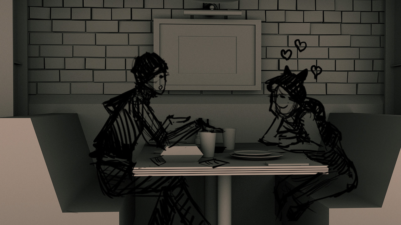
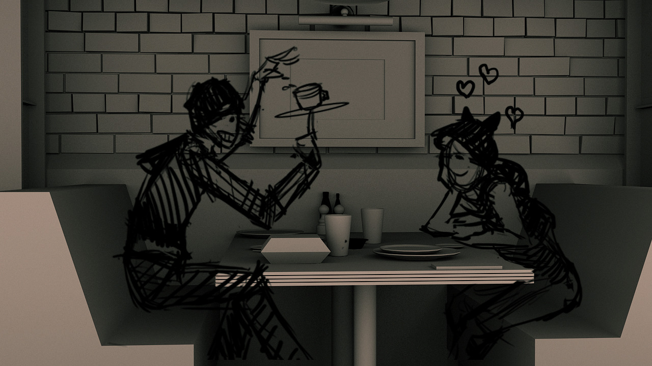
- Create a still scene that tells a story
- Get some practice and practical feedback on character design and modeling if I can!
- Improve my rendering techniques in Max using Image Based Lighting
- BONUS GOAL: Explore usage of physically based mats in UDK
Here's what I got so far:
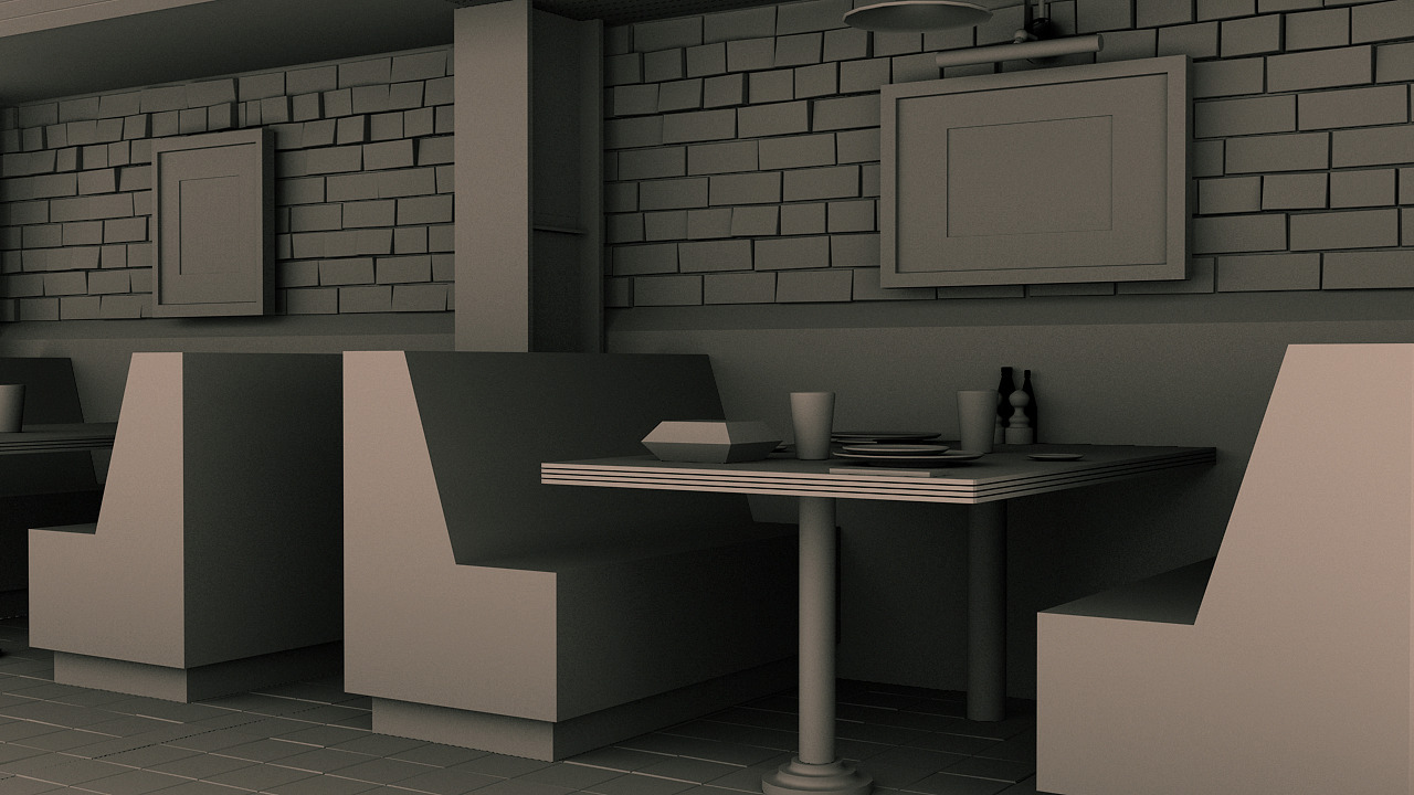
BLOCKOUT and CONCEPT
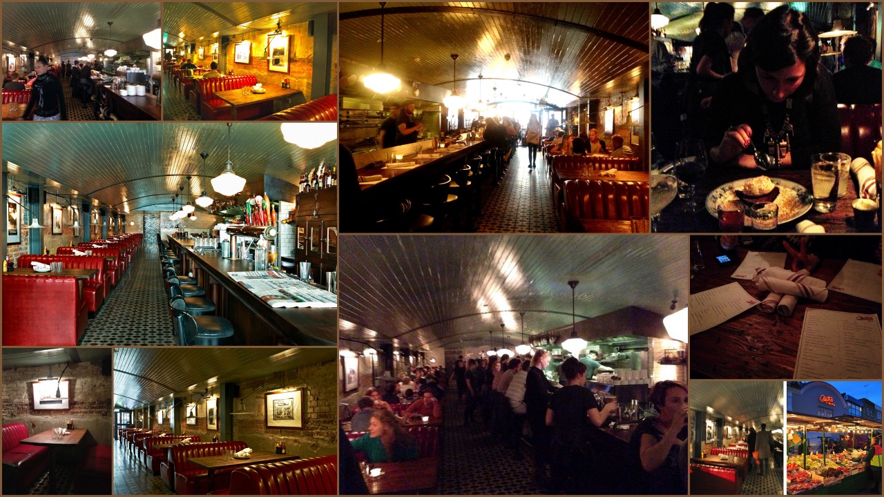
REFERENCES (Electric Diner @ London)
ENVIRONMENT SCULPTS [WIP]
CHARACTER SCUPLTS [major WIP]
Some of this stuff is further along than others. In particular, character stuff is taking me forever since I'm not used to character modeling. Any tips on speeding up workflow for that would be much appreciated!
Any feedback in general is welcome. :]
This is a scene I'm putting together for fun and to try out some new things. It's all WIP and fair game for critique.
So I've got some pretty specific goals I want to hit with this piece.
- Finish by the end of December
- Find new techniques for modeling/sculpting hard surface objects in Zbrush faster
- Create a still scene that tells a story
- Get some practice and practical feedback on character design and modeling if I can!
- Improve my rendering techniques in Max using Image Based Lighting
- BONUS GOAL: Explore usage of physically based mats in UDK
Here's what I got so far:
BLOCKOUT and CONCEPT
REFERENCES (Electric Diner @ London)
ENVIRONMENT SCULPTS [WIP]
CHARACTER SCUPLTS [major WIP]
Some of this stuff is further along than others. In particular, character stuff is taking me forever since I'm not used to character modeling. Any tips on speeding up workflow for that would be much appreciated!
Any feedback in general is welcome. :]
Replies
As Ross said, the guy's face needs some work. And I think the girl's face too. She seems pretty scary. Why do we see her teeth? Is she smiling? Is so, you should work on the eyes too to make them follow the overall expression.
I do enjoy her clothes though, especially that cute hat.
Can't say much about the guy for now.
Keep going
Based on your feedback, I decided to dynamite the girl's face and essentially redo it, trying to stick much closer to reference provided by the face of a friend of mine.
I don't have much progress on the guy atm, but I'll make your corrections on the next update!
Now for UPDATES
BLOCKOUT
ENVIRONMENT SCULPTS
CHARACTER SCULPTS
QUESTIONS
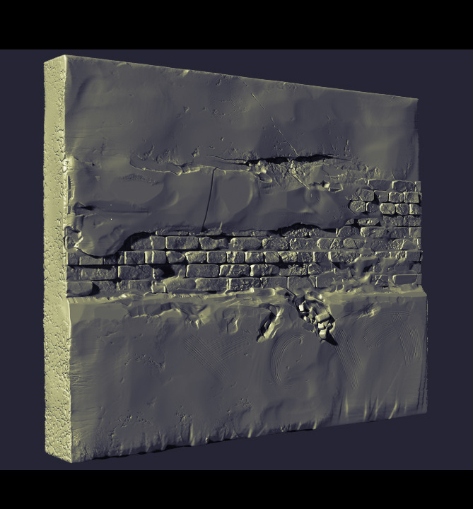
Anyone ever feel like their decimated sculpt looks good in Zbrush, but looks cruddy in Max? That's how I feel about my wall atm. Is there some uber trick to keeping the same level of visual quality between the two?
I've been searching for better ways to do the hair on the characters but coming up kinda short. I've so far been sculpted hair as a solid dynamesh, but I've seen awesome stuff where the hair is made up of multiple meshes layered on top of each other. How the heck do they set that up?
Thanks again for your feedback!
I figured out in Max that I can get a quick start using the topology tools. Draw strips on surface, controlling the thickness with min distance setting. Then I can rearrange them to my heart's desire. I know you can essentially do the same using Zbrush 4r5's topology brush, but drawing out strips is ultra fast and feels like there's a lot more control of the process in Max. I wonder if there's a way to do it with curves in Zbrush?
Still puzzling out the Zbrush -> Max question. I have a feeling the answer may lie in the lighting setup.
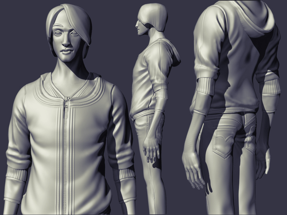
Anywho, a little more progress on the guy today.
Fixed his eyebrows and took his coat off, cos I didn't like it much. Added a beanie and started to add some misc. jewelry and personal effects. I also buffed up his forearms a bit, which I slyly forgot to show in the updated pic :S
Low polys getting baked mostly. Also made up my mind to get this in Marmoset 2 as a full scene.
Got some great feedback from friends to make a few changes to the environment:
Tried to make the brick wall to look a little less soft. Adjusted the booth seats to poke a bit more under the table. Also smoothed out the top of the table and got rid of the super pronounced normals there. A few items were redone sticking a lot closer to reference. Added a few more misc. meshes in the form of bottles, coasters, placemats, drinking straws, etc.
I spent last week hitting up a few restaurants for breakfast, lunch, and dinner to take some first hand reference during the meals. A joy for my stomach.
Next up:
Painting over my characters to give them a better design
More character sculpting
Light fixtures
Power outlets, cables, and pipes
***extraneous polish***
So it was awesome.
Small update:
ENVIRONMENT STUFF
CHARACTER STUFF
Paintovers as promised. The lack of responses makes me feel like I'm having conversations with myself.
These paintovers look quick, but these took me all freakin day to do. Even using Photoshop magic. It was frustrating as hell, and makes me want to cut these guys from the scene altogether.
But I got a clearer idea of where I want the designs to go. If it means they don't look god-awful when I resculpt, sweet.
The girl got a lot more thought than the guy at this point, so I'll spend some more time tonight on him.
I'm generally happier with where the diner stuff is going. But all the textures could use a good deal more detailing imo. The napkins look especially poor atm. At least I got both the light fixtures in there.
Part of my polish pass has to be the drinking glasses. I'm having some problems figuring out how to get a more convincing look for them with refraction, smudges, condensation, etc. Research mode.
Because it's been like two weeks of silence and I am really needing some help.
Your environment is looking pretty solid at this point. I'm not sure about the lamp. It's somewhat of an odd design which doesn't quite match the rest of the decor.
You might want to take a closer look at your brick texture. The mortar looks like it needs to specular pushed way back as it's coming up looking quite plasticy in some of your shots. I think your chairs are a tad on the overly shiny side too.
I think an ambient occlusion pass over the entire scene would help to ground things a lot too.
Your character designs are looking pretty good, and all of them have some potential. I think it's really going to come down to personal preference. There's a fair bit of red in your environment, so perhaps choosing cooler colours for the clothes might be a good option.
Maybe having some contrast between the guy and girl would be good too. If its a first date, maybe the guy maybe the guy has gotten nervous really tried to clean himself up, so the more formal-ish clothing and conservative haircut of the fifth design could work well.
Contrast that against the more colourful and free style of the girl - any of the designs could really work there.
I got that feeling too about the lamp. For what it's worth, I took the lamp straight from the diner I'm referencing. Maybe it's just not a traditional enough shape?
I added more AO to the scene, the wall in particular and tried toning down some of the spec and gloss.
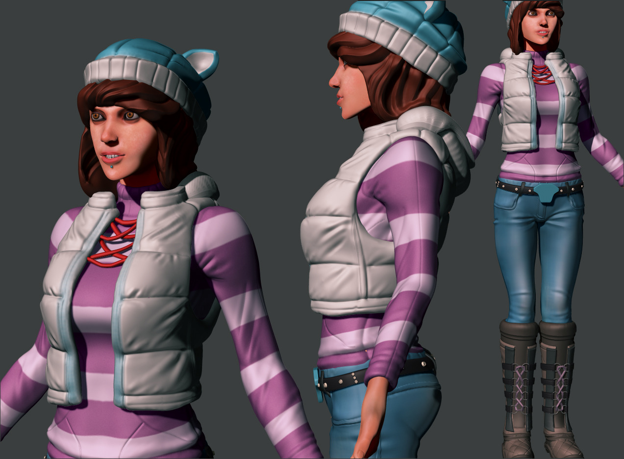
As for the characters, I did a quick sculpts for my two favorites atm. I'm leaning toward the left girl. The outfit on the right seems very costume-y! The girl on the right is supposed to be the purple sweater concept if it's hard to tell.
No progress on the guy cos I just realized I saved over the guy's sculpt accidentally
Ugh
Thanks a lot for providing some feedback! It really helps, especially with the characters! :]
I ended up tweaking his face and bulking up his forearms more, redid the wrinkles across his shirt and pants. I'm toying around with giving him a badly tied tie or something to look more like he rushed to get ready as per Jackablade's suggestion.
Not too happy with the hands still.
updates
After some polling, I went with the gal on the right. Though I'll definitely save the other for other possible designs. Although it wasn't a goal from the start, I wanted to learn how people get sweaters looking all sweater-like in Zbrush. It seemed to work well on the stockings too.
Gave the guy a tie!
My break from work came to an end Thursday, so I'm back to working on this after hours. I've been focusing on the characters almost exclusively this past week. While there's still lots I'd like to do, it feels like it's dragging on. Still, any feedback/commentary is very very welcome!
However your forms themselves are getting a lot cleaner, which is really good, so I think if you clean the proportions a bit the quality of the whole will go way up.
Keep it up.
At least the head is an easier change to make. :]
Thanks!
Made a few changes according to my body ref: enlarged the head and widened the jaw, widened the shoulders just a bit, pulled waist and hips down too.
I'll have to have another look at the guy's proportions as well
I also love the quality of the models.Keep up the good work!
Jacka: Could be! Here are some faces
You're evidently going for a fairly stylised approach with the faces, but I'd suggest the girl could still use a bit of development, particularly around the eyes.
Snader: Thanks! I made a conscious effort to mess my version up a bit, but I didn't want to give off a dilapidated look! o.o I'll have to futz with a few things tonight and get some progress up. A big thing I noticed was the coldness of my lighting so maybe warming it will help out to start
Jackablade: Thanks again. The character iterations have been taking up all my free time lately. I got some more feedback outside of polycount as well and I've basically re-returned to the drawing board to better develop the female character. Didn't spend nearly enough time referencing her in the beginning
I made a few adjustments and blocked out new parts in 3D super quickly.
I wanted to be done before the new year, but it's a personal project. So let's cheat time. I want to put more effort into this :]
Have you put both characters side by side in one file? I feel they've got very different proportions/stylizations. The girl is very chunky, but with a tiny head and bulging eyes, and has much sharper lines in her face compared to the guys straight/narrow silhouette and much more blobby/soft/natural facial forms.
Snader: If it takes me till 2015, I should just build them for real!
I've recently put them in the same file recently to match their proportions to each other and the scene. Though as bad as my eyes are apparently, I can't say that counts for much.
You're really right in saying her face doesn't really match the style of the guy. I have a habit of trim dynamic-ing the planes of the face to see the lighting a little better, especially on the girl. I'll smooth her out and maybe that will help exorcise disparity
Does her head look small and eyes look giant in my latest 3D post? I did scale her head up and shrink her eyes down as part of my changes. Is it like, not enough of a change maybe? I'll try to post both side by side when I get home and see if that shows anything different
I think I'm also going to start posting screen grabs from Zbrush instead of Max from now on cos I think the lighting differences between the two might be throwing my eyes
So even though I started off with base meshes of exactly the same proportion, and checked them only like two weeks ago, somewhere along the line the heads got seriously out of wack. How the fffffffu--
The girl's head was way smaller than the guy's. Small enough to make her 8 heads tall, proportionally, while he's just 7 and a half (but taller!) At matching head sizes (I used the size of his head as the 'correct' version) she should only be about 7 heads tall
Well! I've done dumber things so correcting and moving on... :poly121:
I need to check myself more often and in different ways from now on
Shootin back over to the environment... I did that texture pass over the scene trying to match everything back to the reference. I cleaned up my textures a bit too and put those mats to work. Overall, I feel like I can read the materials a little bit better. True?
I'm dissatisfied with the table atm and the glasses. I figured out I can just do stuff with the gloss and spec maps to mess with the surface properties of the glass, but that doesn't answer a lot of the questions I had like condensation, frost, etc.
Eh, I'll find a way
Chillydog: You're quite right! And a purse has been on my plate for a bit. Needs adding now, methinks
Really lovin the booth seats, the texture detail on the beams and walls, and some of the smaller props as well as the table and overall lighting. At one point your lighting and AO was really off but I think you pretty much nailed it this iteration.
The stuff I'm not lovin so much would be the Styrofoam container shape which seems to me to be really off as well as something reading wrong with the outside of the lamp. The DOF seems like it could be refined more to be less sharp and if this is your beauty shot camera the composition could be worked on a bit more.
Overall it's lookin tight though! Great job ^.^
The only thing I'm having trouble seeing is what's off with the lamp! Sorry.... What is it you see there that's off? My eyes, they fail me
Thanks for taking the time to have a look!
Looking forward to seeing the purse and more! Keep up the good work!
It would be really subtle but still cool.
Just one thing, have you try another doily/mat ? Those one look like asian sushi restaurant while usually in those kind of restaurant they use white paper one that they throw after people eat. (since it's usually messy juicy food)
Gave another pass over the bricks and the table this time. Resculpting and re-projecting on both, reducing a lot of the noisier detail. I also replaced the dynamic lights I had in the scene with child lights from the main skylight.
@chris: whoops I totally missed your comment before I made my changes. I'll give the detail normals for the wall a try!
I guess my lighting isn't really showing it off cos it looked a lot better when I previewed it in an isolated scene.
My materials have a pretty straightforward spec, but more detailed roughness textures.
tbh I did it this way while trying to follow what was described in Dotnod's approach to PBR for Remember Me since I'm learning it for the first time. Is there like a better approach for this?
Added some detail norms to the wall. I think my lighting or camera positioning doesn't really show off my spec. Added some darkness in between the bricks and contrasted the spec.
The purse is progressing, some issues with the flow of geo on the strapthough... Also not sure about the trim. I like where it's headed, but it needs a bit more work! And it's not casting shadows when I get close up. Weird.
I'll be switching back to the characters full time for a bit. I've really enjoyed working on this and just the environment alone has given me a wealth of experience and learning Marmoset and PBR.
Ive been following your project for some time now, I gotta sya, the bricks look alot better! It nice to see some darker spec in the grain slits, sells it depth wise more.
My current critiques include doing another variation of the booth, because the tape detail is really a bit to obviously repeating.
Also its really cool to see your doing both characters and an environment, as alot of people choose to stick with one or the other.
Id like to see more WIP on the characters!
Otherwise, Keep it up!
I tried the cloth sim in Max first, but the dang thing stopped working after my first sim and hasn't worked since. I'm not sure what's wrong. It's never been a complicated tool to setup.
In better news, Vertex 2 came out and is giving me some good ideas for the glass shader!
Thanks for your comments and critique!