The BRAWL² Tournament Challenge has been announced!
It starts May 12, and ends Oct 17. Let's see what you got!
https://polycount.com/discussion/237047/the-brawl²-tournament
It starts May 12, and ends Oct 17. Let's see what you got!
https://polycount.com/discussion/237047/the-brawl²-tournament
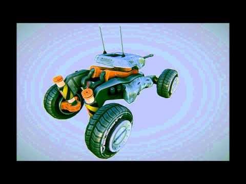
ikarus' Drone Buggy
Here's a one-week project i currently finished for the Unity Asset Store. It is a fast, recon unmanned vehicle designed for rapid deployment and quick mission intel gathering.
I'm not perfect with normal maps so please point out and help where you see bugs. I chose to do 50-50 half of it baked with rounded edges and the other half, minor details in photoshop as a quicker method.
The model is about 5k polygons, it might be a bit too high since it's more of an asset rather than a vehicle you go close up to. Then again i'm a bit disconnected from the 3D modeling for games since i did more concept art lately.
For the asset shop i also did a couple of skin variations with different paintjobs.
Anyway, i hope you like it and also please check the [ame=" http://www.youtube.com/watch?v=OBzyCm8MqZA"]turntable animation[/ame] of it and a lower resolution of the model uploaded here for 3D viewing.


I'm not perfect with normal maps so please point out and help where you see bugs. I chose to do 50-50 half of it baked with rounded edges and the other half, minor details in photoshop as a quicker method.
The model is about 5k polygons, it might be a bit too high since it's more of an asset rather than a vehicle you go close up to. Then again i'm a bit disconnected from the 3D modeling for games since i did more concept art lately.
For the asset shop i also did a couple of skin variations with different paintjobs.
Anyway, i hope you like it and also please check the [ame="
 http://www.youtube.com/watch?v=OBzyCm8MqZA"]turntable animation[/ame] of it and a lower resolution of the model uploaded here for 3D viewing.


Replies
@Dwalker This is an eternal conflicting issue in games, making something look good and inaccurate vs boring and military accurate. This vehicle has so many inaccuracies that the paint is the least of my worries, nonetheless, good point, i do have some troubles with spec map so i think a less metal look and more-paint look will fix this issue.
Anyway here is the link to the unity asset ! The price is a bit steep because of all the taxes, i did lower it but it'll take a couple of days to update.