[WIP] Hallway project
polycounter lvl 14
Hello everyone!
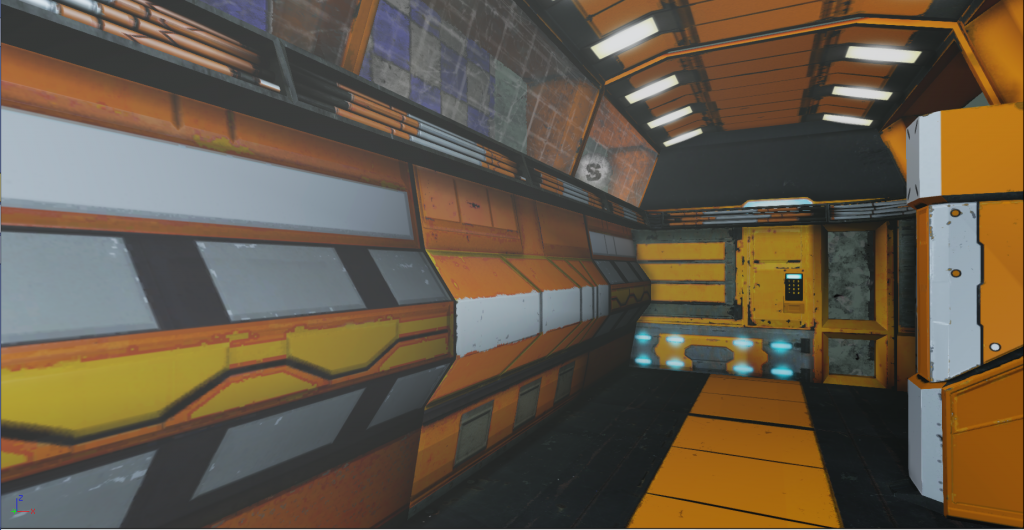
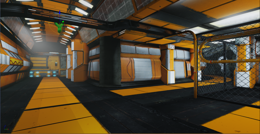
So I've been working on this little project for the past 2 weeks and I've got enough to show to start receiving feedback.
My friend was discussing a few things with me. He's not onboard with the orange color scheme I have going on. I have a flat ceiling with a bevel which I want to redo, because I know I can do better than that. The pipes should be more shinier, but I didn't put a spec map for that one yet. Also the glass should be more of a strip texture rather than tiled.
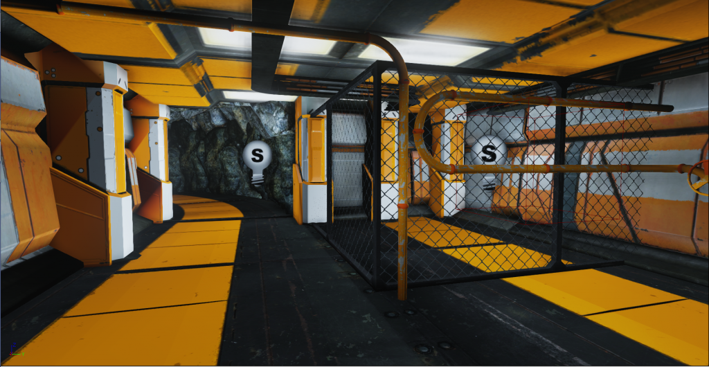
In the cage area, I was debating to either put a cylinder shaped generator or a giant pipe for pumping oil or collecting stuff from underground.
I'm not sure what else I need, but I'm open to feedback/suggestions of any sort at this point.
Thanks!
So I've been working on this little project for the past 2 weeks and I've got enough to show to start receiving feedback.
My friend was discussing a few things with me. He's not onboard with the orange color scheme I have going on. I have a flat ceiling with a bevel which I want to redo, because I know I can do better than that. The pipes should be more shinier, but I didn't put a spec map for that one yet. Also the glass should be more of a strip texture rather than tiled.
In the cage area, I was debating to either put a cylinder shaped generator or a giant pipe for pumping oil or collecting stuff from underground.
I'm not sure what else I need, but I'm open to feedback/suggestions of any sort at this point.
Thanks!
Replies
I also think the fact that there's no reflected orange in the lighting also breaks the immersion a bit - add a little orange to your lights and see if that helps things feel more cohesive.
I found this example to show you..not mine , just something I found.
The person that made it is in this thread below.
http://www.mapcore.org/topic/15243-sci-fi-scene-ce3/
Is this better?
You have some interesting things going on, you are bold with the choice high saturated colors, however this will give you quite some trouble with the contrast.
You are missing out a few fundamentals, so just lets start with the most basic one.
Values
Your values are very mixed. Normally anything that has a high value (very bright) catches the eye easily .
The first thing that you notice in the screenshots you provided is the pure white floor panels. They will keep a high contrast to basically anything else in the scene.
When trying to create an atmospheric perspective in a scene, you usually try to keep the values consistent, and increase the value of a central focal points. This is usually done by lowering the value around it, or increasing the value (by adding lights for an example) of that focal point.
Among mixing up values, when you have very low contrast in value, you loose the shape definition. That corner piece specifically is a dark spot in your scene at the moment, making it difficult to figure out the shape.
I read someplace that if you suck at paint-overs, don't do them. I guess I won't follow that advice.
Perhaps the paint over will describe what I mean better.
1. Take one thing at a time. check your values, make sure that you let the viewers eyes where you want them to be.
2. Your lights decreases the overall contrast in your scene, this happens when you have to many lights or have very large light volumes that flood the entire area.
3. Consequently your shadows are gone, or very low in contrast.
There are several things you could do in your scene at the moment, by not getting to overwhelmed, try adjusting these things first, and then move on to the texture and scale.
Work on this scene, and you will get lots of xp from this!