Sketchbook: Hannah
Hi all!
I'm Hannah, a Computer Arts student at University of Abertay Dundee.
Decided to start a sketchbook thread here, as my blog isn't the best place for getting feedback. I'll be posting small 3D and 2D media tests which I'm doing alongside my dissertation, and other doodles or paints.
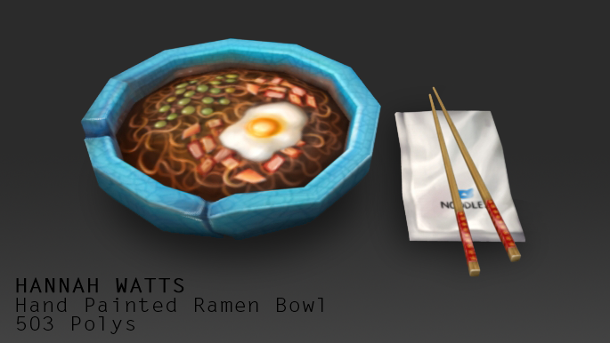
Small handpainted prop:
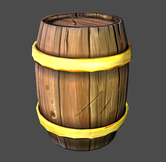
Small barrel test:
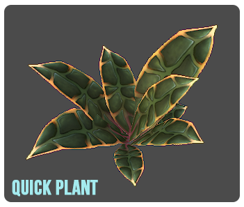
Quick plant I did for the Nov2013 Noob Challenge. I didn't really like how it came out though, so will probably redo:
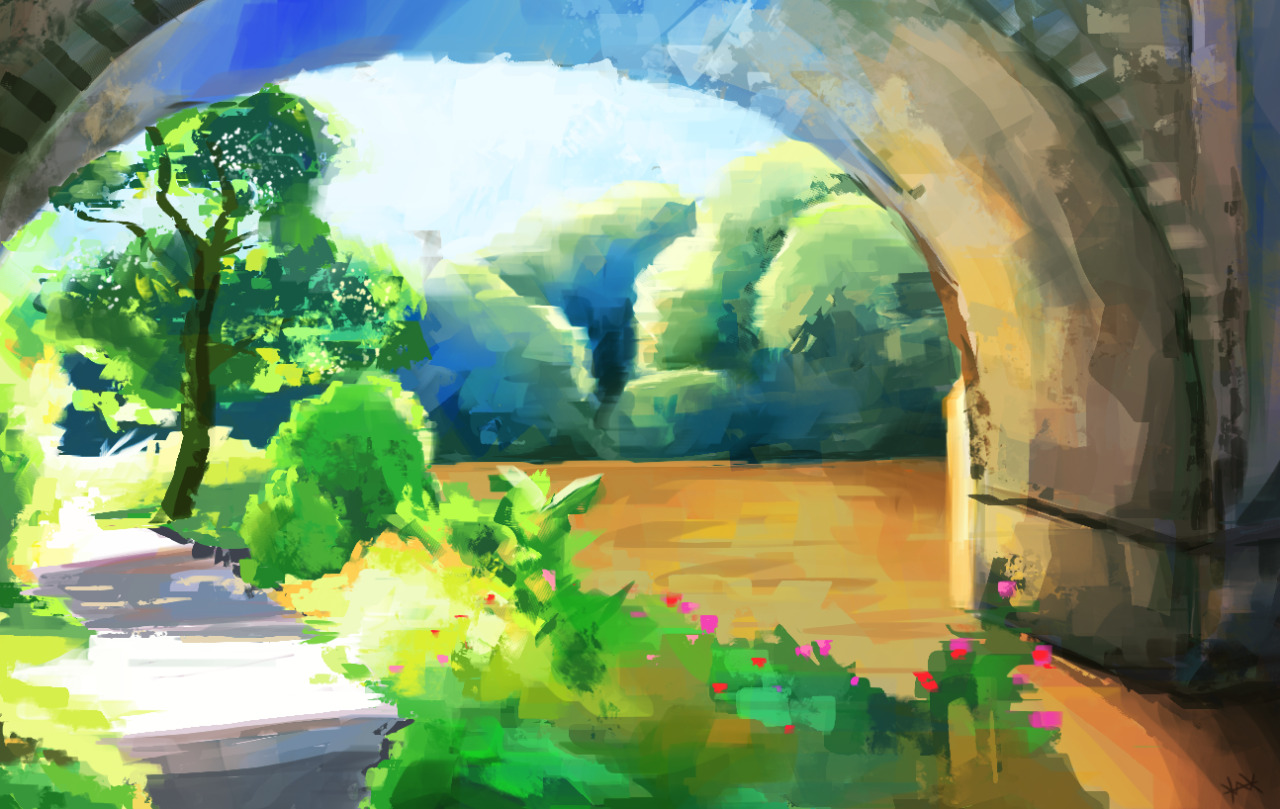
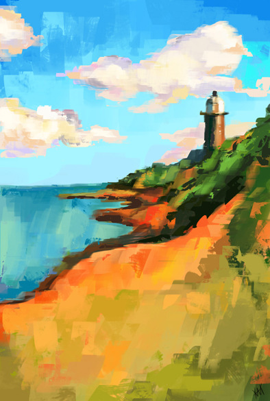
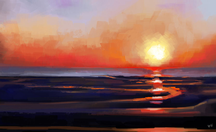
Some paintings with a digital 'palette knife'. (A lot of my dissertation has involved looking at Impressionism).
I'm Hannah, a Computer Arts student at University of Abertay Dundee.
Decided to start a sketchbook thread here, as my blog isn't the best place for getting feedback. I'll be posting small 3D and 2D media tests which I'm doing alongside my dissertation, and other doodles or paints.
Small handpainted prop:

Small barrel test:

Quick plant I did for the Nov2013 Noob Challenge. I didn't really like how it came out though, so will probably redo:

Some paintings with a digital 'palette knife'. (A lot of my dissertation has involved looking at Impressionism).


Replies
Also did a new stone texture, which I felt went a lot better than my previous ones I made.
Thank you! I'm actually pretty new to it so I'm still learning myself. I've painted for way longer than I've modeled, so I kind of just use what I know and combine it with tonnes of reference image hunting.
Thanks a lot! c:
I did another study yesterday. It was way harder than rock but I wanted to pick a type of material I'd not done before, and breadcrumb covered chicken is definitely something I've not drawn aha.
So yeah, it didn't turn out nearly as well as the rock one, but it was fun.
Also I did a texturing test on a plank of wood I'd sculpted. Part of my 4th Year Honours project is trying to make Impressionist style textures, so I did this with a palette knife brush pack I'd downloaded.
It was also pretty fun but so hard to get it looking okay. 3D is by nature pretty "neat", so trying to get the loose, fat brushwork to translate was tricky.
(I also cheaped out on the back side and copy and pasted aha).
Maybe you could try some cold back light on the dark side of the chiken.
Cheers!
Yes, I think so too.
___________________
Working on my ivy vines today for my scene. I'm carrying on with November's noob challenge, but it's going kind of slow as I'm doing several digital tutors courses at the same time. For this I used a Maya tutorial book by Michael McKinley to help.
So here is the scene progress. At the moment it's just default lighting model as I am working on getting all the models in:
Things I need to do:
Rocks - The rocks at the moment are just my first attempts at zBrush (I've used Mudbox for everything else) so they're kind of rubbish. I've just found the Digital Tutors course that focuses on zBrush for Mudbox users so I'm going to go through that and try again.
Foliage - I've done some research and found that foliage needs custom lighting models to look right, so I'm need to teach myself how to do that. The grass also needs better diffuse textures than what it has at the moment.
Steps - Just AO at the moment, I need to paint in some colour to match the rest of the scene as they're quite plain and dark.
Wall Seam - I plan on hiding a lot of it with rocks and foliage, but I also need to make a translucent plane to blend between the floor and wall. I'll probably also make a separate wall texture so it's more cave like.
First and most importantly I would say you need to start sorting the lighting out. Everything is a little flat looking since the cavern walls are lit almost the same as everything else, apart from those black pillars at the front. You might have planned to do this last, but I'd say you you should get in all your lighting now and save the very fine tweaks for later.
For the foliage I'm really liking what the ivy has done to the pillars by breaking up the grey and adding silhouette, although it might be on the sparse side in a few areas. With the grass, as you say it'll look a lot better with the custom lighting, but another suggestion would be to make more grassy clumps rather than a few planes . With the existing plant in the clump formation really hides the fact that it's just simple ego clipping through the floor, but it's a bit too obvious on the grass, so I'd suggest varying it up a bit. (This would be pretty simple if you just bend the mesh a bit and add a few blades coming off?) also they look like they're using the cutout alpha blending which is why you get harsh pixel crawl on the edges, so I'd look into different alpha modes in UDK.
Your floor sculpt is really, really nice. But it currently doesn't match the rest of the texturing, and I think that's more because you have improved since you started, resulting in a much better normal map. At the moment it's making the pillars look flat in comparison, which could be fixed with lighting, but might be better to do with some mor geometry in the silhouette.
Steps look really nice, maybe mask out some of the AO on the edges. For the boulders on the outside of the shrine I would say to Look at the rock thread on P&P or on the wiki for some more rock sculpting advice, as currently they are looking a little too soft to read as rock.
Overall it's looking really good and I think it's plain to see how much progress you've made since the start, which is something to keep in mind when all you have is hate after staring for so long
I took a break from 3D today and did a texture study. This one took super long (about 5 hours) because of all the overlapping details. It was fun though, and I think (hope) I did a slightly better job on the lighting.
Hand study
Also been working through the Sub-D Maya tutorial on Digital Tutors to learn a better workflow in Maya. On about video 13 of the course. Here's my progress so far:
(Velociraptor, modeled from the image concepts supplied with the course).
Spitpainting for "offering to the sea" - went a bit over the 30 minutes though.
Did another material study. Moss is really hard! I struggled to get the softness without making it too muddy, I think I needed to be more confident with blocky colours because I don't think there's enough contrast?
Also carrying on with the Digital Tutors Sub-D course. About 70% of the way through now.
Thought I'd post my scene progress as desperately need feedback on it. I've been staring at it so long it's easy to be overwhelmed from what I still need to do, and it's my first UDK scene I've done with 95% of the assets made from scratch.
The cave walls are my main focus next, I think, as I still need to blend them in and perhaps give them their own texture.
Also, I've been scouring the web for a tutorial or guide for getting rid of the black shadows on the grass with custom lighting. So far no luck. Can anyone recommend me anything to help with the dark foliage issue?
Also any other suggestions would be greatly appreciated.
And here are the first 5 all together:
My friend wanted a portrait for her birthday.
@Kahlusha - Thank you so much.
Working on textures for my final year project (3D scene in UDK). Both of these were first attempts, but style didn't suit the concept, so both are scrapped for now.
Concept on right. Norm/Diff/Spec/Emiss maps.
Tiny cactus. Small prop that is only about 1 foot high. Diff + Spec map.
WIP of flower cart. Sculpted in zBrush then baked out. Atm, it's only normal map. Will be painting diffuse and specular maps tonight.
Progress on scene can be found IN THIS THREAD.