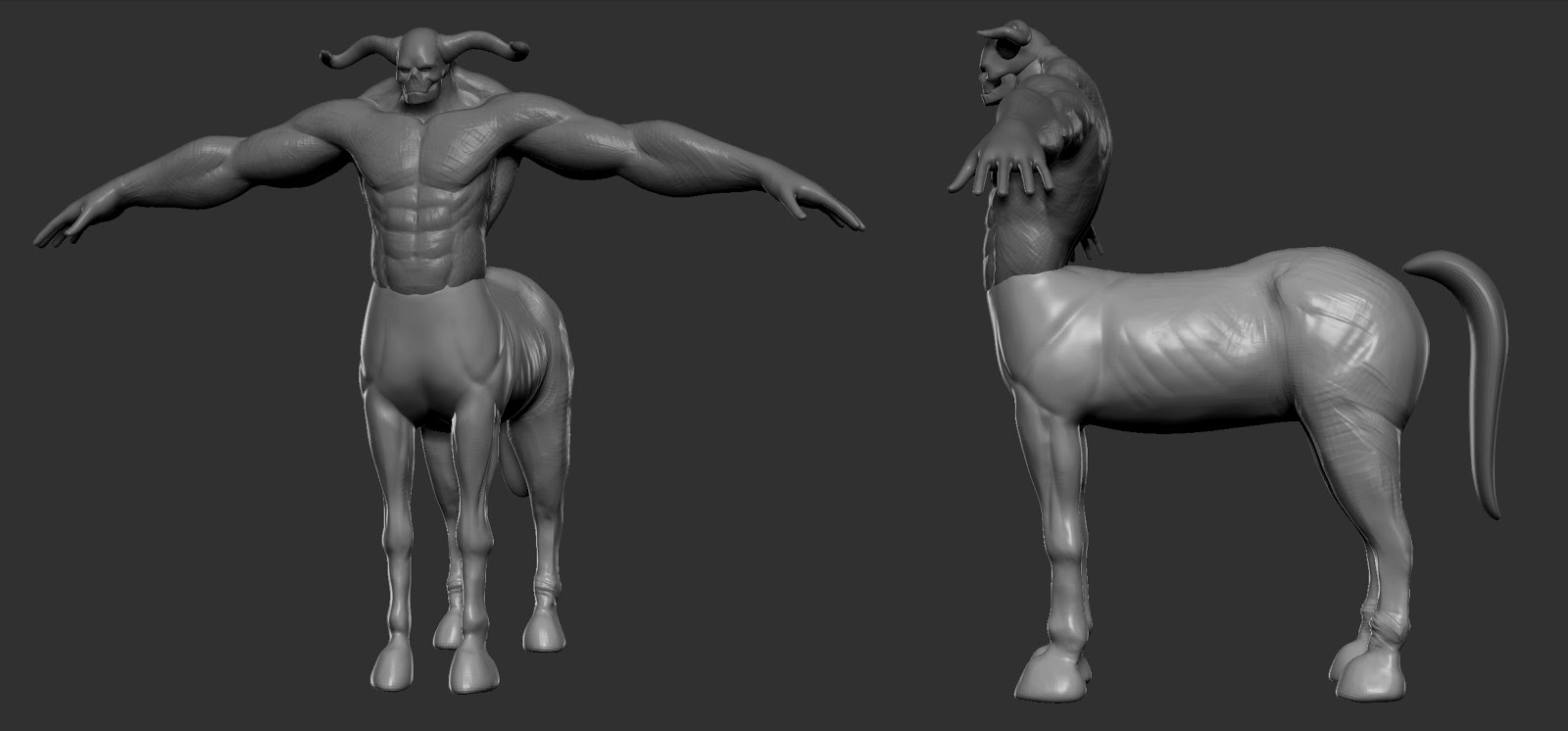
Hey guys I just started a new character the other day and it's about time I start posting some WIP. Feedback is always appreciated! I am still working out the proportions.
For the record, this is pretty much a Centaur - don't know if you knew that, though.
Anyway, I like where it's going, the arms look pretty big in comparison to the thickness of the torso in my opinion. I like the blend you've got going into the horse body.
Horses have huge neck muscles to support their heavy heads. This guy has huge traps but a very tiny head. It might be too stylized? Should turn out really cool though!
I know it'll make you feel like crap, but have a look at this. Don't copy this, but study it. Make some calls on anatomy you hadn't considered, style and sculpting technique. Then I suggest you rework your model.
I like your head; especially the horns....but his shoulders are hiding his profile. You need to work on your silhouette. Good luck, keep on that anatomy.
Jack Ryan: Yea, I knew that. But since I was very early in the concepting phase I didnt want to limit myself on a very specific type of character. I completely agree on the arm, I havent gotten around doing anything to the arm and back. But thats definitely where Ill be focusing on today.
kmactastic: Thanks! Yea I agree, I am trying to tone down the cartoony feel a bit, hopefully what I have done so far is a step in the right direction. Currently the arms are a big issue so Ill make sure to fix em next.
Pixelpatron: Awesome! Yea its definitely the kind of thing I needed to be reminded of. It doesnt make me feel like crap, but it does make my work look like crap lol. Its definitely an amazing piece that Ive considered while making some small adjustments.
As far as my current update, I am still making anatomical adjustments. One thing I would love to get is a decent reference of a horse sculpt or photo that indicates the muscles from more than one view. Ive been researching my ass off trying to find as many references as I can, I just havent found the right one yet.
Thanks Jack, nice catch. I made some proportion adjustments to the model. I really wasted a little too much time today trying to find better reference for the knees. Part of the proportion issue is due to the fact that I am trying to exaggerate the muscle structure of the horse portion but it becomes easy to screw things up since I am in unfamiliar territory.
Individually your parts are looking quite good, but I don't think quite working together yet. I think maybe having a good think about how the skeleton of the human body flowing into the horse fits together is going to help you considerably. My thinking s you're probably going to wind up with a more gently curving body shape that leans back more over the front legs.
I suspect more slender arms might give you a more balanced appearance, but playing with the thickness and centre of gravity of the human body will help there too.
I think the head needs some more consideration too. Like the rest it looks good in and of itself, but a bit awkward and stuck on when looked at as a whole.
Kind of an image version of what Jackblade was saying about blending the parts together.
It results in a thicker torso but it's kind o the only way to get it to look "right", you may also want to consider having the torso moved back a bit to help it look a little more balanced.
Scott Eaton did a very nice sculpture of a centaur and has notes on it: http://www.scott-eaton.com/?s=centaur&searchsubmit= It might help give you an idea of how to want to connect the torso and horse body.
Thanks guys, I really appreciate the feedback it really helps push my work in the right direction.
I had to take a few days break from the desk chair due to a shitty chair.
Jackablade: I know what you mean, I find one of the most difficult parts of my work is trying to figure out how to resolve problematic areas. But having feedback like the ones Ive received so far makes the process so much more enjoyable. So thank you.
amile duan: Thanks I am glad you like what you see so far!
Alemja: Thank you, it was exactly what I needed, I think there were a few instances where previous posters tried to point it out as well which I missed. It was unintentional like most of you I am most effective when I see things visually rather than in text.
rkwongwai: Yea in hindsight what I did was a bit silly, but that goes to show how little I know about horsies.
Stinkfoot: Man that brings back some good memory, I was really into Motaro when I was younger. Didnt it involve some cheat code to get him out to fight? Its been a while so my memory may be wrong. Anyways after seeing your gif it made me want to add a more interesting tail. So I am still debating in which direction to take it. Right now its between a full on scorpion tail or a rat/scorpion tail hybrid.
As for my current progress I am just going through and simplifying some of the shapes since it started to look a bit noisy. I spent some time improving on the arms and back. Let me know what you think, what's working and what isn't. Thanks everyone for all of the feedback!
just my 2 scents but you need to make the horse part a bit wider, just consider horses are like twice as wide as their head so now you have an extra gigantic buffed torso on top of it so you need consider the weight distribution otherwise he would easily fall to his side with a minimal push from the sides, i hope that helps
Sorry for the long delay, life has been kicking my ass but I finally was able to resume my art work. Here is the final game character. Thanks everyone who helped me, I really appreciate it.
This is looking awesome! I don't feel that the arms are nearly as detailed as the torso or lower body. How the jaw is connected is a little odd to me. It might be because there isn't really a throat. This tail is far better than the scorpion version imo! I really dig it, but it looks like the binding is just pushed into the body instead of ending flush with the body like it would in real life. I'm basing that off of the model view in maya though. I think you could push the color variation a little more as well. Maybe add some kind of fur pattern instead of a flat grey? That is more of a personal preference though. Lastly... he needs some accessories! :P
Yea, the jaw area is a bit of an odd design choice. In hindsight I would have done it a bit differently. Thanks I am glad you like the tail revision Yea I was thinking of adding more accessories but I am trying to start making my own dota 2 workshop items so I might add some of those on this character when I finish a few =P
Hi Leinad, I agree with Rafferty_Eggleston, it was starting to look good--not saying it's not--but it seems like you got lazy and just decided to finish it. I felt you were heading the realistic route despite the anatomical exaggerations, and then ended up cartoony (tail and texturing). Ah, if you're going for dota2 style (judging from the tail and texturing), the huge guys with big arms usually have big hands and thick fingers ala-hulk.
Thank you Paololazatin for the feedback. I've taken heavy influence from the dota2 workshop guides and tried to incorporate that into my texturing process. Also texturing is my weakest area, so it's something that I still need to concentrate more on. I definitely did not want it to seem that I rushed it. I'll continue to work on it and improve the overall presentation, so thanks for pointing it out!
Replies
Anyway, I like where it's going, the arms look pretty big in comparison to the thickness of the torso in my opinion. I like the blend you've got going into the horse body.
I like your head; especially the horns....but his shoulders are hiding his profile. You need to work on your silhouette. Good luck, keep on that anatomy.
kmactastic: Thanks! Yea I agree, I am trying to tone down the cartoony feel a bit, hopefully what I have done so far is a step in the right direction. Currently the arms are a big issue so Ill make sure to fix em next.
Pixelpatron: Awesome! Yea its definitely the kind of thing I needed to be reminded of. It doesnt make me feel like crap, but it does make my work look like crap lol. Its definitely an amazing piece that Ive considered while making some small adjustments.
As far as my current update, I am still making anatomical adjustments. One thing I would love to get is a decent reference of a horse sculpt or photo that indicates the muscles from more than one view. Ive been researching my ass off trying to find as many references as I can, I just havent found the right one yet.
Again, thank you all from the awesome feedback.
Also the thickness of the join at the back of the human torso to the horse body isn't quite right. Looks too thin imo.
Consider your model without the human torso on the end but in its place a horse head and you might start to see inaccuracies a little clearer.
I suspect more slender arms might give you a more balanced appearance, but playing with the thickness and centre of gravity of the human body will help there too.
I think the head needs some more consideration too. Like the rest it looks good in and of itself, but a bit awkward and stuck on when looked at as a whole.
It results in a thicker torso but it's kind o the only way to get it to look "right", you may also want to consider having the torso moved back a bit to help it look a little more balanced.
Scott Eaton did a very nice sculpture of a centaur and has notes on it: http://www.scott-eaton.com/?s=centaur&searchsubmit= It might help give you an idea of how to want to connect the torso and horse body.
I had to take a few days break from the desk chair due to a shitty chair.
Jackablade: I know what you mean, I find one of the most difficult parts of my work is trying to figure out how to resolve problematic areas. But having feedback like the ones Ive received so far makes the process so much more enjoyable. So thank you.
amile duan: Thanks I am glad you like what you see so far!
Alemja: Thank you, it was exactly what I needed, I think there were a few instances where previous posters tried to point it out as well which I missed. It was unintentional like most of you I am most effective when I see things visually rather than in text.
rkwongwai: Yea in hindsight what I did was a bit silly, but that goes to show how little I know about horsies.
Stinkfoot: Man that brings back some good memory, I was really into Motaro when I was younger. Didnt it involve some cheat code to get him out to fight? Its been a while so my memory may be wrong. Anyways after seeing your gif it made me want to add a more interesting tail. So I am still debating in which direction to take it. Right now its between a full on scorpion tail or a rat/scorpion tail hybrid.
As for my current progress I am just going through and simplifying some of the shapes since it started to look a bit noisy. I spent some time improving on the arms and back. Let me know what you think, what's working and what isn't. Thanks everyone for all of the feedback!
Azkur, thanks! I made some adjustments to the proportions hopefully it resolves the issues you pointed out.
I am going to start merging all of the pieces and creating the game mesh. If there is anything that bothers you guys please let me know.
Looking forward to seeing more of your stuff!