Nina Williams Redesign
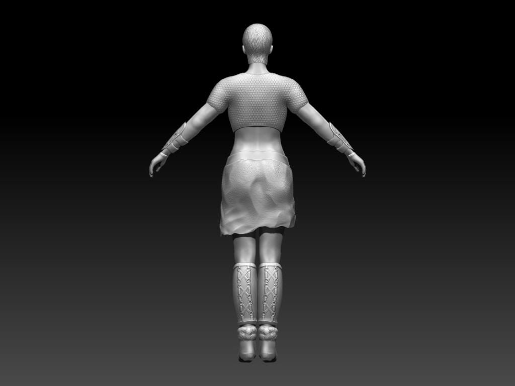
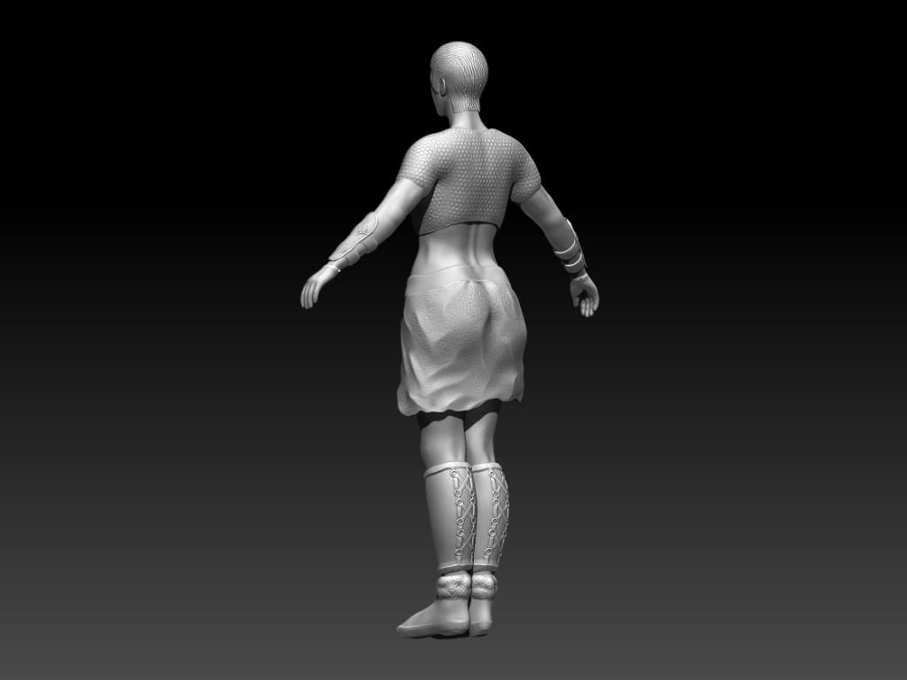
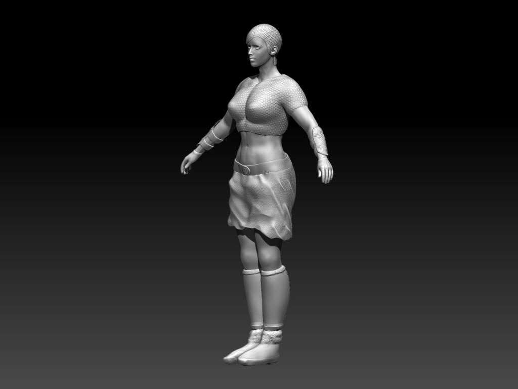
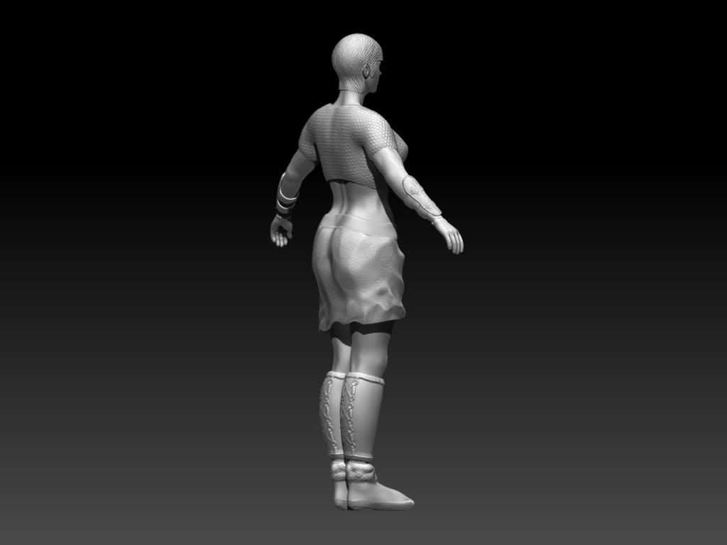
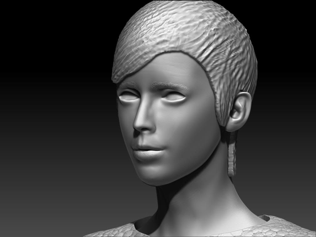
Hi so I've gone about doing a redesign of Nina Williams from Tekken with a celtic redesign.
Here's the quick design sketch.
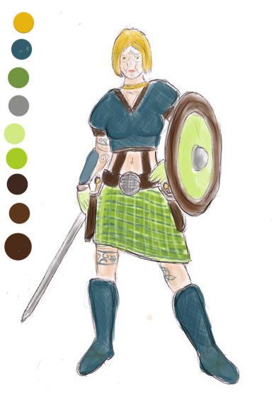
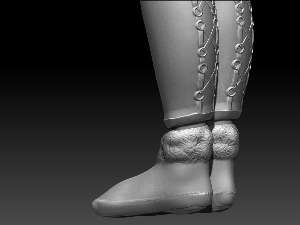
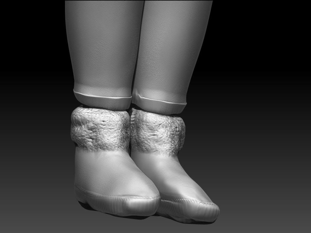
At the minute I'm sculpting and decided to leave out the extra strapping on the abdomen and holsters. The boots design is also changed. The weapons are being done separately.
Just looking for general feedback.
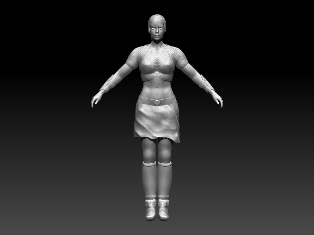
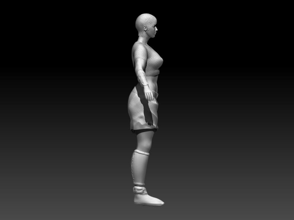
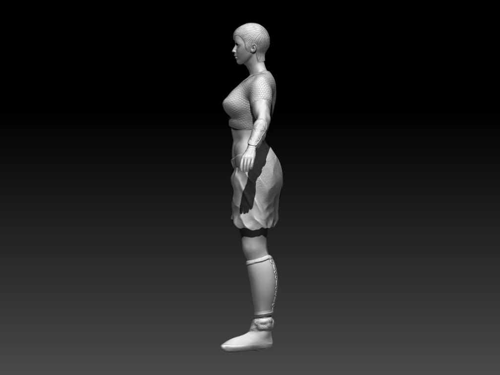
http://i1281.photobucket.com/albums/a518/Christopher_Pendleton/ninamaterialclose2_zpsdca1d77f.jpg
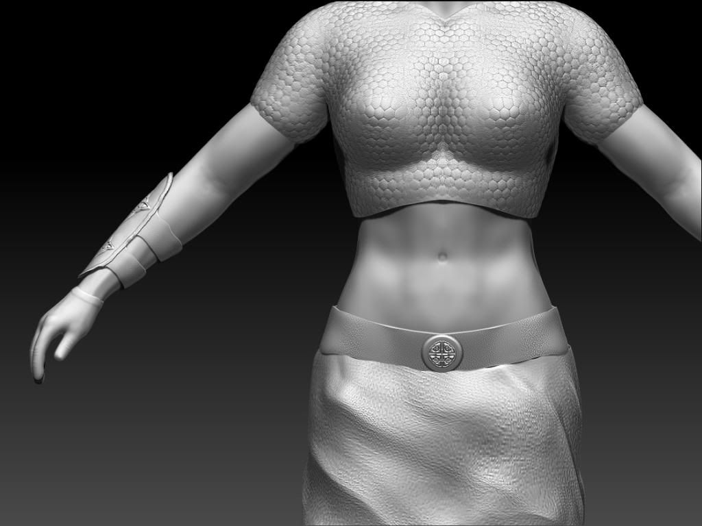
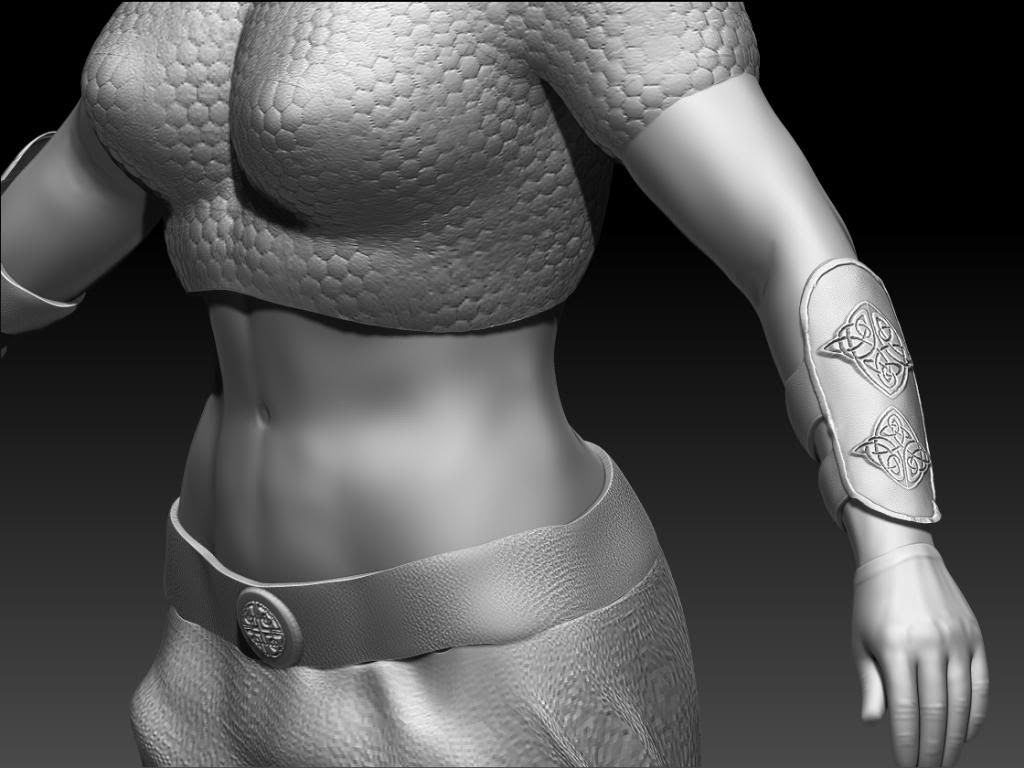
*Update* Due to time constraints I'm going on to the retop.
Here's the quick design sketch.

At the minute I'm sculpting and decided to leave out the extra strapping on the abdomen and holsters. The boots design is also changed. The weapons are being done separately.
Just looking for general feedback.


http://i1281.photobucket.com/albums/a518/Christopher_Pendleton/ninamaterialclose2_zpsdca1d77f.jpg


*Update* Due to time constraints I'm going on to the retop.
Replies
[SKETCHFAB]c0582e1d10ad49138f61429ff705fd6a[/SKETCHFAB]
[SKETCHFAB]33f06d75fd444c2e89485304b76081f2[/SKETCHFAB]
Looks like you skipped straight to the highest subdivision level and threw in some alphas. I'd recommend spending time defining the overall shapes and volumes in the lower levels. Also study the materials you're sculpting, look for reference how cloth folds and wrinkles. Now it looks like the skirt is made of stone and the shirt a strange blob.
Anyways, good news: anatomically its not THAT bad. The arms and head might be a tad too small, the shoes are might be a size too big also, but the overall proportions are pretty close, besides the gravity defying chest.
Don't rush to get to the details, get the form working first.
Points from the current Nina design.
Diffences in Nina's style over the Tekken series
Moodboard of female Celts
Queen Medb from the Ulster Cycle in Celtic Mythology
Silhouettes
Value gradients
[IMGhttp://i1281.photobucket.com/albums/a518/Christopher_Pendleton/ninavlaue_zpsd431e031.jpg[/IMG]
Colour Scheme designs:
Autumn Colours
Forrest Scheme
Blues and Greens scheme
Scheme using Nina current colour scheme
Heads height observation:
http://i1281.photobucket.com/albums/a518/Christopher_Pendleton/ninaheadproportions_zpse8618e65.jpg
Body Shape reference used from the Street Fighter x Tekken Art Book
I then went on to polypaint in zbrush and texture to bring the character into UDK
Polypaint shots (Kilt was done separately):
Unwraps:
Body Unwrap
Hair, Boots, Pads, Eye, Kilt unwrap
Diffuse Maps:
Normal Maps:
Specular Maps:
AO/Complete Maps:
Example of a quick short attempt at sub-surface scattering
Criticism is most welcomed.
Thanks,
Chris
If you really do want to get better at modeling here is my suggestions.
I think your biggest problem is it is very rushed at the sculpting stage. Really take your time to get stuff right. Rushing through like you have done just gets you a bad model without learning much. Next time take it slow get the anatomy right first before moving to armor or detailing. Use a lot of reference for every part of the character when sculpting. Build out base meshes for the different pieces of armor. Don't just sculpt belts and thing on to the underlying model. Also trying going after someone else's concept that is really well designed. It's much easier to come out with something good when you have a clear, well designed concept from the start.
Sorry if it sounds harsh. I am just trying to help out.
Your textures don't suggest you are much into texturing either. So whats your goal? With this character and in general?
I'm sorry to be a bit harsh now: Your version of Nina Williams doesn't really stand well against the original. Indeed its pretty bad. You seemed to rushed this trough. Either you are not experienced enough to do better or you are just not paying any attention to what you are doing and are aiming for quick solutions and quick results. If it is the first: Go a step back and try to do something simpler. Pick simpler assets and try to do them good. Then do another asset and try to do it amazing. Get expeirence with easier projects. If you are just aiming for the quick solutions and quick results then you really need to rethink if game-art is for you. You have to learn much about loads of stuff. And will take you long. You will have to earn experience by spending hundreds of hours practicing. There is no short path to great charakter designs and artwork in general.
1'st:
I'm not going into details about anatomy issues, messy topology, lacking silhouette, insufficient highpoly modelling and texture let downs, material definition. Your model has all of them and doesn't stand well on one of the above disciplines.
I think your first mistake was to start a redesign without first nailing your initial design. If you wouldn't state your redisgn Nina Williams no one could tell from your model. Which is not good. You did some iitial research and you analysed the original charakter design but apart from that you have not much as a concept. A simple style sheet will not cut it when you are trying to do such a heavy redesign of a modern assassin into a medieval nina williams.
Your own concept should have correct anatomy and needs to be far more polished. The less concepting you do the higher the chances you will make huge mistakes that would take ages to fix later on. You have to be experienced to work from very rough concepts or concepts that have anatomy and proportion issues. Because you need to spot and fix them as you go.
2'nd: NEVER fix model issues later and start your texturing.
3'rd: Spamming this thread with more and more pictures will not give you better feedback. Take my advice and take a step back. At the moment I would say such carackter redisgn is beyond your abilities. Learn about anatomy and zbrush sculpting. The maybe try to just copy the Nina Williams Design you have there. And compare your results with your reference and see where you need improvements.
I prefer doing motion capture. This module was compulsory and this is why I'm willing to improve my modeling for the future. I know I need to improve.
I do agree with the point of you not being able to recognize this as redesigned Nina Williams if it wasn't stated.