The BRAWL² Tournament Challenge has been announced!
It starts May 12, and ends Oct 17. Let's see what you got!
https://polycount.com/discussion/237047/the-brawl²-tournament
It starts May 12, and ends Oct 17. Let's see what you got!
https://polycount.com/discussion/237047/the-brawl²-tournament
2D Community Noob Challenge November 2013
Welcome to the 2D Noob challenge!
Apologies for this being one day late!
This thread is for those of you who wish to improve your skills in concepting / 2D in general.
This is a once every 2 weeks (ish) challenge on the first of each month and on the 16th of each month. On the beginning of each new challenge I will post two entries, the most creative idea and the best technical. This is subject to change depending on feedback from you guys and gals on what you feel is an appropriate time slot.
Add Vysuki on Skype and I can add you to the 2D challenge group chat on there.
Previous 2d Challenges:
October 2013 Part 1
October 2013 Part 2
The Challenge!
This two week challenge will be around the conception of personal defense. I'm leaving this one quite broad but the basic principle is a defensive item used by a human sized character. This could cover a wooden shield to a floating robot equipped with an energy shield that would fly in and deflect shots so approach this design however you feel!
Rules:
It would be preferred if you can show your initial idea generations and post any development pics.
An example of some simple designs: (By Jose Vega)

P.S Don't forget to check out the Monthly Noob Challenge!
Also Special note to noHero again for making some interesting thrones, especially the King of the dump!
Apologies for this being one day late!
This thread is for those of you who wish to improve your skills in concepting / 2D in general.
This is a once every 2 weeks (ish) challenge on the first of each month and on the 16th of each month. On the beginning of each new challenge I will post two entries, the most creative idea and the best technical. This is subject to change depending on feedback from you guys and gals on what you feel is an appropriate time slot.
Add Vysuki on Skype and I can add you to the 2D challenge group chat on there.
Previous 2d Challenges:
October 2013 Part 1
October 2013 Part 2
The Challenge!
This two week challenge will be around the conception of personal defense. I'm leaving this one quite broad but the basic principle is a defensive item used by a human sized character. This could cover a wooden shield to a floating robot equipped with an energy shield that would fly in and deflect shots so approach this design however you feel!
Rules:
- Starts November 2nd and ends on November 16th
- It can be fantasy, sci-fi, steam punk, whatever genre you can think of.
- It has to be something usable for a single human sized character
- It needs to be finished as digital but your starting / designing steps can be traditional.
- Try to leave a crit for someone else when you post as it helps your own observational eye.
It would be preferred if you can show your initial idea generations and post any development pics.
An example of some simple designs: (By Jose Vega)

P.S Don't forget to check out the Monthly Noob Challenge!
Also Special note to noHero again for making some interesting thrones, especially the King of the dump!
Replies
I'd love to say that I'm in but I don't know if I will have the time.
Oh, f*ck, I'm in, I really love the theme !
Started blocking out some different designs
Here is what I came up with for my 3 tiers based off my design sheet
Now on to working on getting some detail in them.
I will try to come up with 3 rough designs at the end of the week and will detail them the other week.
After some research, I might go for some fantasy shield, built with parts of animals !
Thanks, that's kind of what I am struggling with at the moment as I try and figure out the details on the shield. I hope to have something to post in the new few days.
Fincks - looking forward to seeing what you some up with.
Think I might attempt steampunk next, if it comes to me.
Hey man, I like it. I mean, if anyone tried to use it they're pretty much guaranteed to die, but still pretty.
To start off I did a quick sketch to have a general idea:
Then I started working on the actual thing, modified the wings that didn't make sense upfront and I still have to decide for the central part of the shield:
Crit: noHero awesome job like always, wish I could give you advices.
Cool shield james, only crit from me is that the bones are way too white and clean and the back handle doesn't cast any shadow ^^
I decided I will scrap the initial symbol design and go with a double keys crossed painted one. That came along with the wings on a "Shield of the heaven city guard" concept
The first sketch is based on a simple shield made by humans. The second is a magic shield designed by dwarves. It will light your way and you protect. Hope you enjoy!
Sorry for the english!
http://2.bp.blogspot.com/-HNgDjfORfiU/UnwMw5deb5I/AAAAAAAAAeA/hlIhv9n2MSs/s1600/shields_72.png
Got stumped with the steampunk thing, ideas kept escalating beyond defensive. wanted to keep away from just putting random cogs on a shield.
And sure, you have my permission to do a paintover ^^ thanks!
I tried to get rid of the black lines on the wings and give a more heavenly feel.
ps. feedback
james, really interesting idea but i think that front is a bit to complicated. Some big shapes would propably help it.
@rokugan, this keys in middle are not visible well, and im not sure about this wings. How they stick to the back of shield etc.
this could be usefull
http://www.polycount.com/forum/showthread.php?t=71380
Here is an idea I had for an unfolding force field shield. I plan to develop the idea further with some more images.
riceart - I really like the second one, nice job.
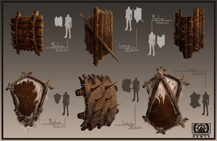
Here is my update so far for the first tier of my shield set. It's going really slow for me so far. Still learning that's for sure. I decided. I decided to go with an orc style for the shields because I think the two or designs will fit better in that style. Please feel free to rip this apart and let me know what I could do to improve on it.
@KristianS: love the design look forward to the development.
I can see what I assume to be lines for a machined type metal and the lighting is looking good (nice touch on the reflections of the figures and the correct specular lights on them too.
The places I'd suggest looking at perhaps would be around where the hair of the figures joins the shield, it's reading pretty strangely due to the inset of the metal and it getting darker to a suddenly lit up hair surface that appears to be meeting the bottom of that dip.
Also I love the 'protect your king shield' it's always good to see a dose of humor in a design or two!
@Pennywise: It reads well, nice warm light makes the metal feel old, combined with the beaten up state makes me feel it's orcish. The painted symbol is done well too! I'd say trying perhaps try looking at adding some knots into the wood? Not needed but might look good. As for the design Orcs vary a lot, it could easily fall into the orcish category, maybe adding some kind of small chain with big teeth and bones or something hanging on it would push it further, but as you said this is upgradable and I'd assume the bigger ones would have more of that orcish pride visible.
@Riceart I love the asymmetry on that tri shield. The brush strokes are big and broad and as a result the image detail is low but the form and the colour/lighting make it perfectly clear what this is made with.
@KristianS Love the idea you've got going here, the execution is great too. because of the semi visibility and the wrist piece coming through it already looks like a futuristic version of a buckler shield. This could be interesting seeing it modeled and animated.
Only critique I noticed is that the stripped two straps, at the end closet the elbow at the top, look a little flat but for a concept its perfectly readable.
@Rokugan, it's nice seeing the jump in quality between your last two pictures, also great work on lighting the feather pieces!
@erikguarisco I love the magic shield, feels like it could fit in either a fantasy game or sci-fi, colour scheme feels like the protoss.
I would say that the two triangle panels on it are painted to seem very curved but the back piece feels quite flat, yet the shadows are not showing as if the curved parts are above it.
Also Welcome to polycount!
@Jamesark, crossing all those bones over must have taken forever! There's something creepy and slightly voodoo Esq with the way you've created the front, it feels like the shield should be old, especially with the bottom being broken away, perhaps you could add some dirt and wear/ tear to the back of the shield?
This is just some practice as I'd not painted in a bit, I'm going to try to get some more interesting designs done tomorrow (though its late I don't count myself in these challenges)
Thank you again for the competition idea, its really helped me get painting. Even if i've been cutting it a bit loose with the theme :P ...
well armour is defensive...
NoHero: Thanks for the feedback; Im glad you liked the design. I think your shield has a very interesting design. The rendering makes it look a bit like the surface of the shield is wet which Im guessing was not really intentional. I think its due mostly to how the highlight are painted.
Vysuki: Thanks. I agree about the strap. I made some changes to the design. That is a nicely painted shield; I think the metal could use some sharper highlights though.
Pennywise: Nice design. It does very much have an orc style to it. I think you could work a bit more on rendering the different materials (wood and metal in this case). Perhaps do some life studies of materials.
Not sure if this challenge is already over or not, but it's still Nov 16 here xD
I've been meaning to join this for a while but had not done so until now
Thanks for starting this and starting me on painting ^^
The idea for this shield is to use plant parts, so I put some thorns around and the middle part has a leaf texture.
Great idea, I think the only direction that could make it stand out more would be to use some more colour variation, maybe some greens or even have a flower or two growing off of the vines.