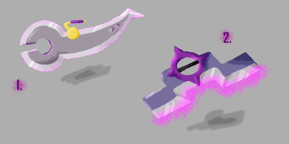
My first concepts
This is one of the first things I've drawn with a Wacom tablet, so don't be too harsh. However, I would like some constructive criticism on them - so I can get better!
No. 1 is an Anti-mage weapon inspired by pincers. I was thinking they could be called the "Pincers of Karkinos" or something, after the mythical crab.
No. 2 is also an Anti-mage weapon where the ring is inspired by a compass. Personally I thing it's a bit dark, but I don't know...
No. 1 is an Anti-mage weapon inspired by pincers. I was thinking they could be called the "Pincers of Karkinos" or something, after the mythical crab.
No. 2 is also an Anti-mage weapon where the ring is inspired by a compass. Personally I thing it's a bit dark, but I don't know...

Replies
If you have troubles with lighting, watch this tutorial series [ame="
Flat areas only a change color due to specularity(how much light bounces off the material), highlights, or shadows (shadows that come from other objects)
The problem with your drawings is your lighting, once you clean that up then all you need to worry about is design and color. (not saying that the color schemes you've chosen are bad)