Old_restroom_UDK

polycounter lvl 10
This will be a small abbandoned restroom.
Here is a first render out of udk.
I'm using my real life restroom as reference.") :poly142:
:poly142:
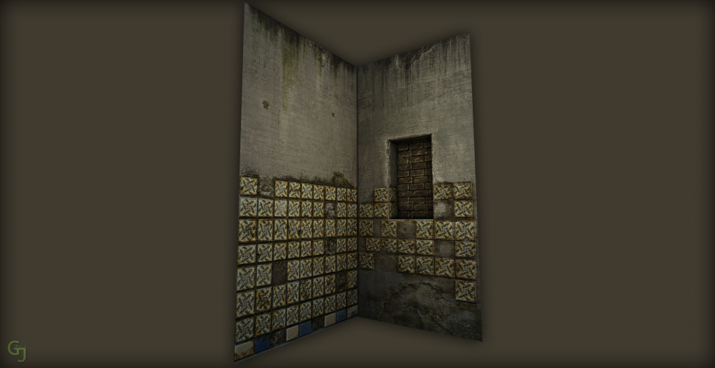
Here is a first render out of udk.
I'm using my real life restroom as reference.

Replies
any critique welcome
Cheers,
Shad0w_Walker
I find the wall tiles a little distracting, mainly the pattern. Maybe reduce the saturation or make it stand out less.
Firstly, why are your tiles all different kinds of sizes? It would seem a lot more natural to me that the tiles are all the same size (standard).
Secondly, make sure your tiles are arranged in the same pattern. The wall tiles at the window for example, it's a bit weird that the first tile below the winow is offset a bit in comparison to the tiles at the left side of the window.
Also make sure that the spacing between the tiles is all the same, for example at the left side of the wall where the tiles are supposed to meet. The left wall-tiles are much closer to the corner-side than the right side wall-tiles.
Keep up the good work!
I'm still deciding if I should let the pipe red. What do u guys think?
Texture for toilet and plant is in Progress
Keep going! Its starting to look pretty neat.. or should I rather say disqusting.. and a place that I hope I never have to be at in real life (:
The toilet has 16 edges and the pot has the same.
The light is in my (real life bathroom) and that's where I took the reference from
All the reference that I have are literally 4meters away:)
PS: I looked at your Resume an spotted that u listed Unreal Engine twice in the 3D Software section:):)
The tiles alone are okay but the overall impression with the very dirty underground and the very detailed tile edge gives me a "wrong" impression like bad pixel resolution. Maybe make the underground brighter and cleaner so that the detailed tile edges dont look like texture errors for me.
So, I added more edges to the toilet. Can u see the difference ??? :poly122:
I also added a very nasty looking carpet, don't even wanna know what happened their. :poly127:
And some nasty toilet paper. Ohh and the bucket is also new.
Should I put a small light source down their to make it more noticable?
I got a question though.
This is my lightmap for the heater in the left-hand Corner and I dont get why, after I build the lighting, the shadows on the object look so crappy.
I already increased the res. to 256 and it still looks like that :poly127:
I will be posting some new shots soon.
Critique welcome
I would agree with other people that the wall tiles are distracting.
I also think that the grass and any other moss etc should be scattered around the floor tile gaps, instead of around the sides of the room. It looks a little fake at the moment
Thanx for the reply
Thanx
And btw. mushrooms and fungi is a great idea i think it would look even better
This is my Final shot