Ewing's Workshop Thread
Hey Polycount!
So I finally mustered the stones to post my first item on the Dota 2 workshop.
It was an awesome learning experience actually going through all the different hoops that you need to go through to get your item imported. Before this project, all of my models have been diffuse-only and pretty simple.
I would love some feedback on the diffuse texture, the masking (which I have never done before), the overall feel, and any other feedback!
Also, unrelated, I am so consistently amazed at the helpfulness of this entire community. I decided in May of this year that I wanted to do video game art and started trolling the forum with NO experience, so submitting something to the Dota 2 shop in just 6 months feels pretty big for me, and it would have been a much rockier road without this community, so THANKS!
[IMG][/img]
Workshop link (I wrote up a little story to go along with the item if anyone feels like a quick 1 paragraph read)
http://steamcommunity.com/sharedfiles/filedetails/?id=190394059
So I finally mustered the stones to post my first item on the Dota 2 workshop.
It was an awesome learning experience actually going through all the different hoops that you need to go through to get your item imported. Before this project, all of my models have been diffuse-only and pretty simple.
I would love some feedback on the diffuse texture, the masking (which I have never done before), the overall feel, and any other feedback!
Also, unrelated, I am so consistently amazed at the helpfulness of this entire community. I decided in May of this year that I wanted to do video game art and started trolling the forum with NO experience, so submitting something to the Dota 2 shop in just 6 months feels pretty big for me, and it would have been a much rockier road without this community, so THANKS!
[IMG][/img]

Workshop link (I wrote up a little story to go along with the item if anyone feels like a quick 1 paragraph read)
http://steamcommunity.com/sharedfiles/filedetails/?id=190394059
Replies
This is a render from blender with diffuse only. I made it in at 224 tris per axe, which is the exact upper limit for his in game LOD. Took forever to pair down the original design to few enough tris.
Would love some feedback!
[IMG][/img]
I totally agree that the blade has some inconsistency in the light source. I do have a question though; is there a best practice for defining the direction of a light source on your diffuse map for an item that moves around a lot like a weapon? What I mean is, the direction of the light source I created makes perfect sense when the blade is held at a 90 degree angle to the ground, as it is in the posted render, but when it is actually in the game beast master will be waiving it all over the place. Is best practice to chose a light source that makes sense for the item when it is held in an idle stance?
Also, the only rule of thumb I know for adding more variation in hue is that highlights tend to be warmer, and shadows tend to be cooler, any other suggestions?
Thanks!
Thanks again for the feedback. Also, that thread is exactly what I was looking for thanks!
[IMG][/img]
Would you mind explaining?
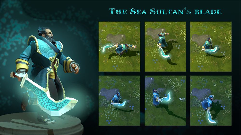
Here is a quick board I put together for the workshop page.
Looking forward to some feedback!
[IMG][/img]
Here's the steam link if you want to read the little blurb I wrote up about it.
http://steamcommunity.com/sharedfiles/filedetails/?id=192532945
I also discovered the "freestyle" render option in blender today, which I think looks pretty sick for process renders. That is what gives it the hard outline for anyone not familiar.
Looking forward to thoughts!
[IMG][/img]
So I got the shoulders textured. I changed the theme of the whole set after coming to the conclusion that a swampy set for Nature's Prophet just wasn't really consistent with the lore in the game. New idea is thus....
Before Verodicia planted the last seed that became Nature's Prophet, she planted a seed which would become a tree imbued with some of her power from which he could harvest the necessary materials for a set of armor and a weapon in dark times. Nature's prophet has nurtured the tree throughout his life and the time has come to harvest its bounty and fashion a set of armor.
The whole set will be wood with a glowing blue/green in several elements to symbolize the magic heart of the tree.
Working title for the set: Verodicia's Gift. The shoulders specifically are called Verodicia's Embrace. Totally open to suggestions. I find my back stories tend to sound good in my head but come out totally corny.
Looking forward to some feedback!
Also, very open to some crit on the texturing and model; I am still trying to figure out wood so any tips would be great. (Already read the Wiki stuff...I think my wood is improving over the axes I posted above these shoulders, but still finding my style.)
[IMG][/img]
[IMG][/img]
[IMG][/img]
All feedback is appreciated!
[IMG][/img]
[IMG][/img]
Just a quick update to get some ideas out there. 5 minute sculpt on top of base mesh, so lots more sculpting to do.
Also if there is already something similar to this in the workshop that someone else has seen please let me know. I always make a point of looking through the shop first to make sure my idea is different enough, and I didn't see anything quite like this.