The BRAWL² Tournament Challenge has been announced!
It starts May 12, and ends Oct 17. Let's see what you got!
https://polycount.com/discussion/237047/the-brawl²-tournament
It starts May 12, and ends Oct 17. Let's see what you got!
https://polycount.com/discussion/237047/the-brawl²-tournament
Female Demon Project
Hey guys working on my end of year project and i really want it to look good, ive got two months to try and make this model look outstanding and i really want to put a heap of effort into it 
My Deliverable's will be:
One rigged textured model of a demon with a face count between 30k-50k (high count i know but intended as a cinematic model)
My goals:
To improve over all skills with maya and photoshop and make a nice piece for my Portfolio
Due Date:
13/12/13
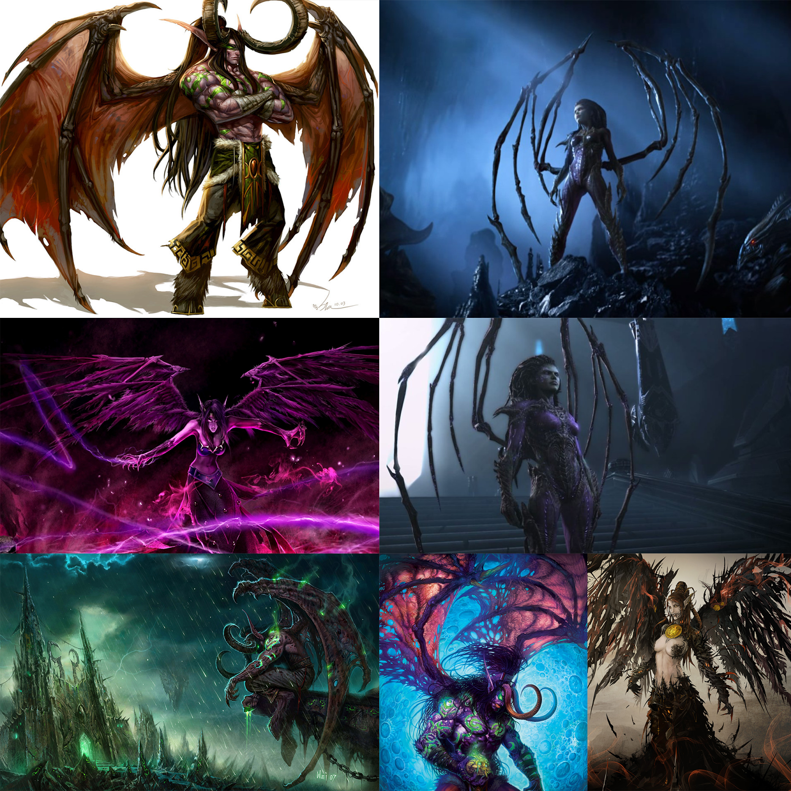
My Reference imagery:

Im really inspired by alot of blizzard art though i dont really play their games any more
More to come
My Deliverable's will be:
One rigged textured model of a demon with a face count between 30k-50k (high count i know but intended as a cinematic model)
My goals:
To improve over all skills with maya and photoshop and make a nice piece for my Portfolio
Due Date:
13/12/13
My Reference imagery:

Im really inspired by alot of blizzard art though i dont really play their games any more
More to come
Replies
Ignore the face count, its just a estimate from the sub-patch emulation it wont be anywhere near that high
Seems like it's 'not', but I want to make sure first.
Im still not quite sure about that, i would like too i have the program, but i have very little experience with Zbrush so im not too sure yet. I mainly want to get the mesh and edges flowing right for Rigging
Right now the anatomy is very confusing and the poly distribution even more so.
You should focus on building up a solid form before going apeshit with the polycount just so that you can get up to 30-50k tris.
I'd say keep the same poly density as you've got where the wings start, and for the first couple of loops. The shape of the tits are nothing what porn has taught me and they are a good example of weird polygon distribution. Where people usually add more polygons to tits to make them round and smooth, you've got 1/6th of the polygons on the tits compared to the stomach.
Just take a lot of steps back with the polycount, reshape your mesh so that it has a believable anatomy (note, I've never used the word realistic here..) and stop focusing on "wanting to get the mesh right for rigging" as that is a couple of pages away for this character right now.
Follow the good old mantra of "Reference, Reference, Reference". Your proportions are way off so get a front, side, and top view of a human model and work from that. But most of all, study some anatomy. You don't need be be a complete lord and know the name of every single muscle as long as you know the big important landmarks and how things connect and overlap.
This is gonna sound really harsh, but I'd start over from scratch. This model is really not looking good and trying to polish it is gonna waste you more time than starting over the right way.
So after sulking for a while i took a few steps back i dont think starting from scratch is necessary (i make new saves often)
This mesh is alot tidier and it flows well the only stars (Verts with 5-6 edges) are the shoulders (front and back) and the top and bottom of the ab muscles is this acceptable? does the Shape and muscle structure look more human?
Right now I would just echo what has been said by everyone else, proportions and anatomy are all wrong. Are you using any particular reference? I would recommend actually checking out anatomy guides as well as books by Loomis or even Scott Spencer's human anatomy book, goes into quite a bit of detail about proportion and forms.
yeah im moving on, and have you looked at the most recent post? is that anatomy looking more convincing? or do you still maintain what you said?
good luck man
https://drive.google.com/file/d/0B1l0akoBFfsPbmlLelBVeHVCQm8/edit?usp=sharing
also, i didnt manage to sort it but the breasts should really join in the middle alot more.
You said this is an end year project, end of which year? 1st, 2nd or 3rd?
Are you using reference while modeling? As in, do you have image planes setup in Maya of your reference? If you do, would you please upload them so that we can critique your anatomy better.
If you don't have proper references, I can supply you some, just pm me. You have about a month and a half to complete this, get your beginning stages solid before going full character crazy.
Don't be discouraged with the critiques here, its all to help you improve :thumbup:
@spiderdude, this is my first an only year on a course that covers quite a range of topics such as video post and sfx and such though im only really in modelling
And most probably a big part of why the first one was off was due to the lack of a proper reference i started with a demonic kind of reference with male anatomy because i was following a tutorial and then just kinda winged it from there (No doubt it shows)
And i dont mind the critique if i want this too look its best i really need it, im from good old politically correct nz so around here everyone is the "best" at everything and no ones allowed to say differently hahaha but im really not too bothered, besides if i want to do this for a living i have to learn to deal with it.
And my tutor at the moment is only really skilled with After effects and doenst know much about maya or modelling (because every student in the class can pick to make a movie, model, or Vfx kinda of thing with some flexibility)
Anyways il get onto tidying up the proportions with the picture nisturm sent me, one thing im not sure about is how to get the arm muscles looking defined with such a base mesh? should i add more edges?
I found this picture in a different thread on polycount. A front and a side view should help some with the proportions.