Updating Website/Portfolio Would Love some Crits
polycounter lvl 7
UPDATE:
Greetings All,
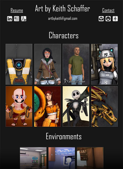
Per everyone's suggestions, I did register a new domain name for my portfolio. I also picked up the matching g-mail account to use as an contact point.
My new portfolio can be found at: www.artbykeith.com
In addition to the new domain, I updated the layout and some of the content. I added navigation at the bottom of the pages so you did not have to scroll all the way up to go back, and I also updated my resume slightly, and added links to Linkedin and such.
I would still love some comments/crits on what I could be doing better. Key area's I would appreciate some feed back would be ease of use/navigation, layout and load times.
I would also love some feed back on what people thoughts are on which is my strongest/weakest piece are.
Thanks again!
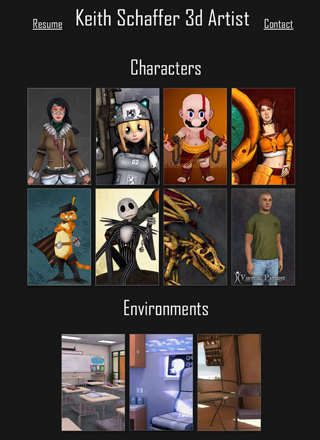
OLD:
Greetings All,
I just finished updating my website layout and would love a few pairs of fresh eyes to take a look and give me some feedback.
Things I'm most interested in getting critiques would be: layout and presentation; ease of use; strongest weakest piece; and lastly, what should I be adding.
Thanks!
www.YdoUwant2know.com
Greetings All,
Per everyone's suggestions, I did register a new domain name for my portfolio. I also picked up the matching g-mail account to use as an contact point.
My new portfolio can be found at: www.artbykeith.com
In addition to the new domain, I updated the layout and some of the content. I added navigation at the bottom of the pages so you did not have to scroll all the way up to go back, and I also updated my resume slightly, and added links to Linkedin and such.
I would still love some comments/crits on what I could be doing better. Key area's I would appreciate some feed back would be ease of use/navigation, layout and load times.
I would also love some feed back on what people thoughts are on which is my strongest/weakest piece are.
Thanks again!
OLD:
Greetings All,
I just finished updating my website layout and would love a few pairs of fresh eyes to take a look and give me some feedback.
Things I'm most interested in getting critiques would be: layout and presentation; ease of use; strongest weakest piece; and lastly, what should I be adding.
Thanks!
www.YdoUwant2know.com
Replies
thats probably not a good first impression
Yea I agree with this, that URL is bad, and it kind of sends the wrong message about yourself.
About the art work, I think the problem I have is nothing jumps out to me or is wowing me. The Mario/GoW cross is interesting, and the Jack model is well done, but the other characters just lack anything interesting going on. For example your take on that League of Legends does not look like it would fit in that game at all, her textures are really flat and lack a color scheme that fits LoL. If you didn't tell me it was suppose to be in LoL I would have never guessed to be honest. I think focusing on texturing would be a good idea because I think that is your weakest area.
The domain name comes from my user name. Its the same username I use on all of the 3d sites. It's also my gamer tag, g-mail and about 80 other things online. I've used it for a while, but I see your point. I update that in the next day or two.
As for domains, I've been thinking about getting "ArtByKeith.com" Any thoughts?
@Bardler Thanks! I agree that texturing is probably my weakest area, and I agree with your assessment of the LOL character. I will redo the textures for sure.
@Progg Thanks. I am focused on characters, but I can do both. I've kept just a few environments up there just to show that I am capable, but all of my time/effort is going into updating my characters.
"keithschaffer3d.com" is a good suggestion, and I am considering it along with a few others...
However, I do have two reservation:
1. my last name "Schaffer" Can be spell 15 different way. From "Shafer" to "Schaefer" to some crazy thing with umlauts in it. As it is a very common name with many very common spellings. I was not sure if it was best.
2. KeithSchaffer.com until recently was being cyber squatted on by some "Get Rich Quick" crap. Now its for sale for only $695.00. I dont know If I even want to be involved with that.
Also, artbykeith.com is shorter...and that is always good.
My mind is not made up, I am brainstorming a few ideas. (I'm also open to suggestions).
Right now Im looking at: artbykeith.com keithschaffer3d.com or schaffer3d.com
Per everyone's suggestions, I did register a new domain name for my portfolio. I also picked up the matching g-mail account to use as an contact point.
My new portfolio can be found at: www.artbykeith.com
In addition to the new domain, I updated the layout and some of the content. I added navigation at the bottom of the pages so you did not have to scroll all the way up to go back, and I also updated my resume slightly, and added links to Linkedin and such.
I would still love some comments/crits on what I could be doing better. Key area's I would appreciate some feed back would be ease of use/navigation, layout and load times.
I would also love some feed back on what people thoughts are on which is my strongest/weakest piece are.
Thanks again!
Edit:
Known Issues:
I Still have not figured out what I am going to do with the "Contact" page. It feels too spartan as is, but i'm not sure what I want to do with it just yet... I think I will add a paragraph or two about myself, and my interests, but I'm not sure if that is the way I want to go or not.