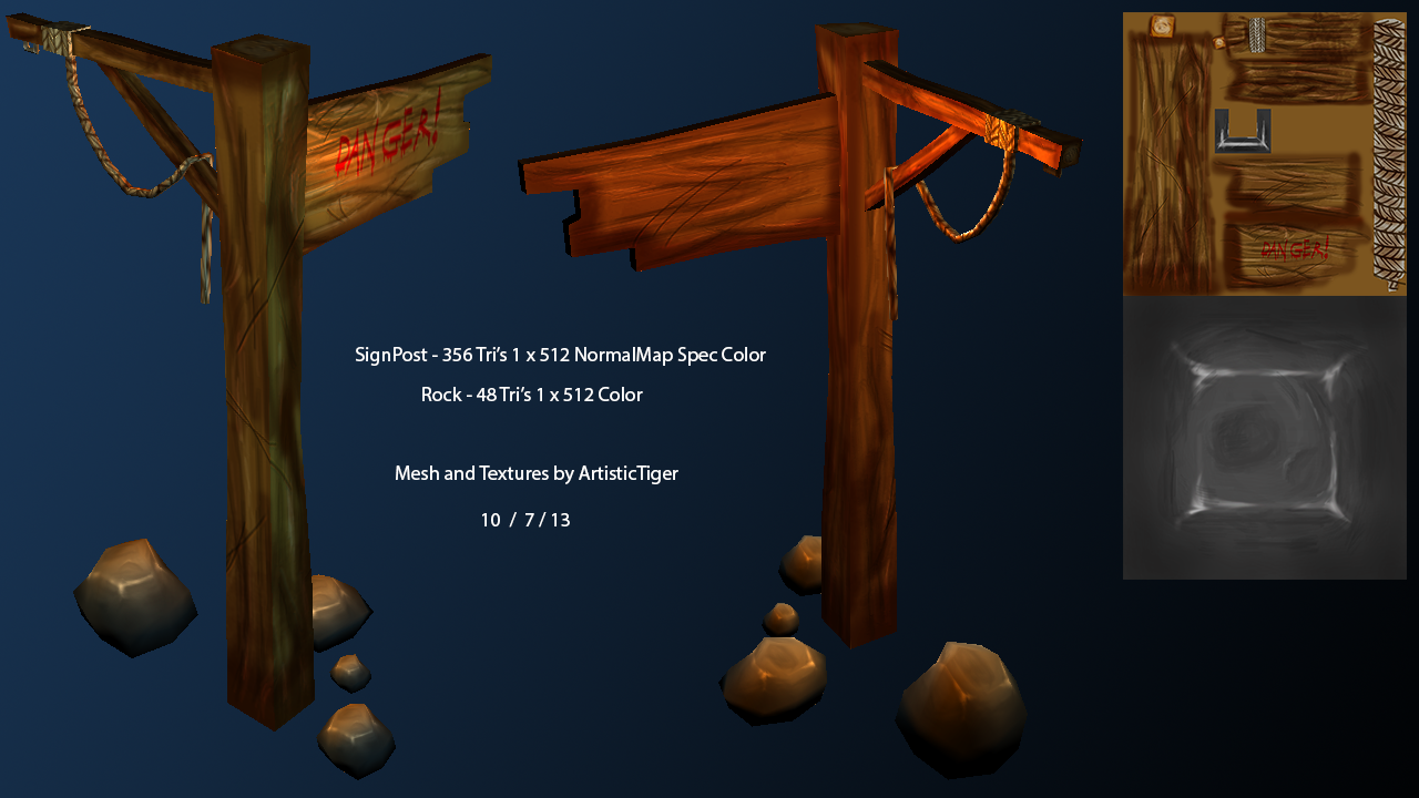
The text on the sign is similar enough to its background value and color wise that its kinda getting lost in the wood texture. It might help to try an outline or different color to make it pop more. Could maybe go slightly larger with it as well.
The rock texture size is really excessive given the relative size & importance; a 256 or even 128 would work as well.
On the sign, over a third of your polys seem to be on the rope, and a large portion of your texture is on the rope as well; this really is a bit much for an accent piece. I'd have spent more of those polygons defining the post & the sign.
The connection between the sign the post is awkward; the sign should either be nailed in front of the post, or should pass through it.
I agree with Goat Justice; the first thing I noticed was that the text on the sign doesn't stand out and it almost looks like wet blood or something the way it is right now. The other thing I notice is that the wood grain looks too large for the scale of the sign to me; notice how fine the markings in the wood are in the image DWalker posted. Other than that, it looks good to me. Keep us posted.
Replies
On the sign, over a third of your polys seem to be on the rope, and a large portion of your texture is on the rope as well; this really is a bit much for an accent piece. I'd have spent more of those polygons defining the post & the sign.
The connection between the sign the post is awkward; the sign should either be nailed in front of the post, or should pass through it.