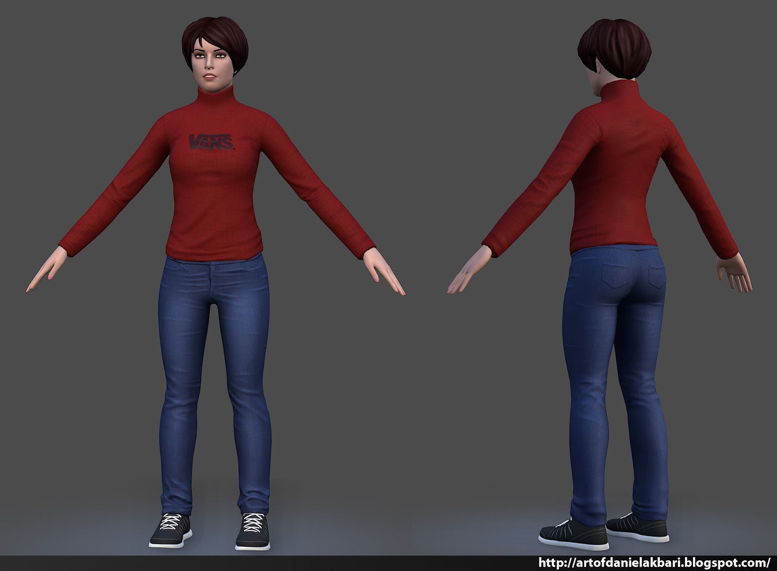
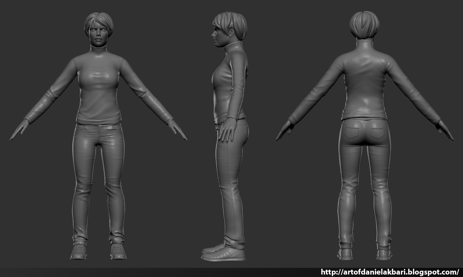
The sculpt is pretty good except :
- the folds on her top are not as good as on her pants. Checks refs, the work on the folds is too superficial.
- arms seems a tad too long
Now you have a decent sculpt that is ruined by a poor texturing and lighting =/
- What's your texturing base? Only an AO?
- Bring color variation in your skin. I looks like you just painted a plain pink under your AO. Add some red on the cheeks, tip of the ears and tip of the nose, blue and red around the eyes, light yellow on the forehead. It lacks imperfections in the skin, like freckles or moles. Same goes for the hands, too plain.
- There's some problem in the spec map. Paint the eye a plain white, it has to reflect the light. Add noise in the specular of the skin. The lips should reflect more than the skin.
- Overall the texture lacks details.
Now about the lighting.
- In what application did you render this character?
- In you renders it seems like the main light comes from straight behind the camera, it flattens all the volumes. Try a 3 point lighting, it will make a HUGE difference. Check the Marmoset Toolbag site for good lighting examples. http://www.marmoset.co/toolbag/learn/character-lighting
The model seems very well done, though i have some small issues with the design which can both be fixed by removing the logo. Firstly, I am highly skeptical that Vans has or ever would sell a turtle neck sweater, also, she looks more like a hipster than a skater girl.
I'm not sure if it's because of the camera or the turtleneck but to me, her head looks small which in comparison to her hands make them look huge. Everything else about the character looks good though.
Popol: Thanks for the feedback. I rendered this in marmoset, Ill keep everything youve said in mind.
Bigphun: Ill change it, yea I laughed when you pointed it out since it never crossed my mind
JordanN: Thanks, Ill try not to repeat it on this new model.
I really appreciate all of this help! I agree with everything you guys have said and I'll be going through each piece one by one and redoing the model.
Right now I am redoing the face. Texturing is my weakest skill atm so progress tends to be slow as I learn how to do it properly (sorry for the slow updates). Here is what I have right now. It's a new face. The only piece I'll keep and re-texture from the old model is the pants and shoes (maybe the hair not sure yet).
Here is a little update. I added eyelashes, Eyebrows, and fixed some minor issues with the eyesocket. I also desaturated the skin since it looked a bit blown-out and added some imperfections in the skin.
When it comes to texturing human skin this tutorial helped me out a lot, hope you can find something in it helpful! If you aren't using mudbox the technique is still applicable
Congrats, in general looks much better, nice work with the skin.. Just a little tip, the eyebrows looks like a part of the skin but with diffrent color.. I'm not sure how to explain...
Because as I can see, the eyebrows reflections looks so similar or the same like the skin reflections, I think if you sculpt the eyebrows in the higth poly, and change that part in the specular map, it will look, diffrent...
Sanro: Thanks for the link, it's pretty similar to what I did in photoshop. The main difference is that I used zbrush to fix seams.
Thanks Yilativ, I am glad it's an improvement. Nice catch, I forgot to update the spec map with the eyebrow so the light isn't catching it properly. I had eyebrows sculpted in but decided to just go in and paint it in instead since it was a bit too much. I'll make sure to update the spec on the next post and hopefully that'll solve the issue.
1. Skin is not pink, with a color balance layer bring in some orange/brown
2. I can't see any color variations. Red on the cheeks, yellow on the forehead (because of the bone), very light green along the jaw (bone again). Don't hesitate to put colors!
3. Colors around the eyes are super important. Mix reds and blues, I usually make the lower lid more red. Make the surrounding of the eye darker (burn tool) so the eyes are more noticeable.
Is it only diffuse? If not then you should boost the specular, but not too much (if it looks like she's sweating, it's too much).
Thanks Popol, I made some changes to a lot of things. I really appreciate the help. After your first comment I started to really evaluate my texturing. For some reason it never hit me on how bad it was till this week.
Alright guys, new update. It took me a while (many revisions) to get a sweater that looks consistent. So here is what I got so far, let me know what you think! I also made a slight change in the eyes (it was a bit too bright in the whites before).
Thanks, I am about to clean it up and create the low poly version. I just wanted to make sure the sweater is consistent in quality (compared to the new head I created) before I continue.
So if there is something that bothers you about it let me know asap Would hate to have to go back into the sculpting phase in the middle of texturing because I messed something up lol...
Hey guys, new update. I am working on texturing the real time sweater asset atm. One issue I am having is trying to balance texture detail. Perhaps I can get some advice from you guys. My current texture doesn't have much detail but at the same time I don't want to add detail just for the sake of detailing. Here is the current WIP of the sweater in marmoset, it looks fine to me in real time but the texture sheet seems like it needs some love, but I am not sure exactly where to focus my effort.
Dang, your sweater came out really nicely! Nice job, I like seeing people do traditional characters, seems more difficult to me. Add some normal waves to that hair, it'll make it pop!
I feel like the skin is a little to shiny. Like plastic shiny. The highlights in the collarbone area and some areas on the face make it look like that. The lips being like that is fine since it looks like lipgloss or lipbalm.
No idea what to suggest on how to make it highlight more like skin. Possibly tone down the shiny?
darknessbear: Thanks I am glad you like it. I have found it to be overwhelming at times (creating characters), but I am starting to get the hang of it by taking small steps in the right direction as often as I can.
Wishie: Yea, you're right, I'll definitely tone it down in the next update. Yea, the shiny part is mainly in the spec map so it should be an easy fix.
Thanks for the encouragement and feedback guys, I really appreciate it.
reuvd the pants and positioned it in the proper position. Moving down to the shoes, once I have everything placed I'll have a better understanding where to concentrate on to improve the overall presentation. Like always, feedback is appreciated
So I've got everything in one place now. I made some adjustments to the proportions. Not sure if I am digging the way I thinned out the sweater. Still figuring things out. I'll post the textures later tonight, have to sort through and organize my files since it's quite fragmented atm.
I just think your textures lacks detail. Like you could add some minor dirt one the shoes, some holes on the jeans. It looks too clean in my opinion. But maybe that's just me.
Thanks Suba, I am glad that the improvements are noticeable. I will definitely keep the detailing in mind for the next update. There is still a decent amount of work to do like you've pointed out.
Your point on my textures are valid. While my new texture work is an improvement from what I initially had, I do feel like there are a few areas that are lacking. I'll definitely keep it in mind, but I won't go too crazy since she's not supposed to look dirty.
In my head I can visualize how I want this model to look, but I often have trouble finding the right methodology to achieve it. So, I will do my best hopefully the next update is a good one.
Btw awesome portfolio I love your streetfighter character, especially that poor turtle!
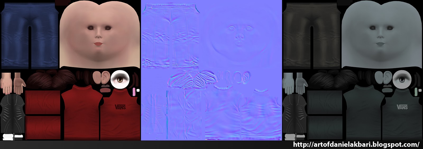
Alright, here are my textures since it's about time I shared them. feedback would be awesome. I am aiming to finish this up this week so any help would be appreciated.
In my head I can visualize how I want this model to look, but I often have trouble finding the right methodology to achieve it. So, I will do my best hopefully the next update is a good one.
Btw awesome portfolio I love your streetfighter character, especially that poor turtle!
Hah, don't worry, it's the same shit for everyone. 3D is like solving micro problems all the time, but it pays off when you finally get something close to what you wanted, that's for sure. ^^
Haha, thanks a lot ! I appreciate.
As for your update, i really love the color of those jeans, it adds a nice contrast. Your texture are more subtle now, i like it.
I don"t see well enough, but maybe the jeans could have even more details.
As you can see, jeans have often darker and lighter areas. Google some jeans references and you will see that pretty much every jeans have more variations than what you did.
I feel you have the same issue with the sweater. I see in your texture picture that you have one blue color, then the shadows. But you didn't paint the light.
Here:
You can see there is a main blue, then the shadows, but also lighter areas like on the folds, on the shoulders etc.
You actually did great with the skin, you painted shadows and light areas so the main color is affected by all of this and become more subtle and interresting. You could do that for the clothes too now.
BTW i hope i was clear, it's pretty late and english is not my lative language so maybe it's confusing...
You are really missing with the textures. The diffuse looks ok, but the spec/gloss is what is really bringing your textures down. I am just going to list off some stuff, in no order, because its easier than organizing a paragraph.
-You have blue spec for your face, but not the hands.
-You shouldn't have the character broken up on that many texture sheets. Not only is it a pain to texture that way, but you are going to increase draw calls on the character like crazy. Generally the character is on a single texture sheet, hair/transparent on another, and then sometimes weapons on another depending on the situation. Or sometimes the character will be on one sheet, and the face will have its own unique texture as well if you need the extra pixels.
-The spec map needs more detail, and you need a gloss map to get better material definition. For example a zipper, rubber on a shoe, jeans, and skin do not have the same gloss/reflectiveness. Also there are imperfections in clothing that will cause brighter and dimmer areas which is what you need to capture in your spec map. Variation and unique details are really important in spec maps to create interesting textures, and more importantly believable textures.
Here are two threads to check out to show you what I mean:
He shows texture flats http://www.polycount.com/forum/showpost.php?p=1939735&postcount=29
She has her texturing workflow video at the bottom of the page. http://www.polycount.com/forum/showthread.php?t=123813&page=7
Suba: yea, I know exactly what you mean in terms of lighting and detail in the textures of the clothes. Part of my workflow is trying most things that I can think of and choosing the least shitty version at the end. I have 10+ texture versions where in some of those I had painted lighting and detail but they simply were not as good as what I have now. I am still figuring my workflow out. But I do agree with what you are saying, and Ill aim to more successfully achieve it. Nothing your saying is confusing, its the kind of stuff I remind myself often to push my work further.
Bardler: Thanks for the awesome list of feedback. I really appreciate all of the help. Part of the reason why I separated the textures like the way I did was because I wanted to concentrate specifically on each piece individually without having to worry about managing complex texture sheet.
Till this point I had never messed with the gloss. I think I mistook the spec map as the gloss thats why they were so plain. All of my gloss maps were default white, but I went in and changed that which should be evident in the zipper for example.
Again, thanks everyone for all of the feedback it has made my revision much better than the original. Here are the final renders.
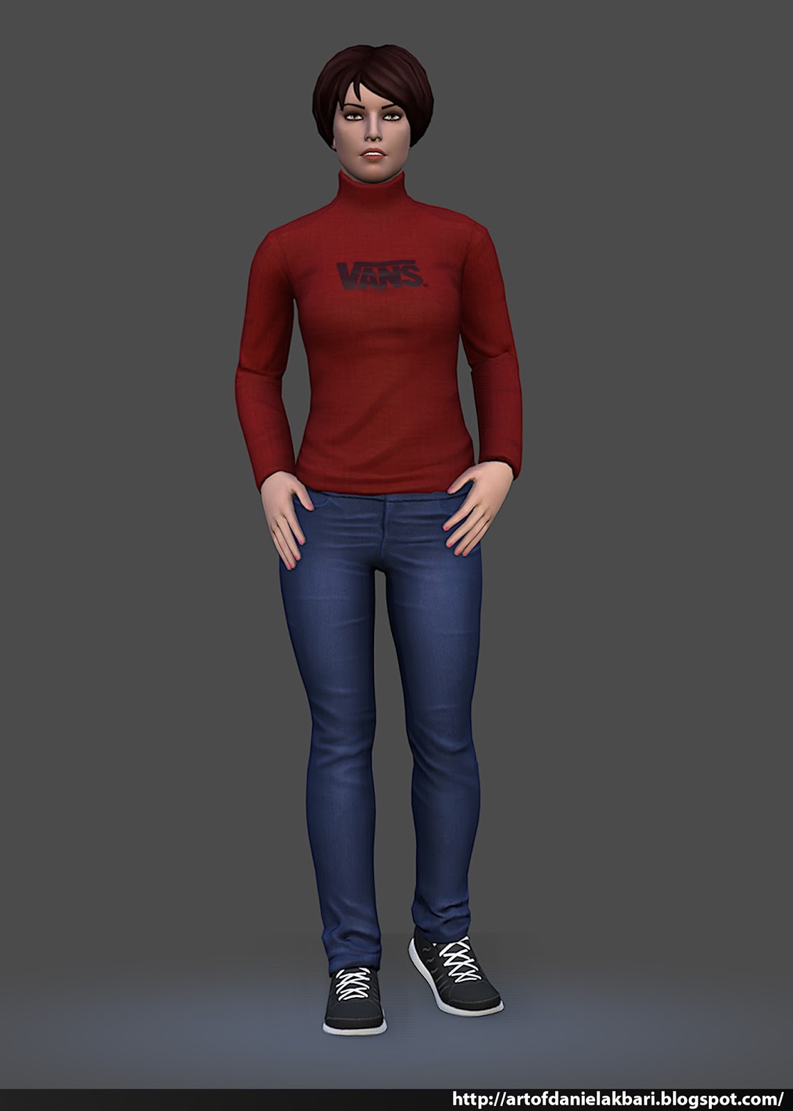
Hey guys, I've been meaning to revisit this character for a long time and I finally got a chance to do just that. I posed (rigged) the model and made adjustments to the overall texture using PBR workflow. (This was rendered in marmoset 2).
but i would suggest to rework the weighting on the elbows, there seems to be clipping
also the pose looks a bit like she has to go to the toilet :D
for the presentation shots i would not recommend using a perspective from somebody
that is actually smaller than her. her chin looks quite broad from that view so
may lower her head or lifting the camera at eye level so the viewer can better identify
with the character rather than feel dominated by it. And i would get rid of that white outline....
Replies
- the folds on her top are not as good as on her pants. Checks refs, the work on the folds is too superficial.
- arms seems a tad too long
Now you have a decent sculpt that is ruined by a poor texturing and lighting =/
- What's your texturing base? Only an AO?
- Bring color variation in your skin. I looks like you just painted a plain pink under your AO. Add some red on the cheeks, tip of the ears and tip of the nose, blue and red around the eyes, light yellow on the forehead. It lacks imperfections in the skin, like freckles or moles. Same goes for the hands, too plain.
- There's some problem in the spec map. Paint the eye a plain white, it has to reflect the light. Add noise in the specular of the skin. The lips should reflect more than the skin.
- Overall the texture lacks details.
Now about the lighting.
- In what application did you render this character?
- In you renders it seems like the main light comes from straight behind the camera, it flattens all the volumes. Try a 3 point lighting, it will make a HUGE difference. Check the Marmoset Toolbag site for good lighting examples. http://www.marmoset.co/toolbag/learn/character-lighting
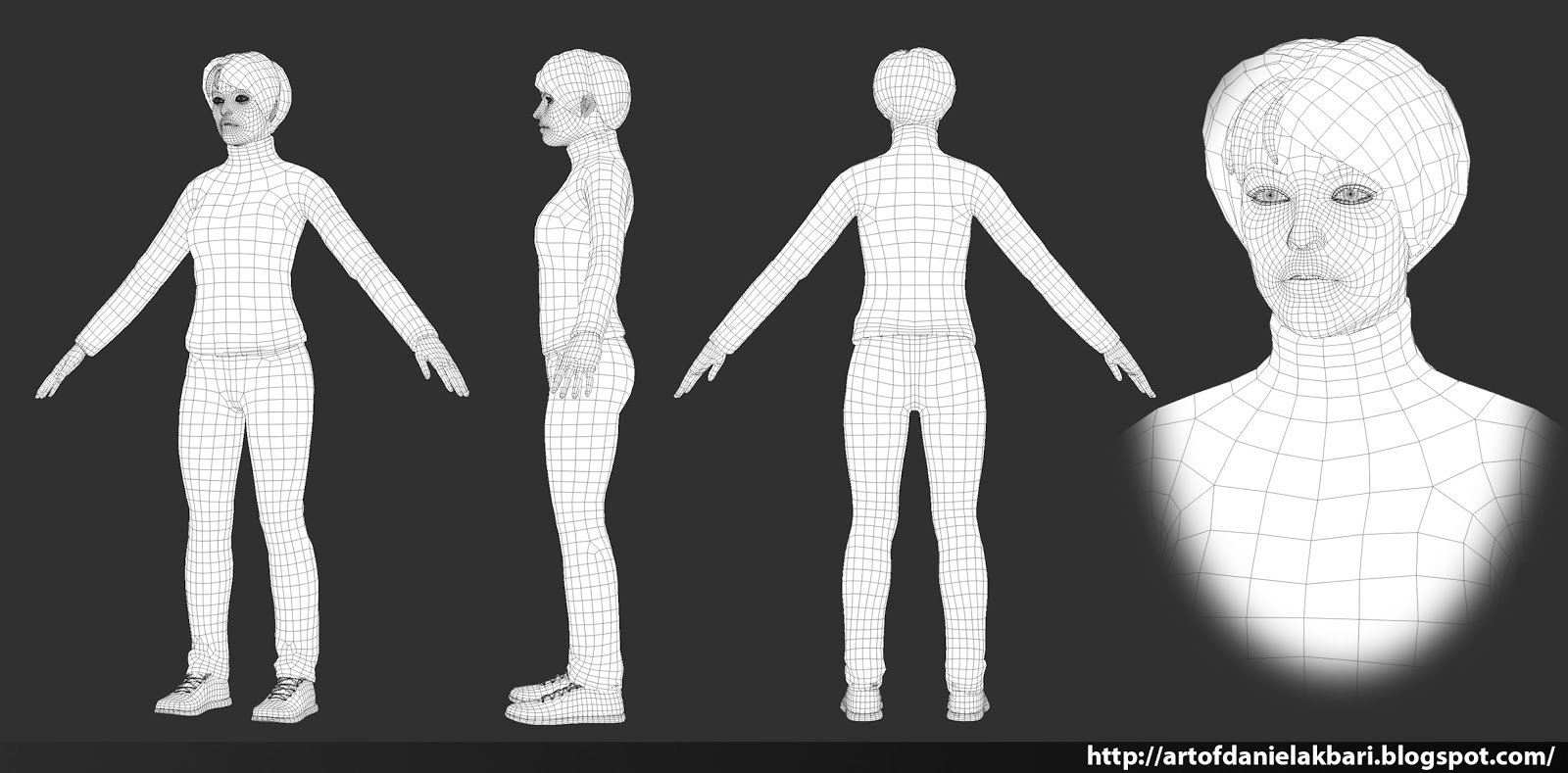
Other than that very good topology!
Hope it helps!
Bigphun: Ill change it, yea I laughed when you pointed it out since it never crossed my mind
JordanN: Thanks, Ill try not to repeat it on this new model.
I really appreciate all of this help! I agree with everything you guys have said and I'll be going through each piece one by one and redoing the model.
Right now I am redoing the face. Texturing is my weakest skill atm so progress tends to be slow as I learn how to do it properly (sorry for the slow updates). Here is what I have right now. It's a new face. The only piece I'll keep and re-texture from the old model is the pants and shoes (maybe the hair not sure yet).
[ame="http://www.youtube.com/watch?v=BFsL4YDw3Ww"]Painting Skin Textures in mudbox (newer version) - Youtube[/ame]
Because as I can see, the eyebrows reflections looks so similar or the same like the skin reflections, I think if you sculpt the eyebrows in the higth poly, and change that part in the specular map, it will look, diffrent...
Just what I think...
Thanks Yilativ, I am glad it's an improvement. Nice catch, I forgot to update the spec map with the eyebrow so the light isn't catching it properly. I had eyebrows sculpted in but decided to just go in and paint it in instead since it was a bit too much. I'll make sure to update the spec on the next post and hopefully that'll solve the issue.
1. Skin is not pink, with a color balance layer bring in some orange/brown
2. I can't see any color variations. Red on the cheeks, yellow on the forehead (because of the bone), very light green along the jaw (bone again). Don't hesitate to put colors!
3. Colors around the eyes are super important. Mix reds and blues, I usually make the lower lid more red. Make the surrounding of the eye darker (burn tool) so the eyes are more noticeable.
Is it only diffuse? If not then you should boost the specular, but not too much (if it looks like she's sweating, it's too much).
So if there is something that bothers you about it let me know asap Would hate to have to go back into the sculpting phase in the middle of texturing because I messed something up lol...
No idea what to suggest on how to make it highlight more like skin. Possibly tone down the shiny?
Wishie: Yea, you're right, I'll definitely tone it down in the next update. Yea, the shiny part is mainly in the spec map so it should be an easy fix.
Thanks for the encouragement and feedback guys, I really appreciate it.
I just think your textures lacks detail. Like you could add some minor dirt one the shoes, some holes on the jeans. It looks too clean in my opinion. But maybe that's just me.
Great work anyway. Keep it coming.
Your point on my textures are valid. While my new texture work is an improvement from what I initially had, I do feel like there are a few areas that are lacking. I'll definitely keep it in mind, but I won't go too crazy since she's not supposed to look dirty.
In my head I can visualize how I want this model to look, but I often have trouble finding the right methodology to achieve it. So, I will do my best hopefully the next update is a good one.
Btw awesome portfolio I love your streetfighter character, especially that poor turtle!
Hah, don't worry, it's the same shit for everyone. 3D is like solving micro problems all the time, but it pays off when you finally get something close to what you wanted, that's for sure. ^^
Haha, thanks a lot ! I appreciate.
As for your update, i really love the color of those jeans, it adds a nice contrast. Your texture are more subtle now, i like it.
I don"t see well enough, but maybe the jeans could have even more details.
As you can see, jeans have often darker and lighter areas. Google some jeans references and you will see that pretty much every jeans have more variations than what you did.
I feel you have the same issue with the sweater. I see in your texture picture that you have one blue color, then the shadows. But you didn't paint the light.
Here:
You can see there is a main blue, then the shadows, but also lighter areas like on the folds, on the shoulders etc.
You actually did great with the skin, you painted shadows and light areas so the main color is affected by all of this and become more subtle and interresting. You could do that for the clothes too now.
BTW i hope i was clear, it's pretty late and english is not my lative language so maybe it's confusing...
Anyway, keep it coming
-You have blue spec for your face, but not the hands.
-You shouldn't have the character broken up on that many texture sheets. Not only is it a pain to texture that way, but you are going to increase draw calls on the character like crazy. Generally the character is on a single texture sheet, hair/transparent on another, and then sometimes weapons on another depending on the situation. Or sometimes the character will be on one sheet, and the face will have its own unique texture as well if you need the extra pixels.
-The spec map needs more detail, and you need a gloss map to get better material definition. For example a zipper, rubber on a shoe, jeans, and skin do not have the same gloss/reflectiveness. Also there are imperfections in clothing that will cause brighter and dimmer areas which is what you need to capture in your spec map. Variation and unique details are really important in spec maps to create interesting textures, and more importantly believable textures.
Here are two threads to check out to show you what I mean:
He shows texture flats
http://www.polycount.com/forum/showpost.php?p=1939735&postcount=29
She has her texturing workflow video at the bottom of the page.
http://www.polycount.com/forum/showthread.php?t=123813&page=7
Just some quick thoughts to help you out.
Bardler: Thanks for the awesome list of feedback. I really appreciate all of the help. Part of the reason why I separated the textures like the way I did was because I wanted to concentrate specifically on each piece individually without having to worry about managing complex texture sheet.
Till this point I had never messed with the gloss. I think I mistook the spec map as the gloss thats why they were so plain. All of my gloss maps were default white, but I went in and changed that which should be evident in the zipper for example.
Again, thanks everyone for all of the feedback it has made my revision much better than the original. Here are the final renders.
Like always feedback is much appreciated. Thanks!
but i would suggest to rework the weighting on the elbows, there seems to be clipping
also the pose looks a bit like she has to go to the toilet :D
for the presentation shots i would not recommend using a perspective from somebody
that is actually smaller than her. her chin looks quite broad from that view so
may lower her head or lifting the camera at eye level so the viewer can better identify
with the character rather than feel dominated by it. And i would get rid of that white outline....
jacket model are suitable for the skinny