Guardian of Death, model, sculpt.

polycounter lvl 12
I love a good story, and most of the things i design have a story even if it is just a line saying what his job is. sometimes thats all i really need to get into making something for myself.
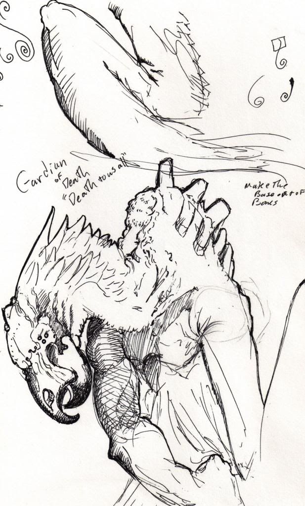
sketching out designs really helps things move faster for me. this guy how ever only had a head design when i started him. i just needed to feel him out, and that slowed me down more than i would like.
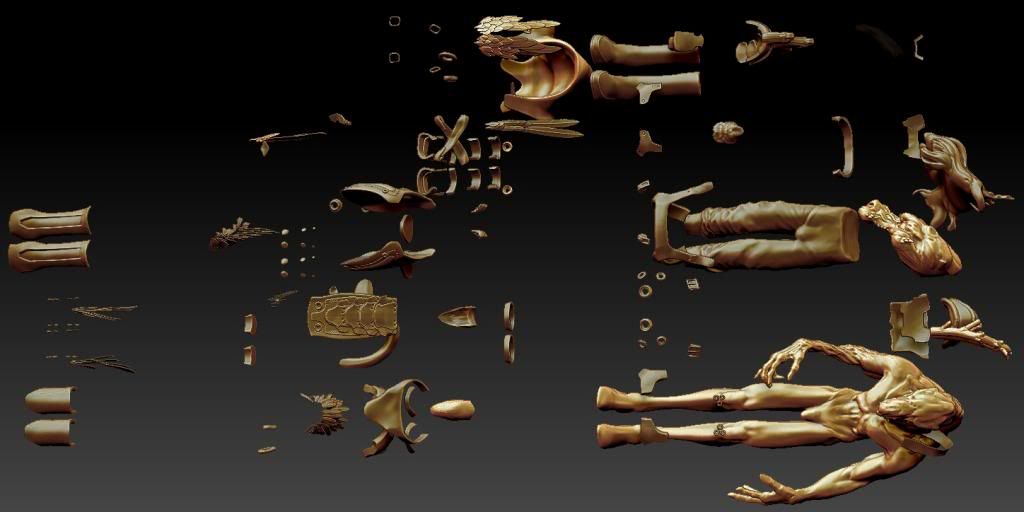
an exploded view to really give you an idea of how i leverage multi meshes. i really got into mm early on in my workflow. it leaves so many options in the build.
for instance this here is the 10th save. the eyes were too small and the mm left me room to make them larger and better suited to the "feel" i wanted.
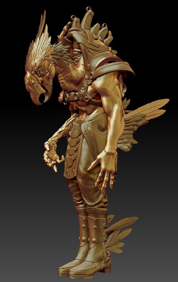
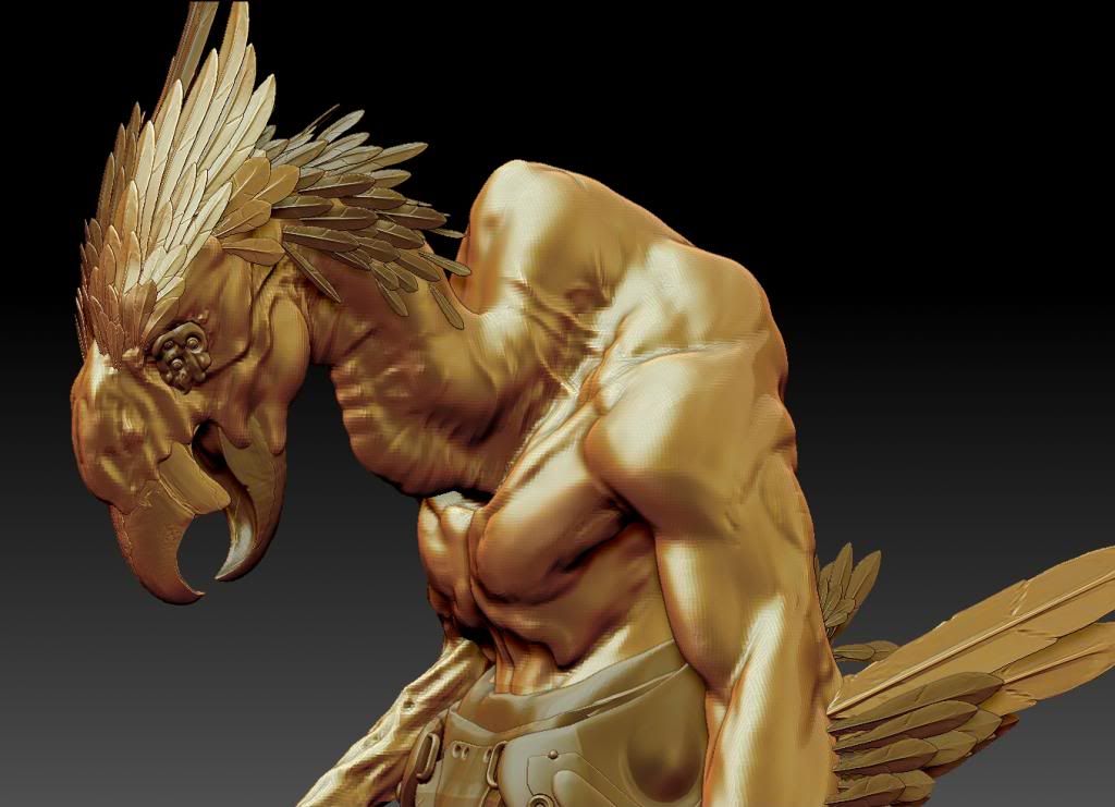
this is the 10th save with all the parts turned on. very few things were added after this and the main masses are all in there but not detailed. notice the neck and compare it to a later versions.
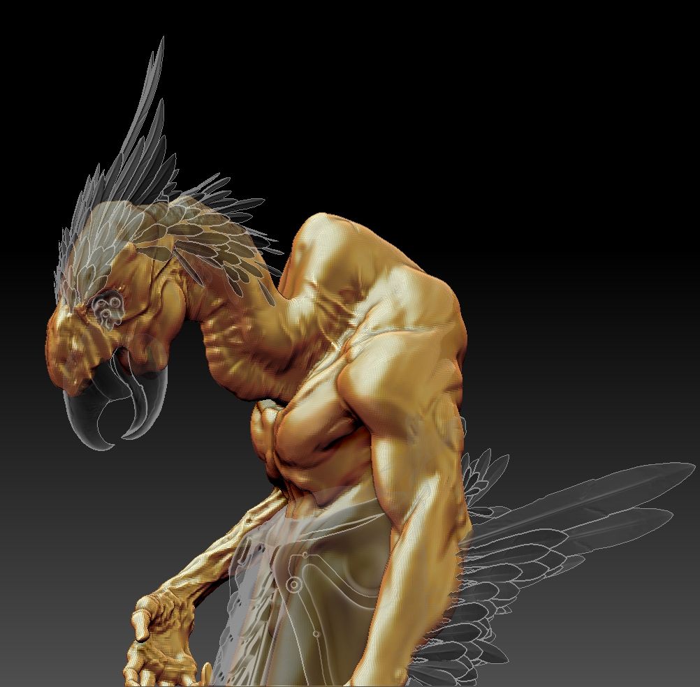
mm or multi meshes make it so easy and fast for the work flow i like to use.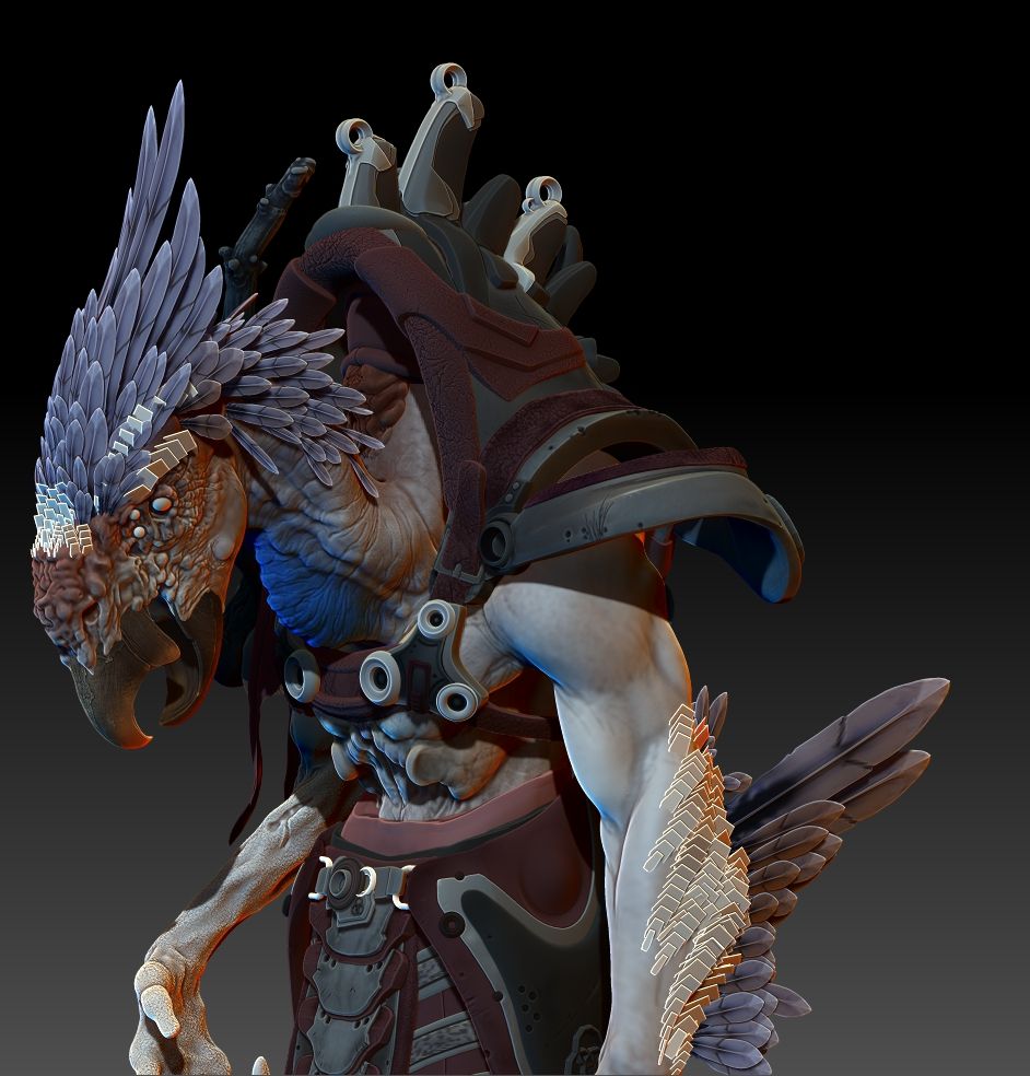
here is the 25th save. you might notice that neck and head are more detailed in the skin. but the underlying masses are still there and supportive of the anatomy. as i work out the textures and put the finishing touches on this guy i really hope to get it possessed when the texture is finished. but for now i hope people enjoy this as much as i have in making it.
one last thing i have lurked the forums for quite sometime. but my good friend "G" finally put a gun to my head and got me to post. i hope his cat pees in his shoes... jk love you man thanks for the support and help.
sketching out designs really helps things move faster for me. this guy how ever only had a head design when i started him. i just needed to feel him out, and that slowed me down more than i would like.
an exploded view to really give you an idea of how i leverage multi meshes. i really got into mm early on in my workflow. it leaves so many options in the build.
for instance this here is the 10th save. the eyes were too small and the mm left me room to make them larger and better suited to the "feel" i wanted.
this is the 10th save with all the parts turned on. very few things were added after this and the main masses are all in there but not detailed. notice the neck and compare it to a later versions.
mm or multi meshes make it so easy and fast for the work flow i like to use.
here is the 25th save. you might notice that neck and head are more detailed in the skin. but the underlying masses are still there and supportive of the anatomy. as i work out the textures and put the finishing touches on this guy i really hope to get it possessed when the texture is finished. but for now i hope people enjoy this as much as i have in making it.
one last thing i have lurked the forums for quite sometime. but my good friend "G" finally put a gun to my head and got me to post. i hope his cat pees in his shoes... jk love you man thanks for the support and help.
Replies
here is his main weapon inspired by the kukri a knife of Nepal. know as a weapon of decapitation. the blade shape adds to the overall feel of this hatchet type weapon. as i didn't really want a bearded ax, or a simple clever. i took a look at the handles for hatchets and axes as my primary inspiration, and modified the blade for this unusual design. history always has the best stories, so whenever i look at mythical creatures or deities i like to find some solid ground to stand on. even if it is just with my toes.
As for critique stuff, I find it sort of hard to find his eye or eyes which would help ground it for me a bit better. I feel like we sort of look to the eyes or face first or second and if you can't see the eyes specifically you can sort of get lost in where the face is exactly. Simplifying it to just one large eye or maybe peeling back some of the detail around the eye might help it out a bit. Just a thought anyway.
His posture kind of bugs me a bit too. I get that he's this sort of bird creature and so he's hunched, but his hunch is contrasted with these really straight legs that are also very close together. It gives it a bit of a weird feel for me. Maybe a concept shot to see what final pose you're going for or something along those lines would help that out a bit. It just feels like he's so hunched that he should be really low to the ground in posture and stature. So his knees and ankles should be able to really bend a lot.
The last thing I would say is just make a bit cleaner presentation before showing it off some. I know that in the end it's superfluous, but I also feel like that's what separates the people who get lots of comments and acknowledgement on cghub or the recap or whatever. I know you're a baller zbrush artist and I know that you know that program in and out way more than I do, but the gradient background screenshot of zbrush looks terrible. It detracts from your design and sculpting and the screenshot shows aliasing and comes off looking meh. I know sometimes you just want to get a quick update out there and post it, but just do a quick BPR render or something or do a little cleanup in Photoshop before posting for like 10 minutes. It's vain, but in the end I think it will help you because you are really good and your presentation of everything, not just your sculpt should project that.
I hope that helps and I hope I wasn't too harsh. You're still the man.
From the last pic fingers look a bit sausage-like. I'd suggest working on the sides a little, carving in more tendons, more pads, make them narrow towards fingernails.
I'd contrast-out the eye area a little, maybe make the skin darker so eyes stand out. Will blend with the nearing textures from afar as-is.
I like the mass distribution from the drawing, seems balanced, more realistic, while the sculpt is more exaggerated and defined. Not a bad thing, just something that struck me.
Yeah, really sweet work, I like this a lot.
love marmoset.
the marmoset shots are much better in terms of presentation, I'm glad you're learning it, nice job!
the pose looks kind of weak. I would go for either something more relaxed or more dynamic. right now it feels kind of half way. For instance, with a relaxed I would just put his arms and the sword down, maybe head up more. If you are going for something more dynamic, I feel like you need to do something with that other arm and push the pose more.
I think you should consider bailing on the shoes and giving him some talons for feet. Right now you have this bird theme going in the face and a bit in the arms, the back also, but it ends there. It doesn't seem to carry out throughout the model other than the feathers. Some fierce looking talons for feet would continue the theme and I think look so much better than the shoes. You could obviously still keep like a shin guard or something on the front so you wouldn't have to abandon all the work you did for that part. You could also do some cool stuff where you have the talons digging into your pedestal. It would also just give you some more higher frequency detail where it sort of falls off after the arms or midsection and isn't quite returned to in terms of his skin and organic stuff.
I have a feeling that your dragon shoulder pad is either -
A. at a lower texel density than your character
or
B. the model density wasn't high enough to get a crispy polypaint.
You may want to consider touching that up once you finish the rest of this and re-projecting the base texture.
Also as a side note Metalness is not the only PBR workflow in Marmoset 2.0 you can still stick with difuse ( albedo), Normals, Spec( Reflectance), and Gloss (Roughness) workflow. You just need to apply PBR principles to you map making.
But carry on this is looking great.