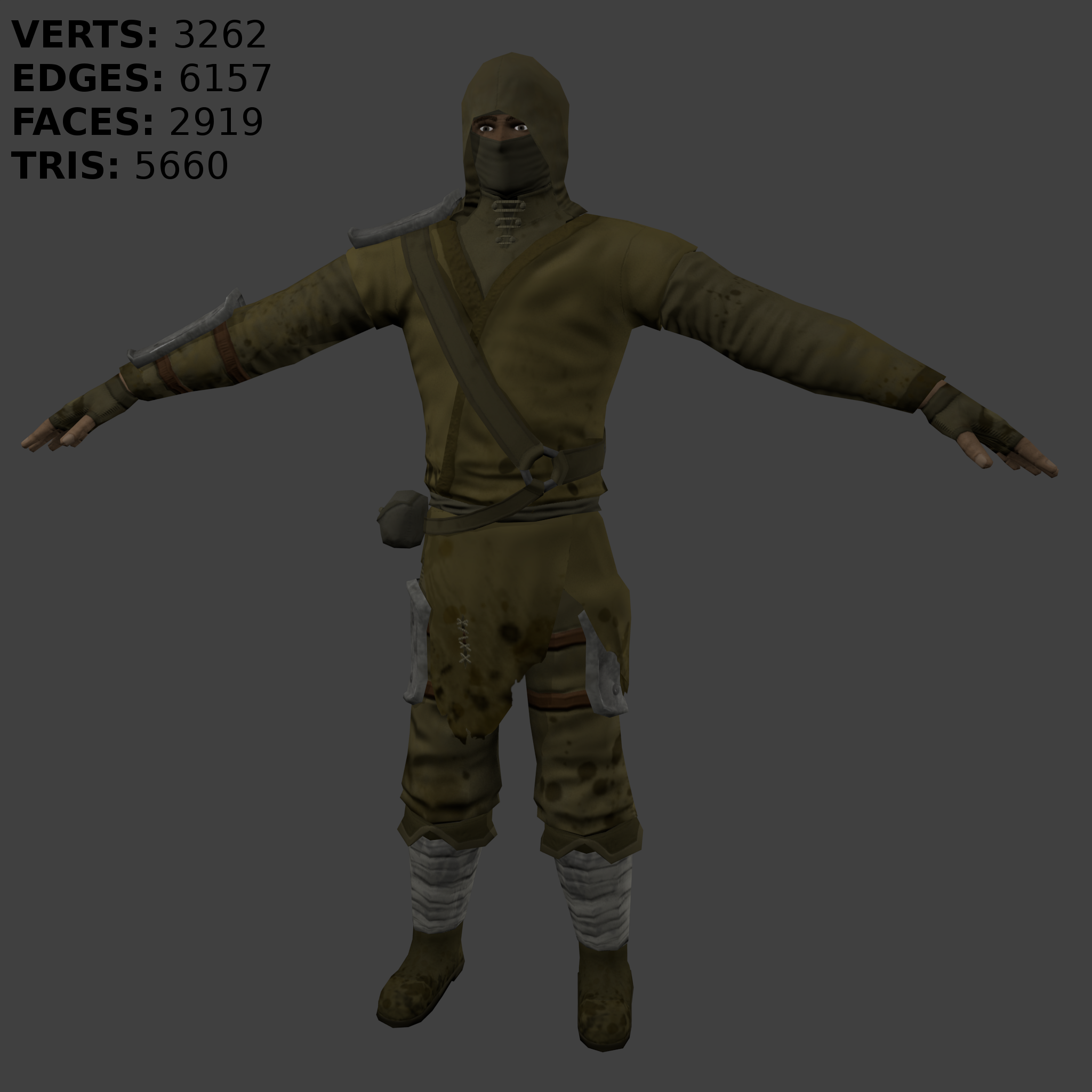
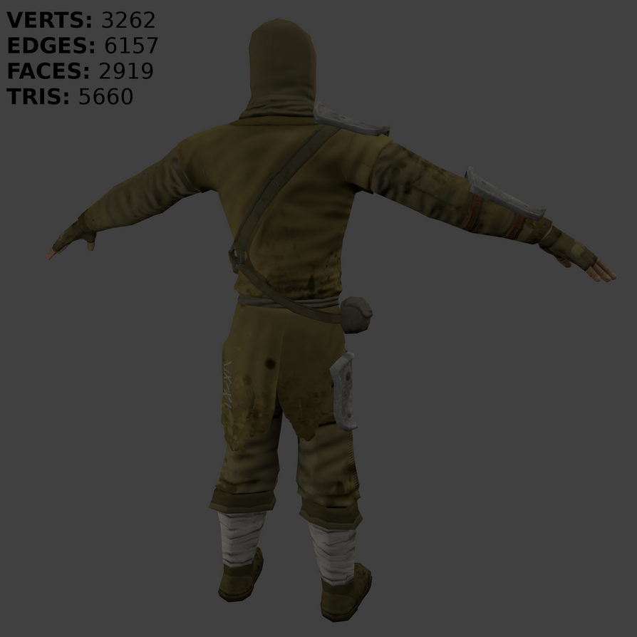
Ninja 3D Model
Here I want to share my last work.. It's not good, but its somethink..
I'm just learning.
My deviantART: http://yilativ.deviantart.com/

I'm just learning.
My deviantART: http://yilativ.deviantart.com/

Replies
The torso is decent I'd say maybe a little lumpy and I can't help and feel like the knees are too low on the leg.
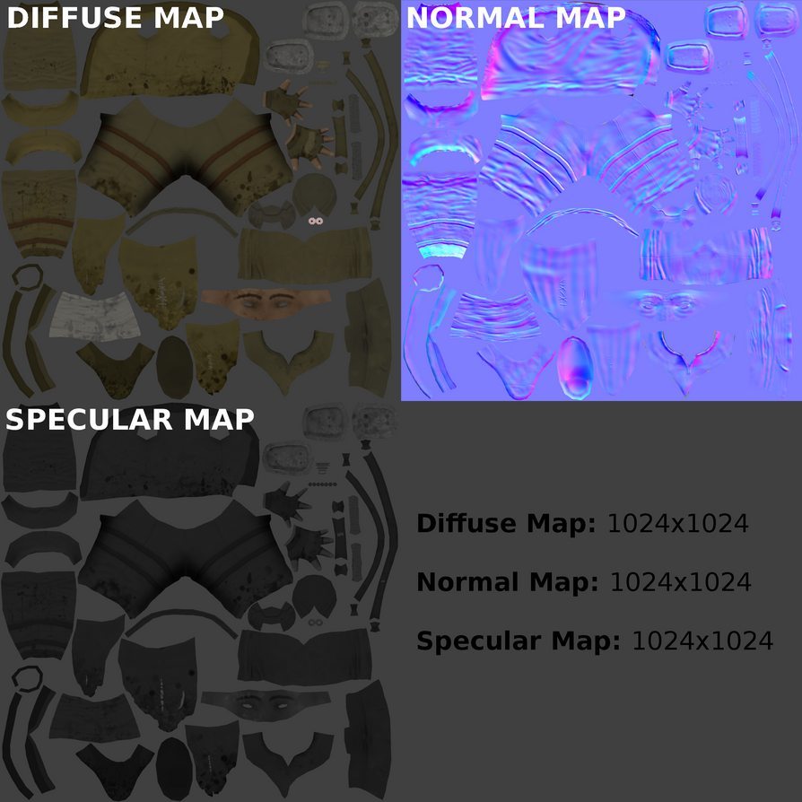
The eyes are looking a bit too cartoonish, the white is much too bright overall. You could sue your UV space more effectively, try straighten out and squaring up some areas so you can back it better.
Overall though, good work, keep at it!
Thank's for comment and tips.
Sorry my bad works, just learning. ^^
[ame="
Thank you for the reply, yes it's true, lot of people says me that I got problems with the proportions, I will work with that