Xoliul Shader: EMP Handgrenade

polycounter lvl 10
So two days ago I decided to make a grenade, using only the Xoliul Shader (realtime viewport 3Ds Max) for my final results, and post process in Photoshop afterwards.
Here are my results.")
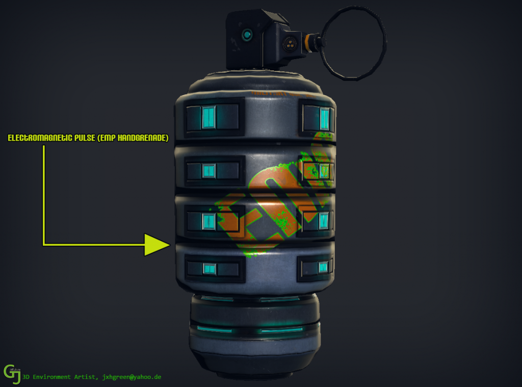
Here are my results.


Replies
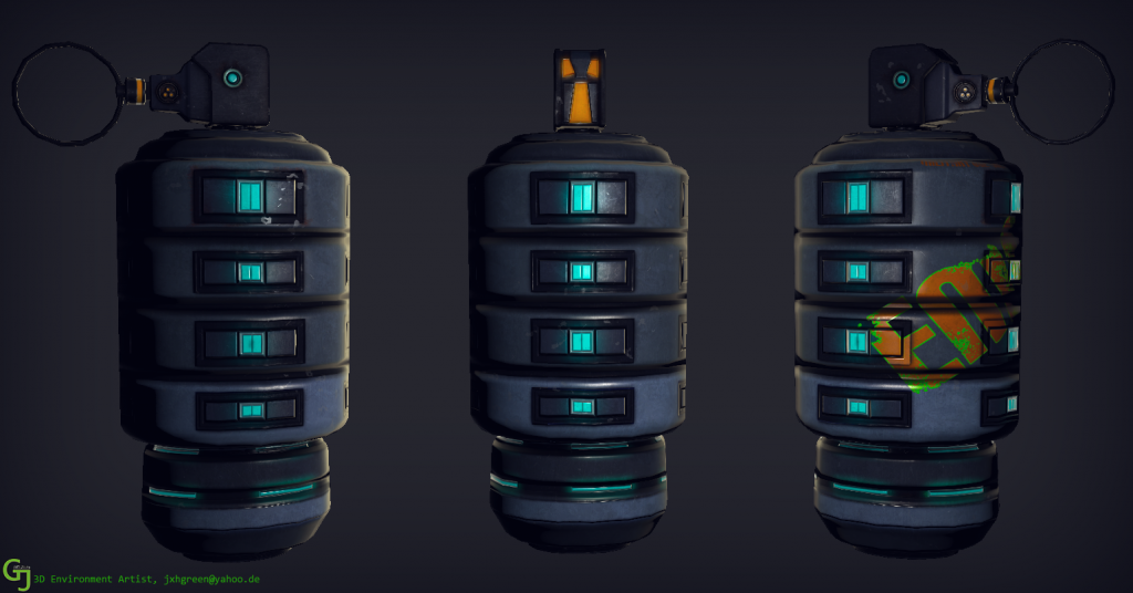
The top handle, it has a odd shape and is not visually in balance with the rest, the form dosnt have a good flow
Also colors, you can mix teal with orange, but you cannot mix neon green with warm colors such as orange. Neon colors work with few colors, mainly other neon colors.
Also you use another new color for presentation, and then 2 other colors for your name (using a neutral green, and a cold yellow) And then you use a warm yellow/orange as lighting.
Colors are very important and can make or break all your things, think about them
Your EMP has the same definition on all your surfaces, that implies that they are all made from the same. Make the text less apparent on that rectangular ejections per example that will make it more real
Also what exactly is the text ? Maybe think again over it, what its made of and how it would work when applied and worn off