Hand painted texturing advice please?
polycounter lvl 3
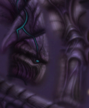
So uh, Hey. I've just started texturing in general, and could use some advice on handpainting textures in photoshop. I'm using PS cs6 and What I'm attempting to do is imitate the art style of Ted Park from Blizzard. His texture work on SC2 unit models is phenomenal, Though I guess thats expected from someone good enough to get hired by blizzard. On my current attempt to achieve something near his work is just so off its bothering me, First it feels like the colors are off, and the contrast on his textures is beautiful while mine is just messed up... Then there's the attention to detail, but I guess that's more to do with the amount of time and work you put in... So what kind of brush(s?) should I be using on something like this? or the kind of color palate I need to be using? From what I already know i think i should be blocking basic shapes quiclky, then smoothing and refining, then adding details...
Here is what I'm talking about:
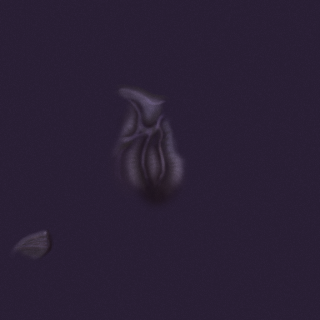
now mine:
http://i1343.photobucket.com/albums/o797/beng128/Diffuse_zpsb15d82b1.png
Also, um Blizzard peeps if you see this don't kill me its only a snipet of the texture... And tell Phil Gonzo and Ted Park that they're awesome.
Here is what I'm talking about:
now mine:
http://i1343.photobucket.com/albums/o797/beng128/Diffuse_zpsb15d82b1.png
Also, um Blizzard peeps if you see this don't kill me its only a snipet of the texture... And tell Phil Gonzo and Ted Park that they're awesome.
Replies
You are misunderstanding frell's comment. 3D-Coat is an application that allows you to hand paint textures directly onto the model. It's not the same thing as sculpting.
Painting in 3D is a very common workflow for hand painted textures these days. It's not impossible to do it entirely in Photoshop, but being able to paint directly onto the model will speed up the process a lot.
http://vimeo.com/5820395
Avoid the smudge tool, blend colors by sampling with the eye dropper (alt click)
painting textures like this shares a lot with painting concept art and traditional art so read up and do experiments.
I do most of my texturing in 3dCoat, but this. Hard round does most of the work, I'll use a softer alpha for specific cases where I just want a smooth blend/gradient.
Painting textures isn't all that hard on a technical level. Once you get comfortable with blending stuff it's pretty straight forward. The difficulty comes in understanding lighting and materials, and how to define those without shaders and various maps. Reference and observation are key.
Blender, 3Dcoat, Mudbox & that other program people keep going on about but I forgot the name, all handle projection painting.
Bodypaint? For low poly painting, 3D Coat hands down!
Looking at the painted attempt, it's pretty good. U've imitated him really well.
His / the style itself looks pretty mushy to me, with too much black. Even if he works @ Blizzard, I don't recommend this as a good example. U should learn how to handle edges, shapes and light from other artists. If u only want Blizz-employees for reference, Slipgate's work (linked above) is better, imo. The recent dump by Faf (http://www.polycount.com/forum/showthread.php?t=125737) is also valid, tho it's for next-gen
Oh yeah I know, I was just looking for Deep Paint 3D because the company who made it was offering it for free for a while. Their website is down presumably because they went out of business and I can't find a link anymore.
It has a layering system that is in many ways more powerful than photoshop and can handle petty much anything anyone can throw at it, all the way up to entire game worlds.
There is a 15 day trial avaiable from thefoundry.co.uk
I guess it depends on how many you have to paint in total. Mari is designed as a high throughput tool. If you have a large amount of texturing to do, Mari will make you as fast as possible. If the amount of time you save is large then Mari makes sense.
I've been using 3D Coat for 3d painting for a while now and have brush presets, hot keys, etc set up really similar to Phoshop so it feels natural painting now.
As far as workflow large shapes, medium shapes, refine, smaller details, refine till you run out of time. Try working in greyscale for a while then adding color towards the end. It will allow you to focus on value only and not hue/saturation as well at the same time. At least starting out.