Small Computer Hologram Terminal
Well a week and a half ago i got let go from my IT/Web Design job. Maybe a blessing since I did not put alot of work into my portfolio lately. This gives me a chance to hit it hard and FINALLY get a job in the game industry.
I saw this is one of the concept art threads and wanted to give it a go, the concept was from syndicate. I'm really trying to work with nDo and get texturing down especially the color palettes and balance since i always have a hard time with color.
Its aprox 900 Poly
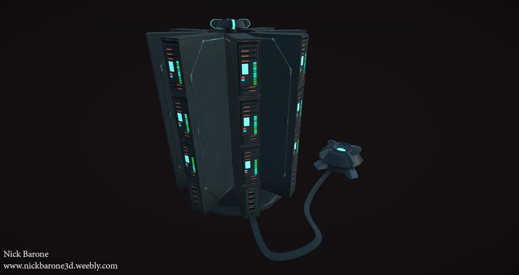
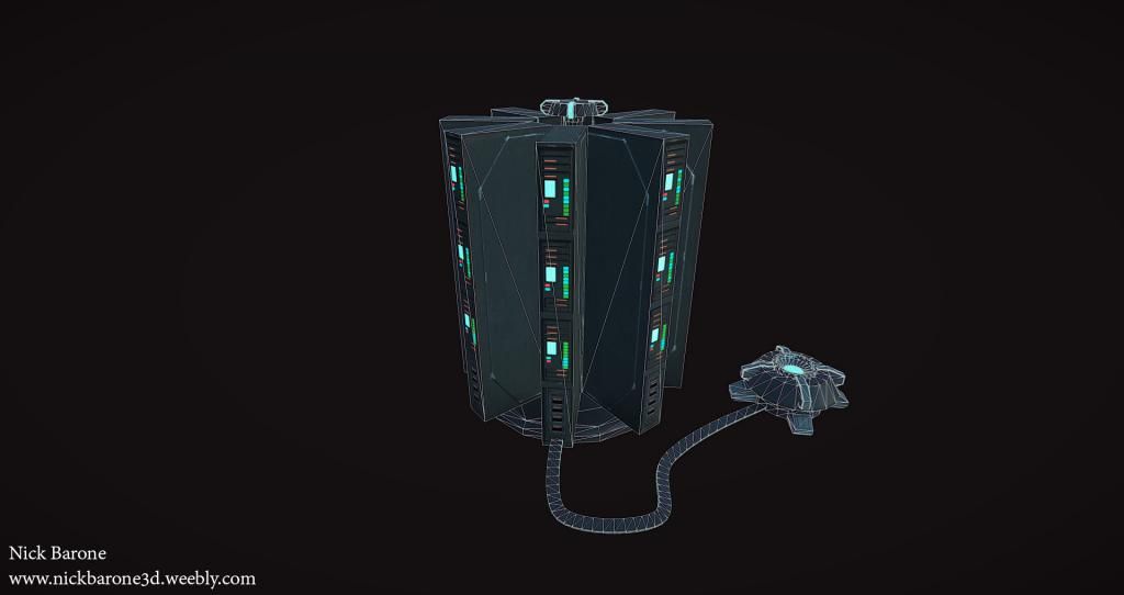
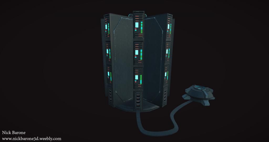
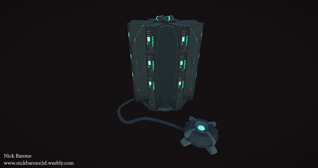
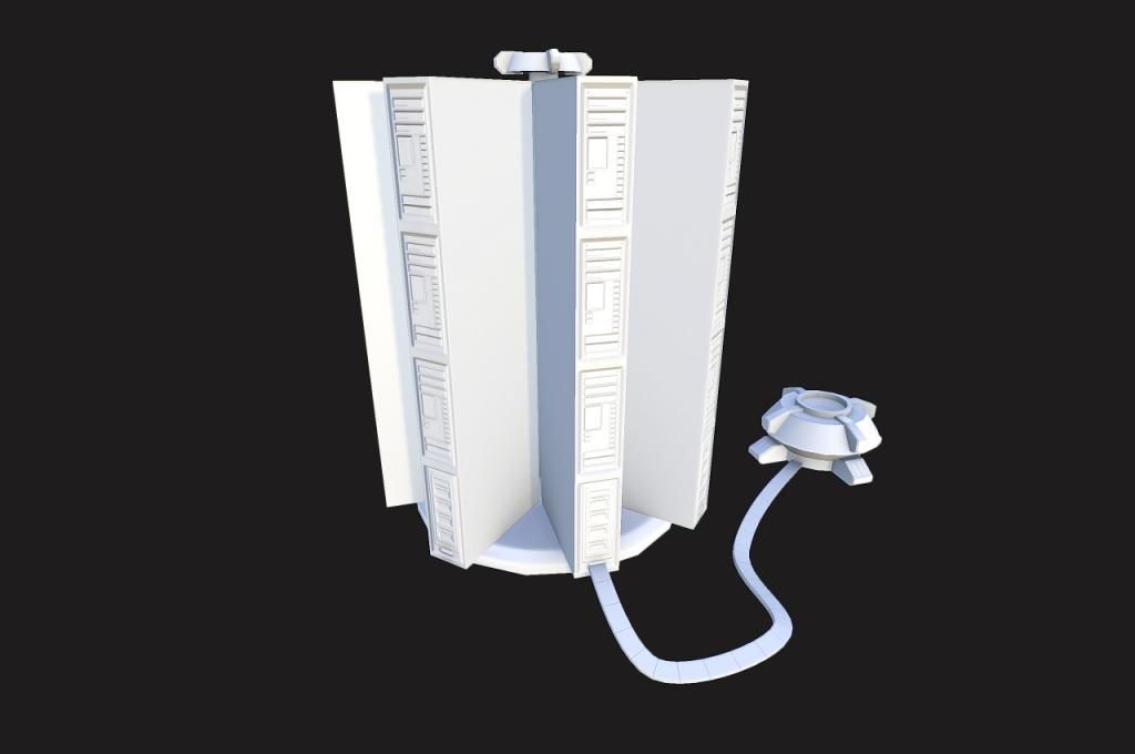
I saw this is one of the concept art threads and wanted to give it a go, the concept was from syndicate. I'm really trying to work with nDo and get texturing down especially the color palettes and balance since i always have a hard time with color.
Its aprox 900 Poly


Replies
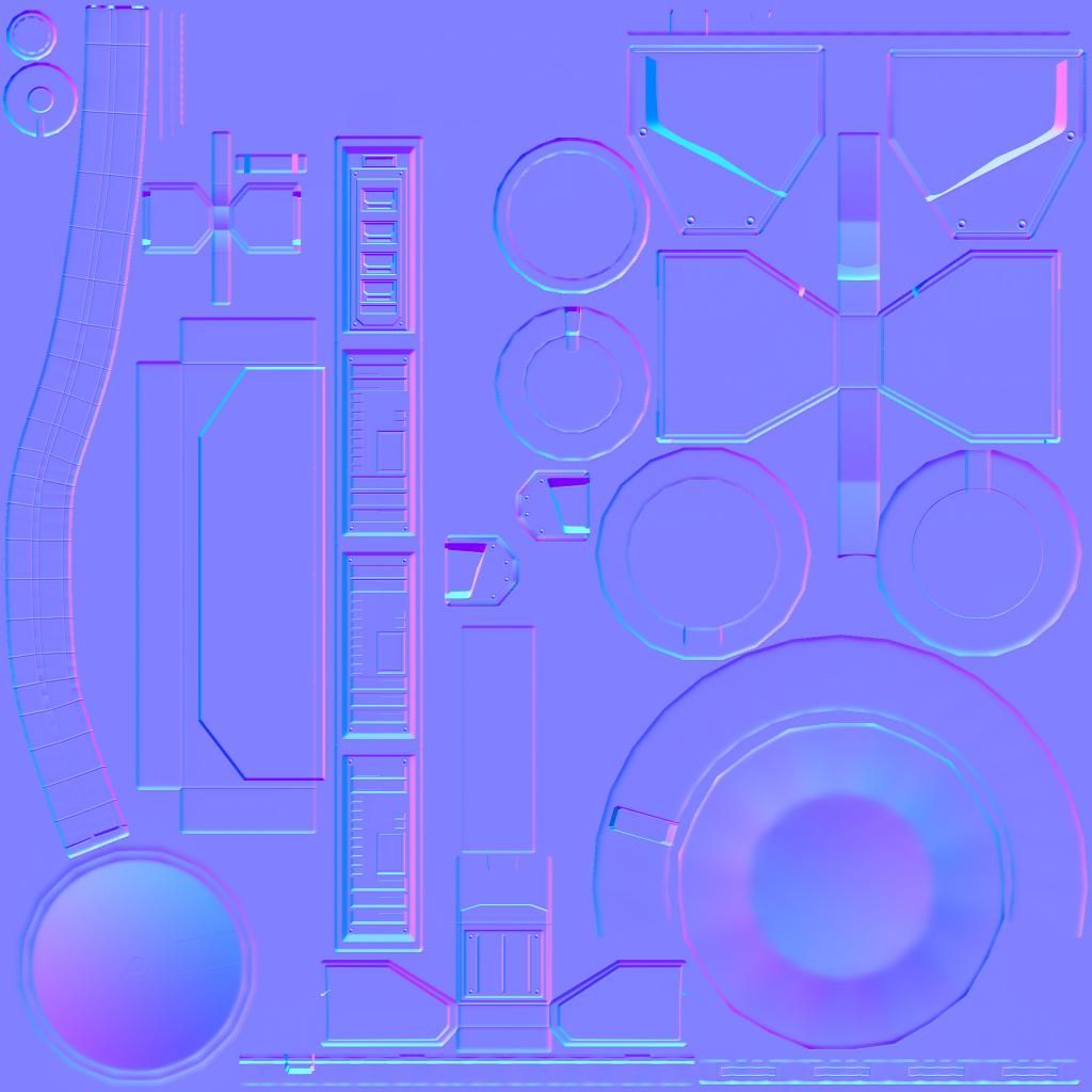
Use spec/gloss maps, these days I can't really see why you wouldn't use them (except for a stylistic choice ofcourse, but this asset seems like it was intended to be placed in a realistic game.
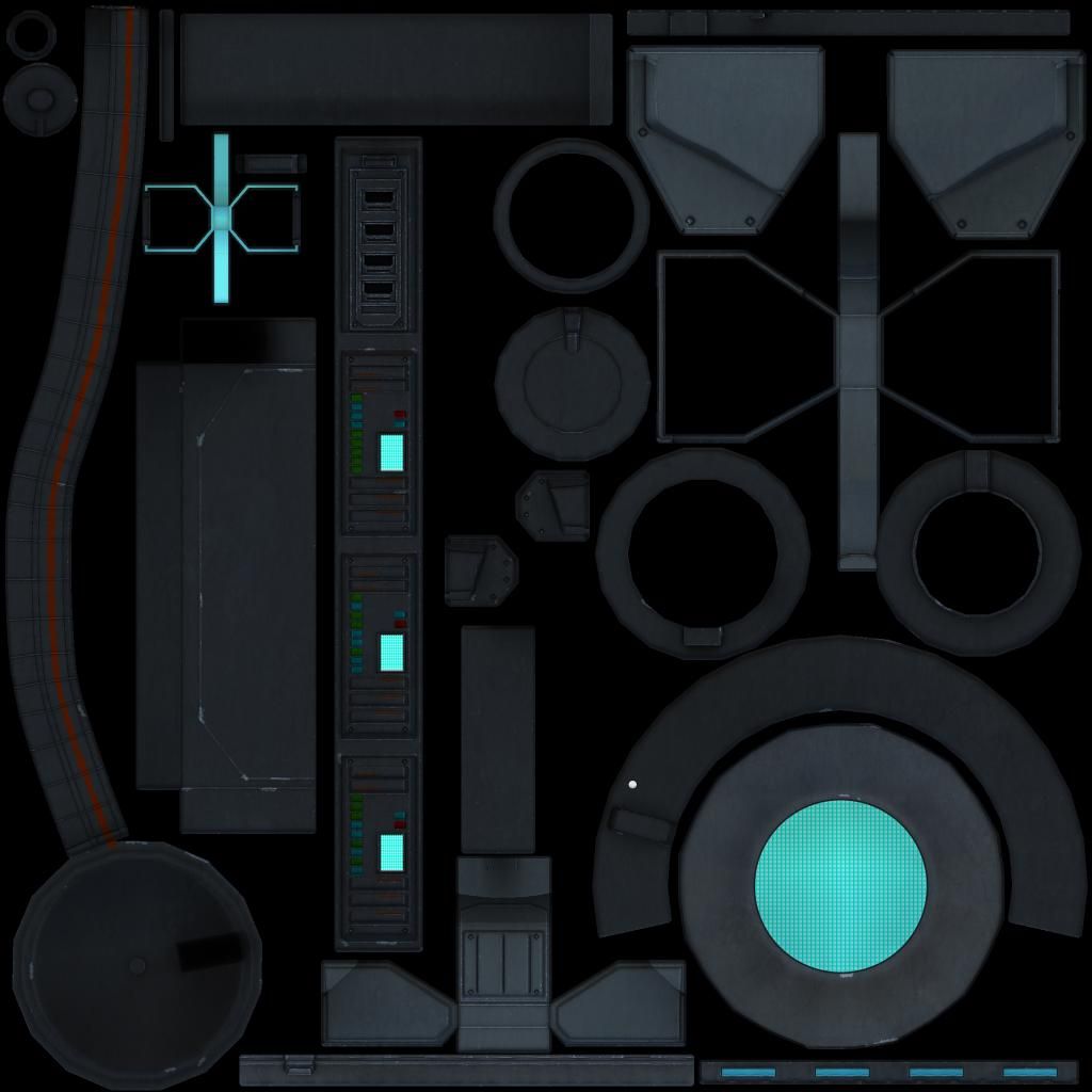
Add padding to your textures (even just not using black would be a lot better already).
If you give polycounts, do it in triangles, that is more clear.
(900 polys could mean 900 triangles, but it could also mean 1800 triangles, or 500 quads and 400 polygons with 4+ sides).
On the Uv's the cable is bothering me, some solutions:
1) Straighten the uv's so it's just a rectangle.
2) Make a cylinder with segments that are equal in size, it gives you a bit more triangles, but now you can overlap all of them and gain a good amount of Uv space
Also, you have some parts that are the same, wich seeing how you can see both sides at once (because the section is repeated), that's okay, but then make use of that UV space to add unique details.
If they are textured 98% the same, might as well overlap them.
Another example is the large circle in the bottom right, might as well have cut that into 4 pieces and overlapped those.
great advice i will keep it in mind for the next thing i do, what size padding should i use? i used 6 for a 2048 map
And that we are now moving to pbr where the "gloss" becomes the more important one, so I would personally advise to really use one, or atleast try/learn it.
for actual spacing between uv islands: (from the wiki)
128 = 2px
256 = 2px
512 = 4px
1024 = 8px
2048 = 16px
For the render settings: As high as you can set it (64 mostly)