[UDK & Uniry] Ethelwood Museum, Th3 Cl0ckt0w3r, Casino Bar portfolio pieces
My name is Dan and I'm a graduate student studying Game Design with a concentration in Environment Modeling, currently living in the Los Angeles area. I will be graduating soon so I'm getting my portfolio together to start my job search for a Junior Environment Artist position, and I thought that this would be a great place to get some feedback on these pieces that I've been working on.
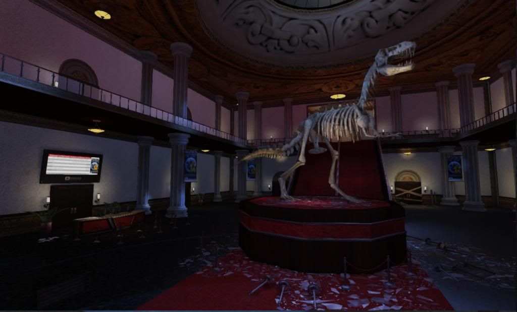
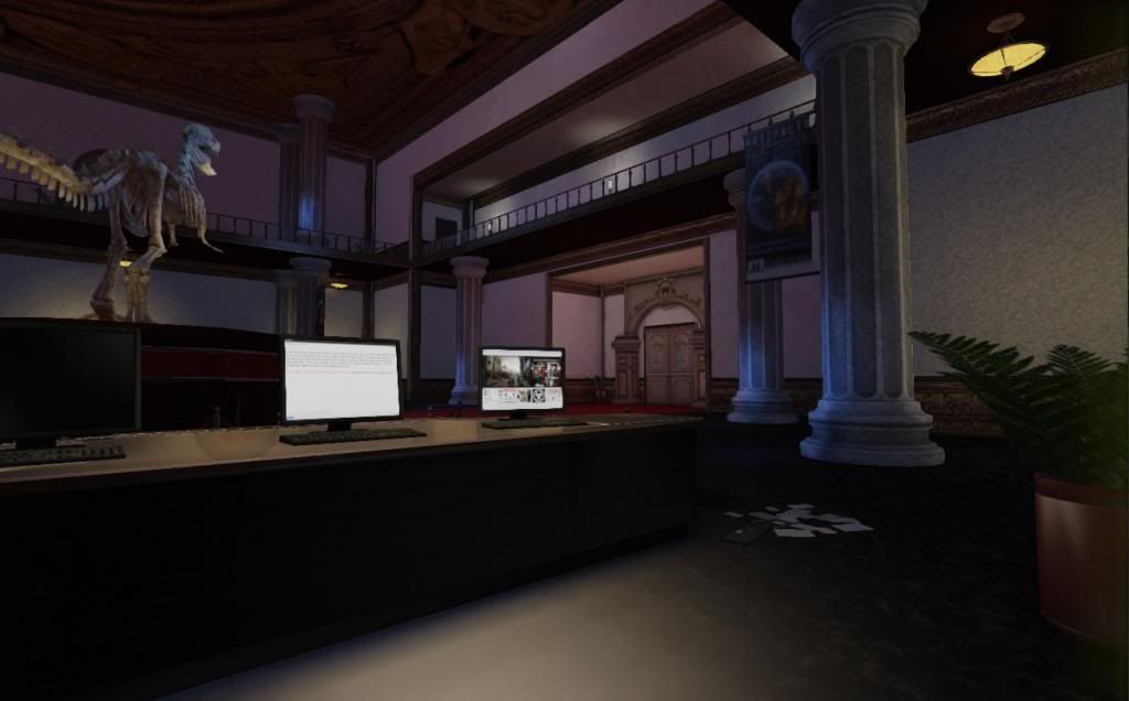
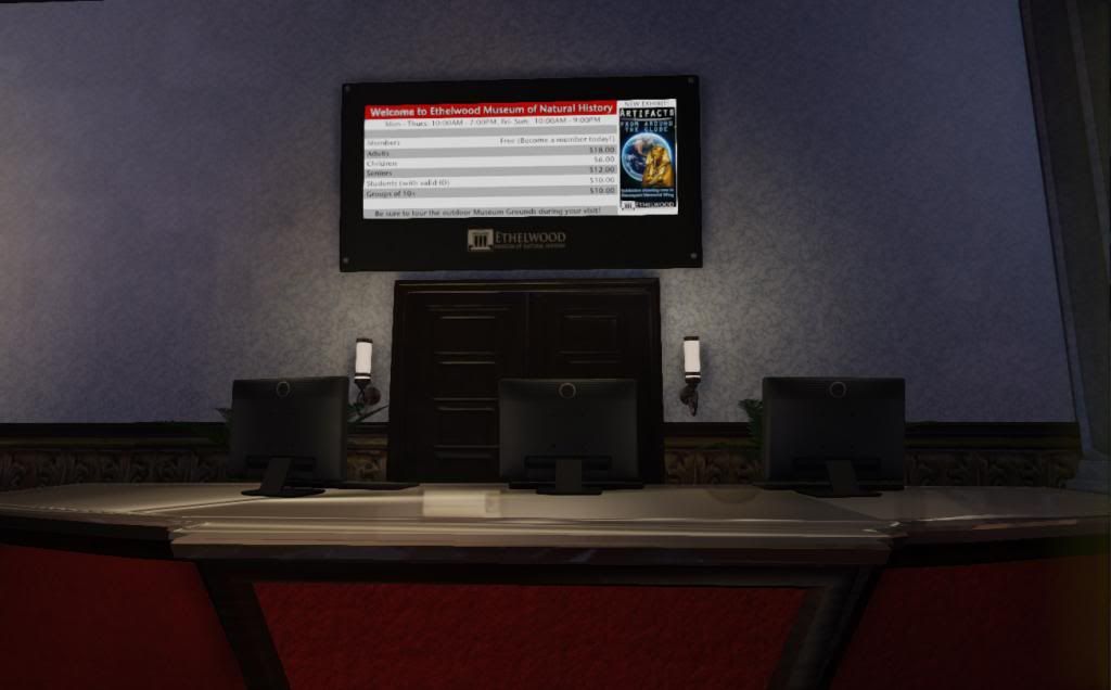
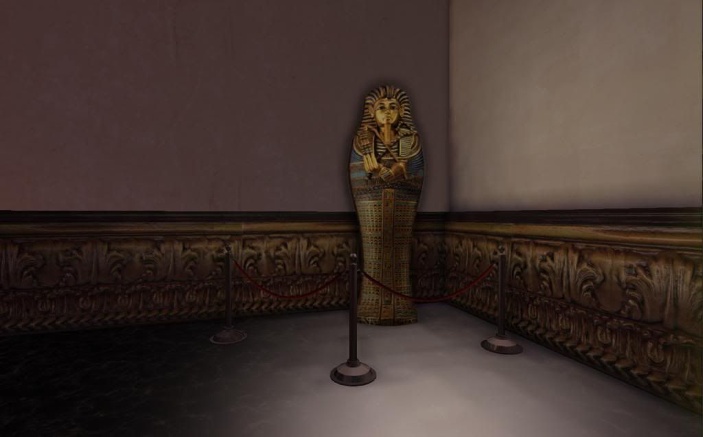
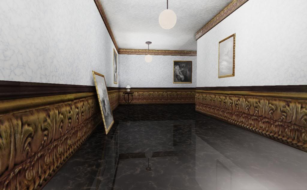
The first is is a natural history museum designed to be used in a survival horror game involving a zombie apocalypse. It's still WIP, and I'd appreciate any comments or critiques you guys have for me. I used Maya for the meshes, Photoshop for the diffuse textures, and XNormal and Crazybump for the normal, AO, and spec maps (as needed):
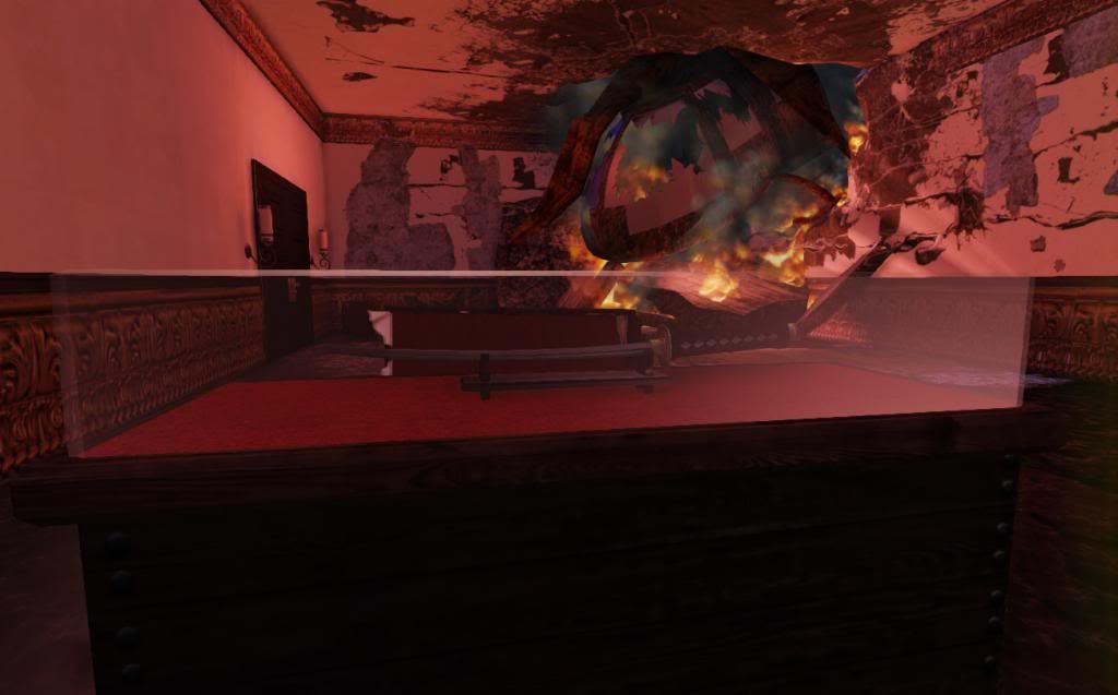
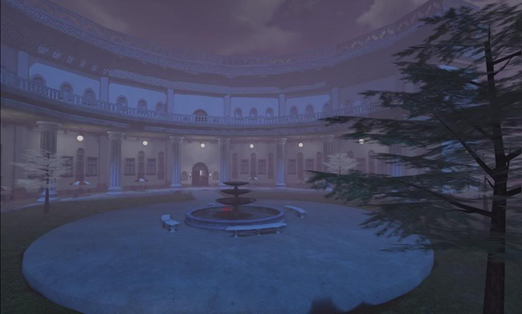
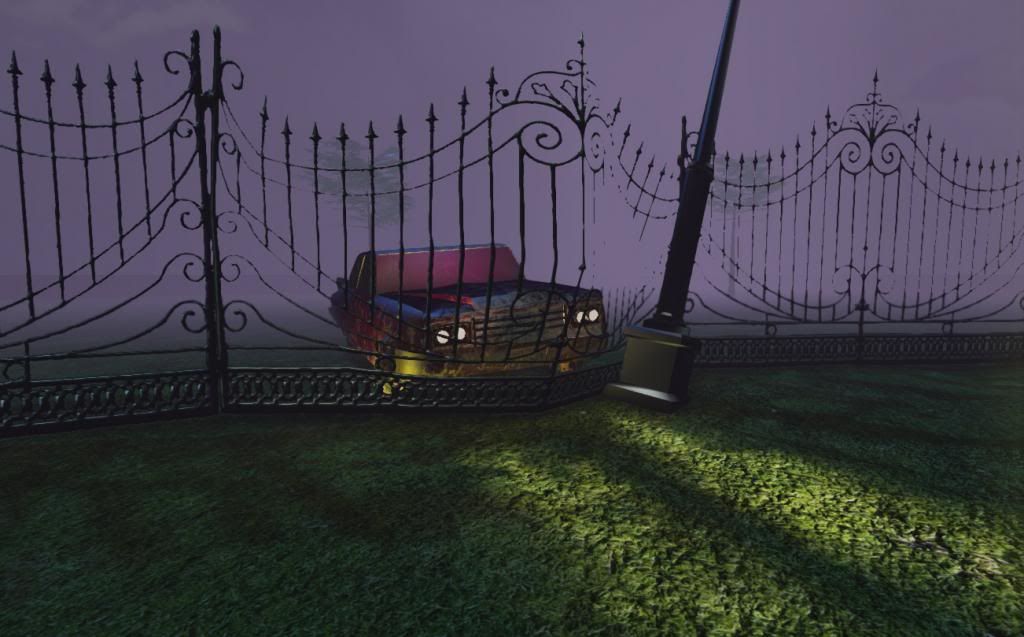
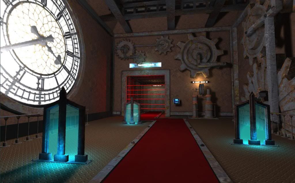
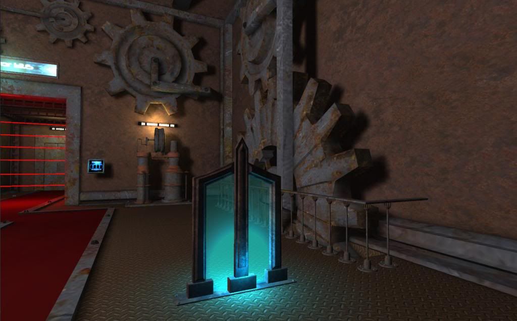
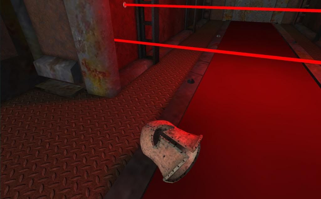
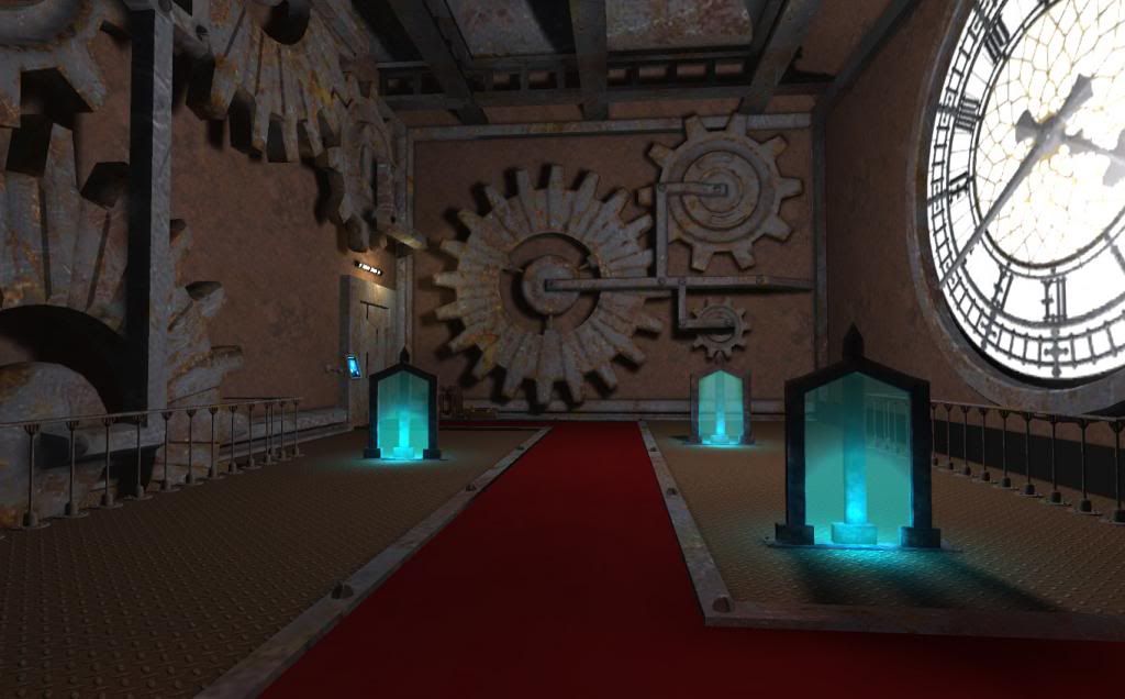
This second piece, Th3 Cl0ckt0w3r, is intended to be an ancient clocktower repurposed in the future as an evil layer. It was created with Unity, Maya, Mudbox, and Photoshop. This piece includes explosive barrels and cover objects, and is intended for a more action-oriented FPS:
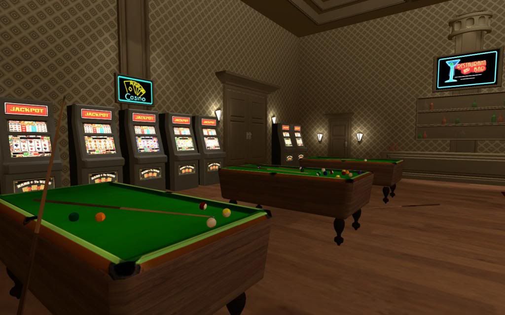
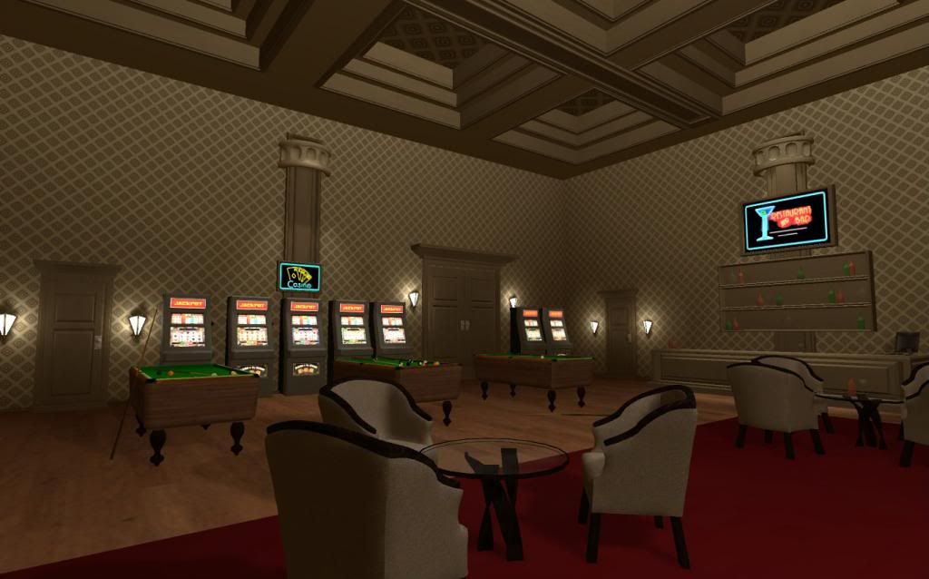
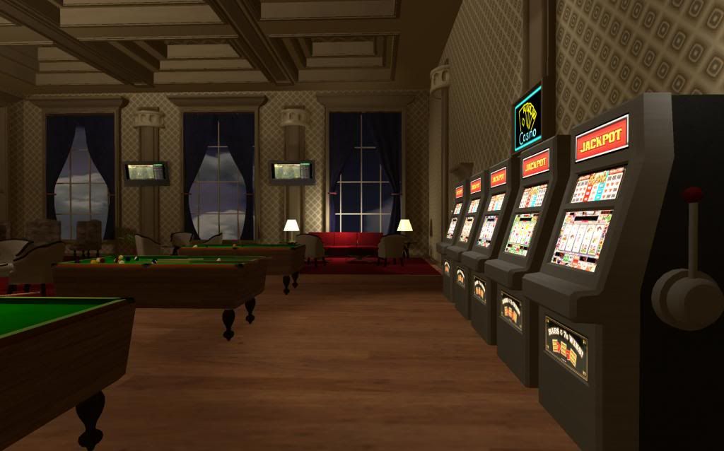
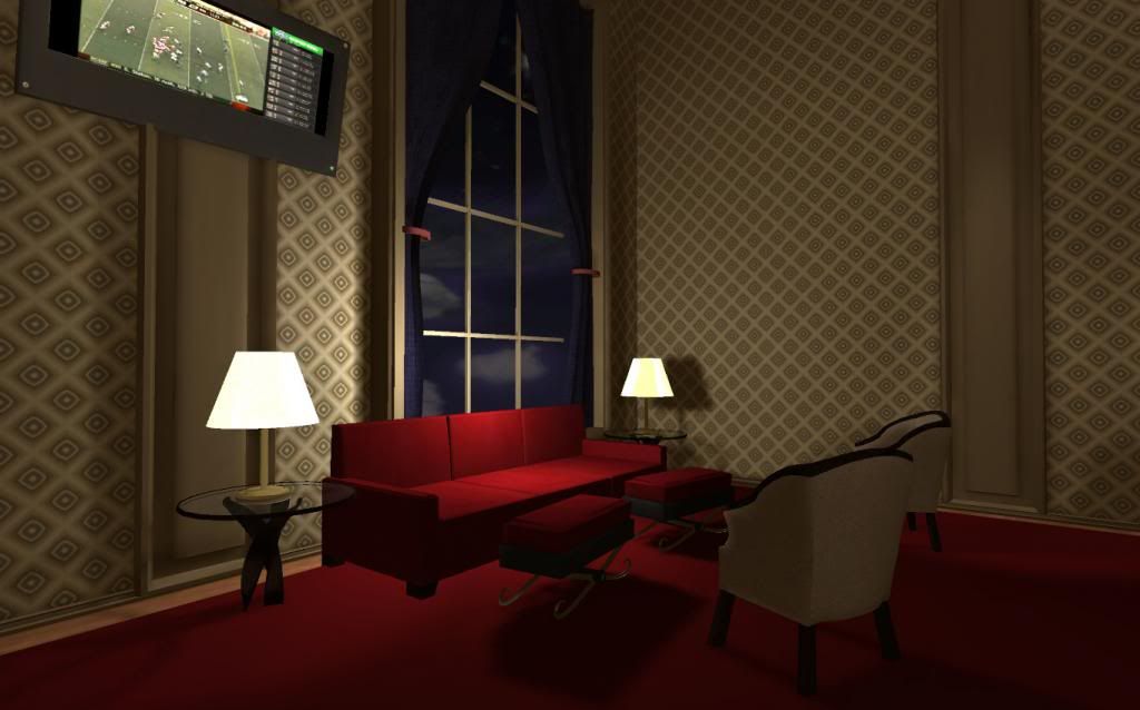
This last piece is the interior of a bar. I had an open-world style game in mind when creating it. It was also put together in Unity, and the pieces were created in Maya, Mudbox, and Photoshop.
The first is is a natural history museum designed to be used in a survival horror game involving a zombie apocalypse. It's still WIP, and I'd appreciate any comments or critiques you guys have for me. I used Maya for the meshes, Photoshop for the diffuse textures, and XNormal and Crazybump for the normal, AO, and spec maps (as needed):
This second piece, Th3 Cl0ckt0w3r, is intended to be an ancient clocktower repurposed in the future as an evil layer. It was created with Unity, Maya, Mudbox, and Photoshop. This piece includes explosive barrels and cover objects, and is intended for a more action-oriented FPS:
This last piece is the interior of a bar. I had an open-world style game in mind when creating it. It was also put together in Unity, and the pieces were created in Maya, Mudbox, and Photoshop.
Replies
All the rooms, every corner, is clearly visible. That wouldn't really happen at night with such small lights. The metal materials/spec are still flat, don't see any spec coming from them at all.
Liking the car crashing through the gate tho,Keep it up!
I'd recommend creating nice, hi-definition models and baking them into low-poly meshes before moving on to entire scenes. Once you are ready for full scenes, start simply, with a single room before moving onto an entire building.
Remember that as a junior artist, you aren't expected to create an entire level. On a large team, your first job will probably involve creating minor props - the flotsam & jetsam that help flesh out levels.
A slot machine would make a good project - it's a fairly uncommon choice, so the reviewers won't have seen a thousand; there are plenty of small details that will bake well; and the material has enough variety to remain interesting without being overwhelming. I'd recommend one of the old analog machines; they just seem to have more personality than the modern computer-driven ones.
On your existing artwork, the proportions seem off, with most things being too tall overall. The rooms themselves also feel too tall, especially the casino. According to https://www.venetian.com/uploadedFiles/Common/Meetings/meetings_floorplans.pdf, the ceilings in the casino of the Venetian (a fairly high-end Vegas casino) are 13.5' tall; yours feels considerably taller. Furthermore, that extra height feels very empty.
Your embellishments feel much too deep, from the ceiling bas relief in the museum to the ceiling panels in the casino. It seems as though you were exaggerating their depth to ensure that they would be noticed.
DWalker - Thank you as well for the advice. I see your point about the empty space above and I'll begin to try and find a way to make the space more true to life proportionally. That's good for me to know moving forward and creating new scenes. I also thought what you said about perhaps not creating entire scenes, but just creating high-poly meshes and baking them down to lower-poly ones makes a lot of sense.