Kate & Virgil
polycounter lvl 4
Okay..after spending a few hours every day for a week or so, im stymied, im fairly happy with colours and design, but now im lost in terms of making the character look better than it is.
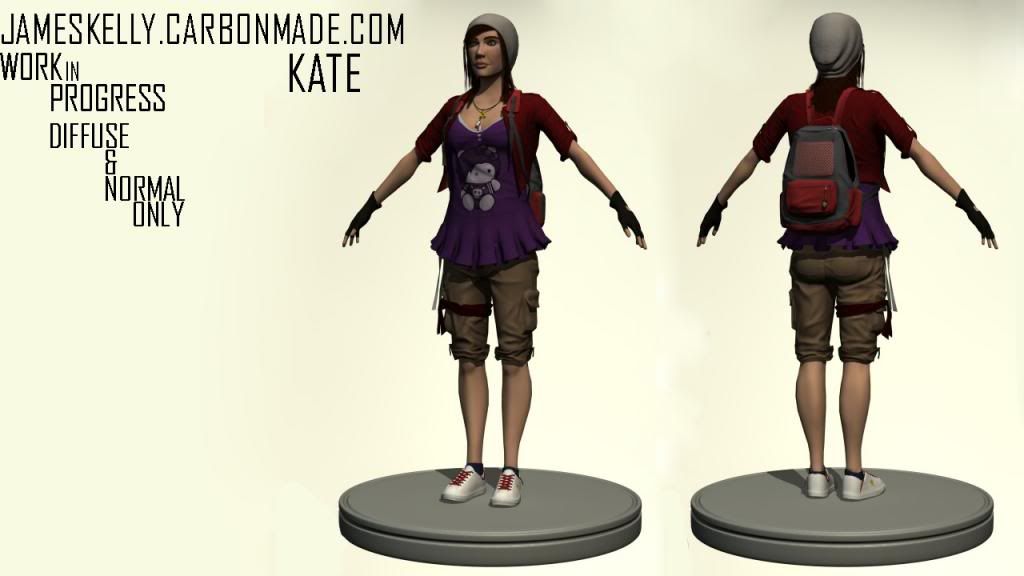
Atm i only have the diffuse and normal maps applied, i have tried to make gloss and specular maps for the head but I've not had much experience before and I'm not entirely happy with the results (as shown below) Any advice would be greatly appreciated as to where and how to use the maps properly
..LATEST UPDATE..
Any comments/critiques are welcomed and greatly appreciative!
Thanks
Replies
Hopefully gunna wrap up the moddelling portion of this soon, just have tweaks and small bits too add to it. Jewellery, tech, maybe a rotor recon drone...
As always any comments/critiques are welcomed and greatly appreciative!
Render below is just a plain material render pass with an Ambient render overlayed on top in PS
and musnt forget her faithful useful Drone!
might just be me, but that dog's head look a bit too big
Keep it up!
@Deathstick: Yeah think i might texture it to be like a dirty hello kitty or something, just to keep the contrast going
Update
Just been sculpting out some detail in the backpack..Tried using zBrush 4R5..but with no experience found it insanely difficult..so went back to Mudbox. Think its just learning what brushes are the same as in Mudbox
The blank plane of polys wasn't meant to be with the model, hence no sculpting, going to be elastic netting type thing.
and the latest sub tool sculp
As always comments and critiques are welcomed!
Dont know if it shows cause of the matcap but..she does have pores and wrinkles
you might also want to make the arms thicker, especially the forearms. they look way too skiny compared to the torso.
Latest update - working on hair texture atm just to get it right
Image below is just Normal and Diffuse. With exception of eyes an hair obv.
Critiques always welcome as always.
Is like if there is only the bone there,like a skeleton :poly141:
Elsewhere the eyes on the face are riding to high, so you could try lowering them. In addition to that the bottom of the shirt, where it has that frilly skirt thingy could do with some creases and fold to break up the symmetrical look it currently has.
But keep chipping away at it as it is coming along really well.
As for the eyes they're at the right place think it was just the render angle that altered its appearance.
Im not sold on the cargo shorts or the top atm thinking i need a colour change.
as for the frills, yeah i plan to alter those once the textures complete, gunna make them less strong..was my first attempt at creating them..not a great result, but i think the characters coming along nicely.
This is just a mray render using a 3 point lighting setup, but i need feedback before i get to the point where starting again rather than editing would be best.
These wierd shading issues pop up only when my normal maps applied any suggestions?
Quick render using Mray, default lighting
All images above also use Standard Max shader
Is Xoliul's shader that far off from an engine?