Sci Fi Reactor Room
*LATEST UPDATE*

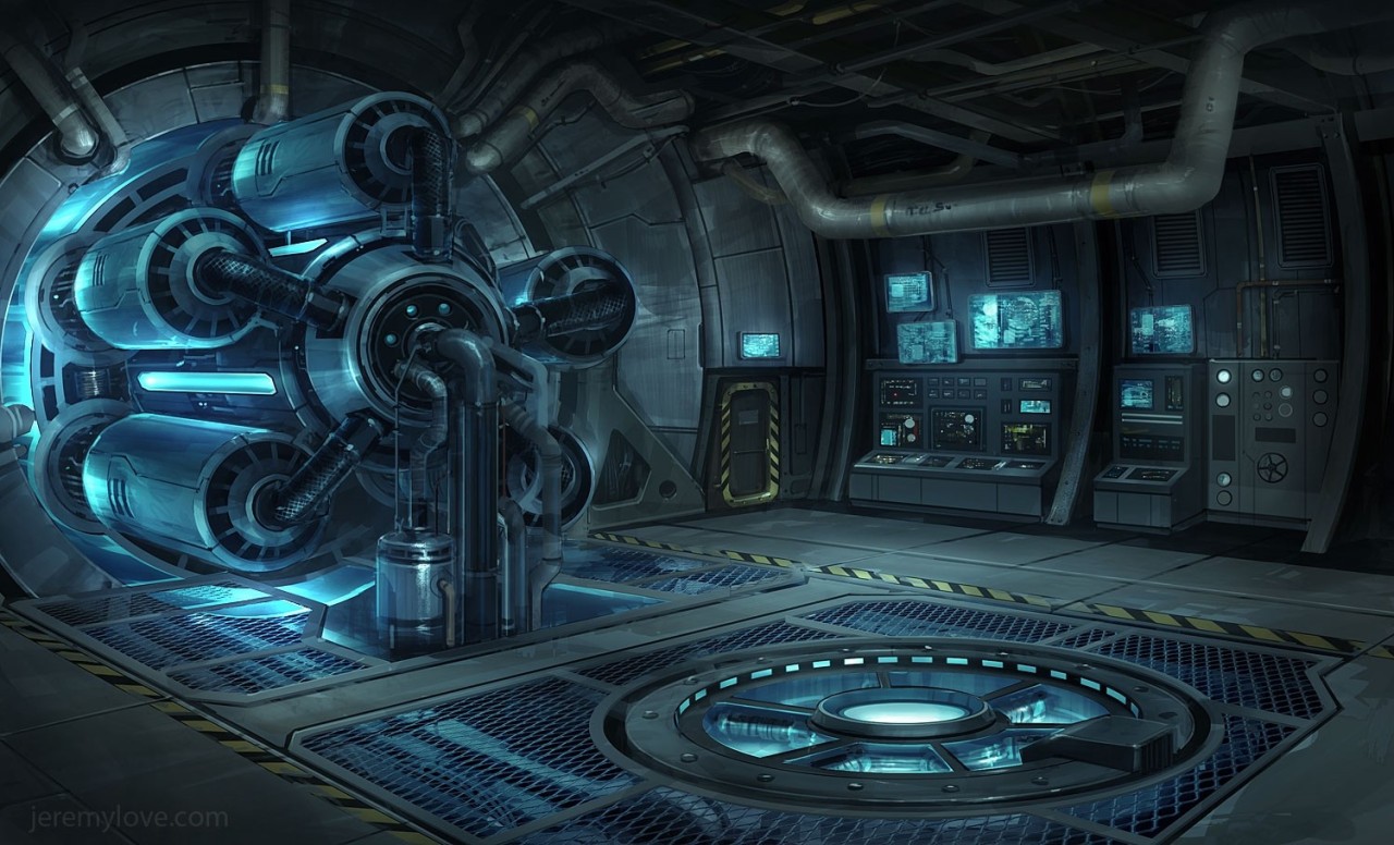
My main objective for this environment is to replace my old one and to learn dDo. It's based off of this concept that I found on http://inspiration3d.tumblr.com/
and according to the little watermark on the image the concept is by Jeremy Love.
Concept Art
My Current In Engine Progress:

Most of the modelling is done, just need to make a crap load of pipes, finish the computers and unwrapping uvs.
My main objective for this environment is to replace my old one and to learn dDo. It's based off of this concept that I found on http://inspiration3d.tumblr.com/
and according to the little watermark on the image the concept is by Jeremy Love.
Concept Art
My Current In Engine Progress:
Most of the modelling is done, just need to make a crap load of pipes, finish the computers and unwrapping uvs.
Replies
Started texturing the scene and redid some of the lighting. I'm absolutely loving dDo so far though i'm still working on going through some more tutorials.
Thanks for the feedback but i'm not following it exactly. The main problem being that when i initially planned to do that I discovered the perspective in the concept was extremely warped despite the abundance of straight lines. Almost every object traces back to a different vanishing point and horizon line.
Current scene wireframe
Well I finally found some time to update this. I feel like I should make the contrast higher on the spec map for the reactor to really make certain details pop out more. Also, I've managed to finally figure out my texture popping problem when I take screenshots. As for the lighting it's still coming out flat, so I need to work on that.
Here are some lighting paint overs to test out some lighting options.
Made some lighting changes updated a number of my textures. Mostly minor changes but i think if gives a bit more colour variation to the smooth metal.
Here are some separate shots of the computer consoles and monitors
Things left to do:
Pipe Textures
Detailing on some items
More lighting changes???
Personally if I were you, I'd change the screens to be blue and also have a similar lighting to the second paint over you did, where the most intense light was coming from up underneath the generator//machine and the lights from the screens themselves. While it made it a bit darker, it overall had more contrast and things popped much better than they do now. I'm assuming the lighting is WIP, like you said in your post, but right now it seems a bit washed out compared to your previous posts which had more dramatic lighting.
It's definitely coming along good though, the proportions are much better than your first blockout, and the props are looking pretty decent so far
Redid some UV map layouts and finished texturing (at least until I feel I need to make adjustments after I'm done playing with the lighting and shaders more.) Added some very soft warm lights I think that it helps keeps the blue from being too overpowered in the scene.
@Higuy - My original idea with the orange screens was to to add some more color variations but you're right the blue screens do look better.
Compared to the machine
-the hole in the floor is a to big (grid from the machine marks the diameter)
- the hole is to low poly (visible edges everywhere)
- the rivets are a little to big and dominant because the concept rivets are a little smaller and plain so its look a little archaic
- the edge to the glass inner ring is to deep
The floor grid borders are to bulky and i miss the visible gap between the normal floor.
Your pipes are to small and simple and not interesting. The organic pipes show the puny humans that the machine is the boss in this room and humans foreign bodies.