3D Environment Artist Portfolio
Hello fellow artists.
This is my portfolio so far:
My Website / Blog | Just another WordPress site
[IMG][/img]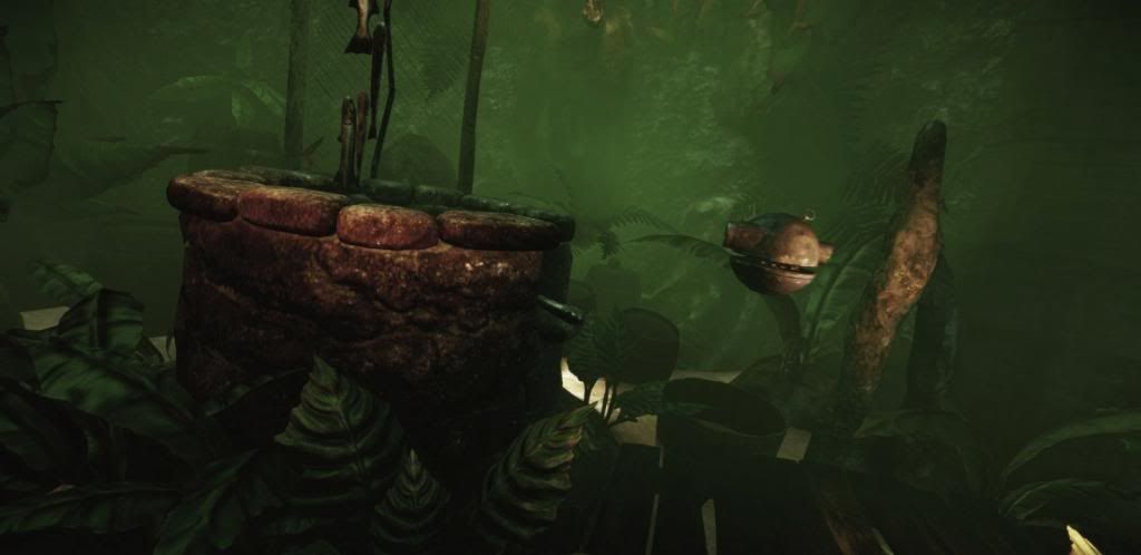
[IMG][/img]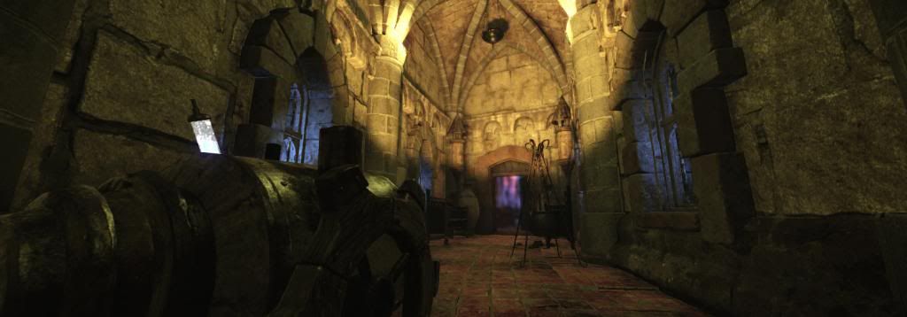
[IMG][/img]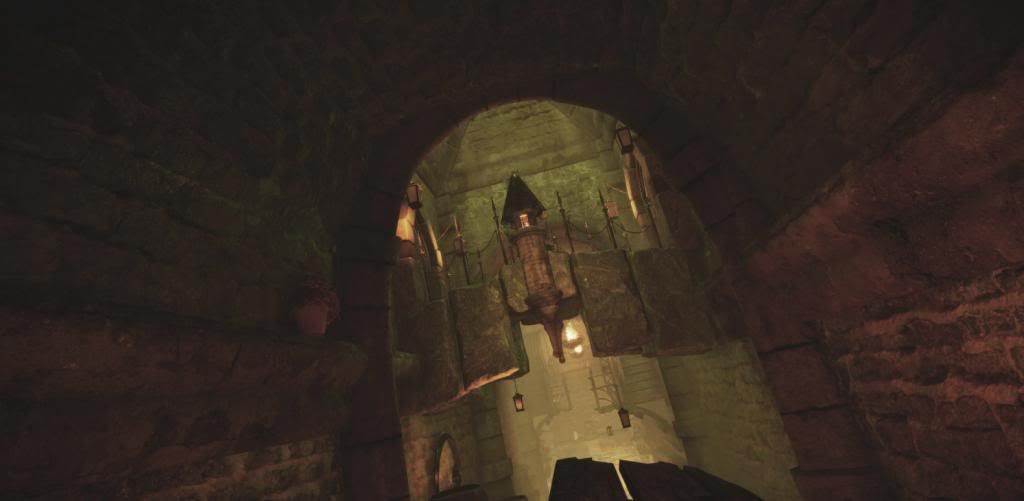
[IMG][/img]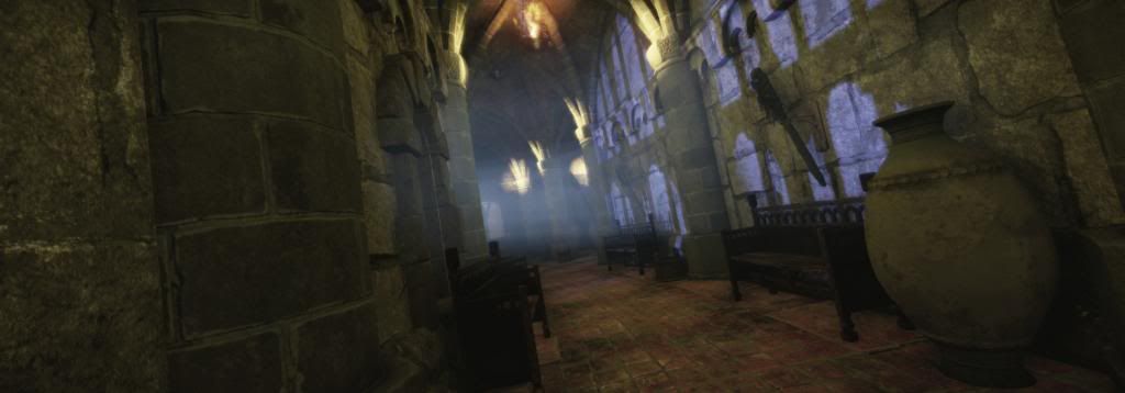
[IMG][/img]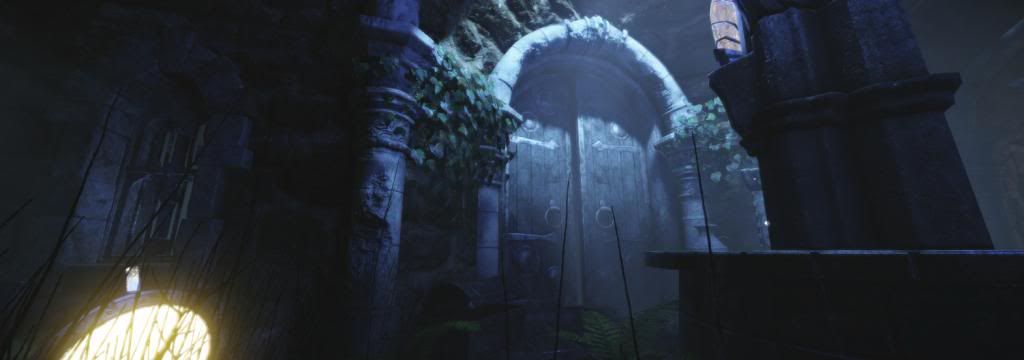
My portfolio is a scene I've out together in CryEngine. I've made everything in it - from scratch - all models, low-poly, high-poly, lighting, texturing, materials and design. Programs used, besides CryEngine are - 3DS Max, PhotoShop, ZBrush, Mudbox, and CrazyBump. The shots here are directly from the scene, with no tweaking, but as they are - in game, so to speak. There is a lot, but don't want to swamp this area with screen shots. For that, please visit my portfolio where there's tons more.
I've intended it to show a lot of different scenes - all within a scene. It is a newly abandoned underground complex, investigated by an orc tribe (or so my story goes).
A scouting party sends down a crudely-built droid and light casters, to discover its suitability to serve as a lair. For that, they've entered an air duct, leading down to a prison cell, in which cages are hanging from the ceiling.
There are many hallways - an underground castle, sewers, a tower, an arena, prison cells, a crypt and more.
As the Whatsit (the droid) goes through the complex, the lighting changes and general environment conditions change - again, to show different scene types, atmosphere and objects. Whilst progressing up the tower, the temperature changes to a cold and frigid area, which leads to the outside, and the end of the scene.
For this, I've made hundreds of items - all low-poly and game ready. All textures have been baked from high-poly objects, and are of course also original.
At this point, I've continued adding to the scene, and am currently working on a brood room in which a creature, lying in a mud hole, guards its eggs, which will be stuck to the surrounding pillars - almost by a cob-web material, and slightly illuminated from within. The eggs, and a large centrally-placed crystal will be the sole lighting for that particular room.
Thanks for looking!
Henrik Larsen
My Website / Blog | Just another WordPress site
This is my portfolio so far:
My Website / Blog | Just another WordPress site
[IMG][/img]

[IMG][/img]

[IMG][/img]

[IMG][/img]

[IMG][/img]

My portfolio is a scene I've out together in CryEngine. I've made everything in it - from scratch - all models, low-poly, high-poly, lighting, texturing, materials and design. Programs used, besides CryEngine are - 3DS Max, PhotoShop, ZBrush, Mudbox, and CrazyBump. The shots here are directly from the scene, with no tweaking, but as they are - in game, so to speak. There is a lot, but don't want to swamp this area with screen shots. For that, please visit my portfolio where there's tons more.
I've intended it to show a lot of different scenes - all within a scene. It is a newly abandoned underground complex, investigated by an orc tribe (or so my story goes).
A scouting party sends down a crudely-built droid and light casters, to discover its suitability to serve as a lair. For that, they've entered an air duct, leading down to a prison cell, in which cages are hanging from the ceiling.
There are many hallways - an underground castle, sewers, a tower, an arena, prison cells, a crypt and more.
As the Whatsit (the droid) goes through the complex, the lighting changes and general environment conditions change - again, to show different scene types, atmosphere and objects. Whilst progressing up the tower, the temperature changes to a cold and frigid area, which leads to the outside, and the end of the scene.
For this, I've made hundreds of items - all low-poly and game ready. All textures have been baked from high-poly objects, and are of course also original.
At this point, I've continued adding to the scene, and am currently working on a brood room in which a creature, lying in a mud hole, guards its eggs, which will be stuck to the surrounding pillars - almost by a cob-web material, and slightly illuminated from within. The eggs, and a large centrally-placed crystal will be the sole lighting for that particular room.
Thanks for looking!
Henrik Larsen
My Website / Blog | Just another WordPress site

Replies
I always like it when a site doesn't just look like a re-purposed blog.
As mats said though, I would think about rearranging the gallery. If I just click on the gallery tab I'd like to see all of your work and not a black page.
Get rid of the category choice where you have it now. If you still feel you want to separate them in your gallery page, you could try drop downs, that way the user can choose to view all at once or not and they could also move through everything in one go through your lightbox.
Another small thing, try formatting all the images in your home page to the same size.
As they are now your signature jumps around and it's a tad distracting.
Loving your construction page, that looks awesome!
I'm not sure which hot spots you mean. If it is the pillars, then it is because there will be light sources placed there as soon as I have made the items - and that will be a very closely set light source to the top of the pillars.
As for not splitting up the images into categories, then I did that since the areas are distinctly different, and it would take forever and a day to load the page - even with thumbnails. That was an early critique I got some time ago, so hence the categories. I do, however, see the point, but it didn't work well with the site.
Henrik
Why is there a home ? Scratch it.
And oh, just noticed the construction site. What a fitting name, since you need to work on that :P Dont use such a paper texture as text background, and dont cut the edges with a soft brush, it dosnt make sense and dosnt look good at all.
Dont take a serif font, your website dosnt use them neither. Why do you screenshot photoshop ? If you would do that, take the snipping tool from windows, nobody wants to see it. If you thought you can show off how many layers you use, don't do that, you don't know how many others use. Leave that for the imagination. Id expected something more fancy in your layer panel per example.
Dont take grey backgrounds, they're a big turn off. Show multiple low poly assets on a picture with wireframe, you have so many and a chest on fullscreen dosnt fill demands ; )
Shrike, KristaW, do you mean a blog-like Home page would be better? I'll have to chew on that. Good point about multiple items showing wireframes - I could do that. As for the Construction page, then everything behind and on the site is very much something that will and have changed over the course of putting it together. The basic layout could change for that.
As for leaving out stuff, then you are right, that I should and could do that. I'll delete some categories and possibly entire image sequences. In regards to the Bridge, then that is a matter of opinion, and that one I like.
Thanks!
Henrik
I think simpler is better. Your home page just has one picture on it but besides that it doesn't seem to serve a purpose. I would have the beautiful gallery wing be the home page if that makes sense.