Great concept and cool that someone is tackling this. I know this is a wip but here are some things that I came across:
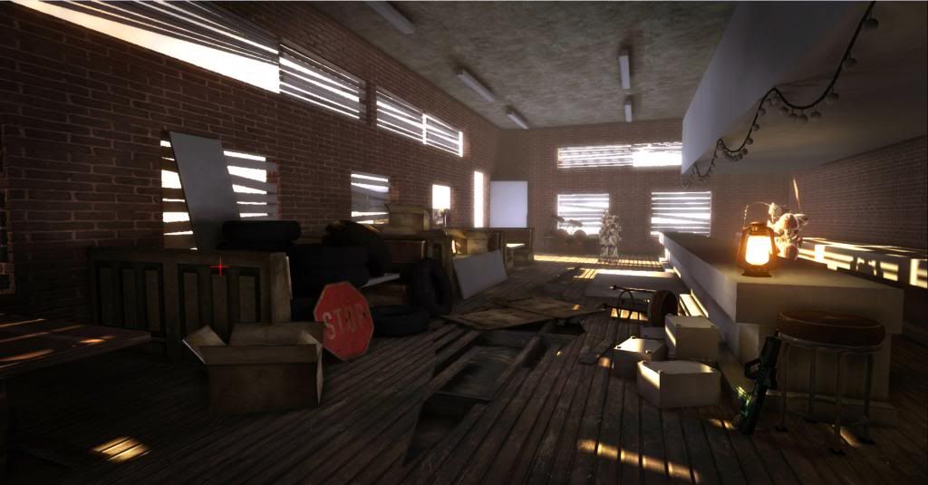
- The stool looks bigger than the character, now those UDK characters have armor, etc on so they may look bigger than others.
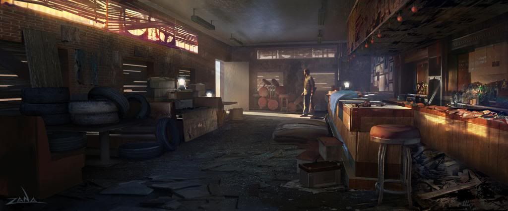
- The counter looks a bit too wide, at least compared to the concept but that is not necessarily a bad thing.
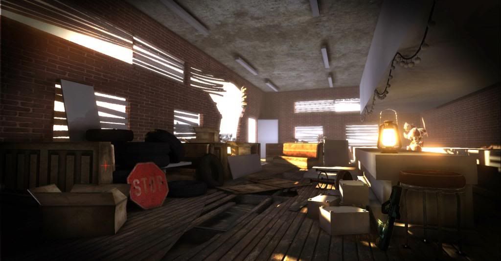
- Some of the textures (the bricks, and stop sign for example) look a bit washed out (at least to my monitor). It doesn't look like there are any normal maps or anything and it's just a flat diffuse.
- You probably didn't get to t his part yet but the windows are missing frames and also that upper sections seems to be a bit off compared to the concept, it's missing that concrete trim.
I don't have much time right now but you are off to a good start!
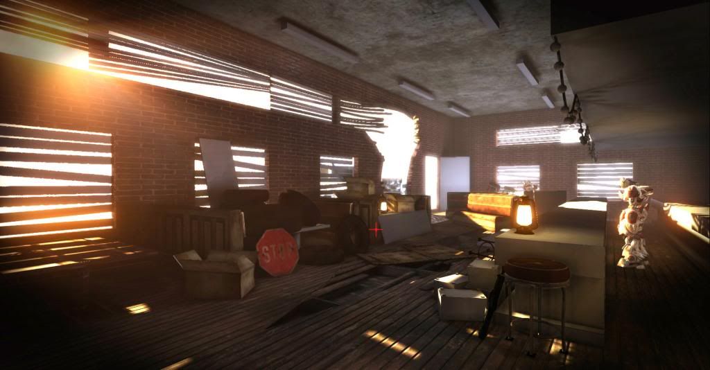
I would probably reevaluate your light setup. Your letting too much random light into the space, over doing the lightshafts, and that lantern in the foreground is drawing too much focus, I would remove it or put it to the back wall like in the concept.
The concept uses light to draw your focus, and provide that contrast to move the eye through the scene.
And that text "When will it end" again pulls a lot of focus.. when it should be a subtle background element.
Personally I prefer the subtleties of the concept more than some of the creative liberties you've taken. (Sorry if that sounds cold..)
I would also really take a good hard look at material definition for your textures. There isnt a good separation.
I have to agree on the text on the wall. It isn't subtle enough and it just feels stamped on. there is no wear to it our any detail of the bricks underneath it and frankly, it looks a little cheesy. Your lighting is being overpowered by the warm sun whereas the concept also shows off some cooler colors around the floor and ceiling. Also, that lantern is really bright for the current color temp in the room. All your warm colors are overpowering it and it looks really out of place because of it.
The scene in the concept is much cooler that your current scene. Obviously you want to be able to read your props well, but your interior lights are very warm looking. I think your window treatments also add to this, letting more of the warm sun light in.
I'm not sure if you're planning on changing the bar area back to how it was in the block out, but the one in the concept comes down much further than your current version. I think if you had it more similar to the concept, the right side of your scene wouldn't feel so open, and it would lead your eye towards where the character would be standing better.
This scene has so much clutter in it that it will take a while to fill it up like the concept, but its definitely getting there. Keep it up!
The scale seems generally off, everything is too big. Drop the ceiling down some, and if you look at the windows in the artwork, they seem to be roughly the length of a person, while yours seem to be of varying lengths.
Replies
- The stool looks bigger than the character, now those UDK characters have armor, etc on so they may look bigger than others.
- The counter looks a bit too wide, at least compared to the concept but that is not necessarily a bad thing.
- Some of the textures (the bricks, and stop sign for example) look a bit washed out (at least to my monitor). It doesn't look like there are any normal maps or anything and it's just a flat diffuse.
- You probably didn't get to t his part yet but the windows are missing frames and also that upper sections seems to be a bit off compared to the concept, it's missing that concrete trim.
I don't have much time right now but you are off to a good start!
The concept uses light to draw your focus, and provide that contrast to move the eye through the scene.
And that text "When will it end" again pulls a lot of focus.. when it should be a subtle background element.
Personally I prefer the subtleties of the concept more than some of the creative liberties you've taken. (Sorry if that sounds cold..)
I would also really take a good hard look at material definition for your textures. There isnt a good separation.
I'm not sure if you're planning on changing the bar area back to how it was in the block out, but the one in the concept comes down much further than your current version. I think if you had it more similar to the concept, the right side of your scene wouldn't feel so open, and it would lead your eye towards where the character would be standing better.
This scene has so much clutter in it that it will take a while to fill it up like the concept, but its definitely getting there. Keep it up!