Environment Portfolio WIP
Latest update:
Hello everyone,
I'm currently working on an environment project to improve my current portfolio. Comments and crits are more than welcomed
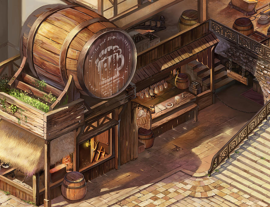
Here is the concept art from puyoakira, masaki, and Chinesegamer-Deviantart:

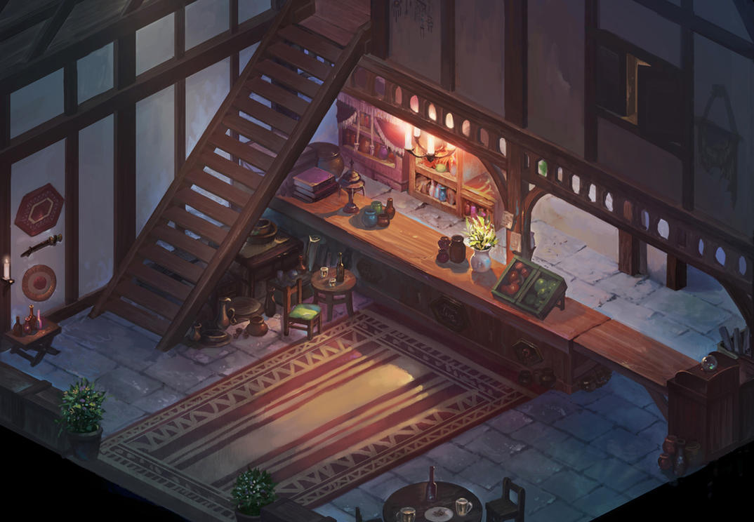
This one is for the second floor from the same concept artist, since I can't see the details on the second floor from the first image.

and this is what I've got so far:
- modelled the assets/props and put (most of)them together:


The total tris count of the entire scene so far is a little over 14k.
- started texturing the assets/props:
I'm fairly new to doing hand-painted texture so will appreciate any crits and comments here
I started with some tileable wood textures and adjust the colour/curve to texture the assets:

Here are some that I've textured so far:
Most of the textures are at 512x512 and 1024x1024.
I'm thinking to go with 1024x1024 for the rest of the assets from now on. I might also redo the ones at 512x512, but I won't worry about it for now..


I will keep this updated once I have more progress to show!
Thank you for looking and have a pleasant day

Replies
I was busy with other projects for the past few weeks and had a guest coming for a week, so couldn't get much progress on this. But I managed to get some texturing done today:
This might take a while to finish, but I'm committed to get this done
Stay committed! Because what you have so far is awesome! and it's a sweet concept that deserves tackling in 3d. Great work! I look forward to more.
-Stockwell
@Benjam: right now I'm just trying to get as much texturing done, so I'm leaving it in Maya where I modelled it. I may put it together in engine later to see how it looks in game
@Benjam: just noticed that too, fixed now xD
more updates from today's work:
still not quite happy with the hay roof
Textures are looking good, nice control in tones.
Notice that the thatch is quite thick, and the ends are generally trimmed neatly.
critiques and comments are welcomed
diffuse only:
I moved the scene to modo and tried doing a quick render of it:
Thank you for the suggestions
@TDub: I think you are right, I will smooth out the large barrel next.
@DWalker: I sloped the side a bit, but may still need more adjustment. I tried trimming the ends but I think I prefer how it looks right now. It seems to match the concept better.
looking reaaal nice work, the environment its so close to the concept to
but yer they are both pretty dam minor cant wait to see it finished oh and loving the floor tiles
@Chimi Jimi: Thanks for the suggestions. The saturation is probably due to the lighting xD I still need to tweak the settings.
I added more edge loops on the large barrel and it's looking better now.
I'm using 512 textures on some pieces and now I'm thinking if I should have gone with higher res instead
What do you guys think? Should I worry about this or just move on?
Here is a quick screenshot of some assets I made for the scene. I did the sign and textured the walls too, but haven't taken any renders yet because I thought I'm going to play with the lighting first :P
Will post more updates soon!
c&c are appreciated
Keep it up!
I agree sometimes. But oftentimes, the bigger a texture is, the more time it takes to create. Which, for private work probably won't matter so much, I suppose. But in production, it can be a time-sink, even with the benefits. Which is something to keep in mind.
So, you should texture at twice the resolution often, yes. But not always.
Adding the greenery along the roof will also help add some color variety.
I'd expect the rails and bannister to be black wrought iron, although that might be a bit too much contrast for the scene.
Here's how it's looking like now. I was worried about the scene looking too brown too >.<
So I reduced the saturation and value on the stone and fences, and added some greeneries around. Might have gone too far with the fences, lol
Going to start putting more colours around with other props next. For now I only added those big vases. I'm thinking to add some sort of table cloth on the counter at the second floor, flower pots, some bottles inside a crate like in the concept, some tools like axes/ swords, and light bulbs/lanterns. Hopefully those will add some colour variations to the scene
As always, feedbacks are much appreciated ^^
p.s lighting is not my strong expertise, so I'm still going to tweak it around as I add more stuff >.<
One thing that I would like to redo is the roof thatching, but other than that I think I might call the rest done for now (unless someone points out a major thing that needs to get reworked on :P). I may still work on the scene, but it won't be a main priority.
I'm sure there is still lots of room for improvements, so please feel free to give some critiques. Thank you everyone for the kind words and feedbacks! I had fun and learned a lot from this project ^^
Bottom before, top after.
I agree with Sythen though, could use some post-processing to make those colors really pop ^^
Great work!
~John Ehresmann
Keep it up man this stuff looks awesome.
@bigley: Agreed! That's been bothering me too, but I've been too lazy to fix it, lol. Will retouch that when I'm working on this again. Thanks for noticing ^^
@Sythen: True. I haven't done any post-processing in PS for the images I posted. I guess I'll look into that for the final renders / presentation. Thanks!