My Enviroment art work

polycounter lvl 3

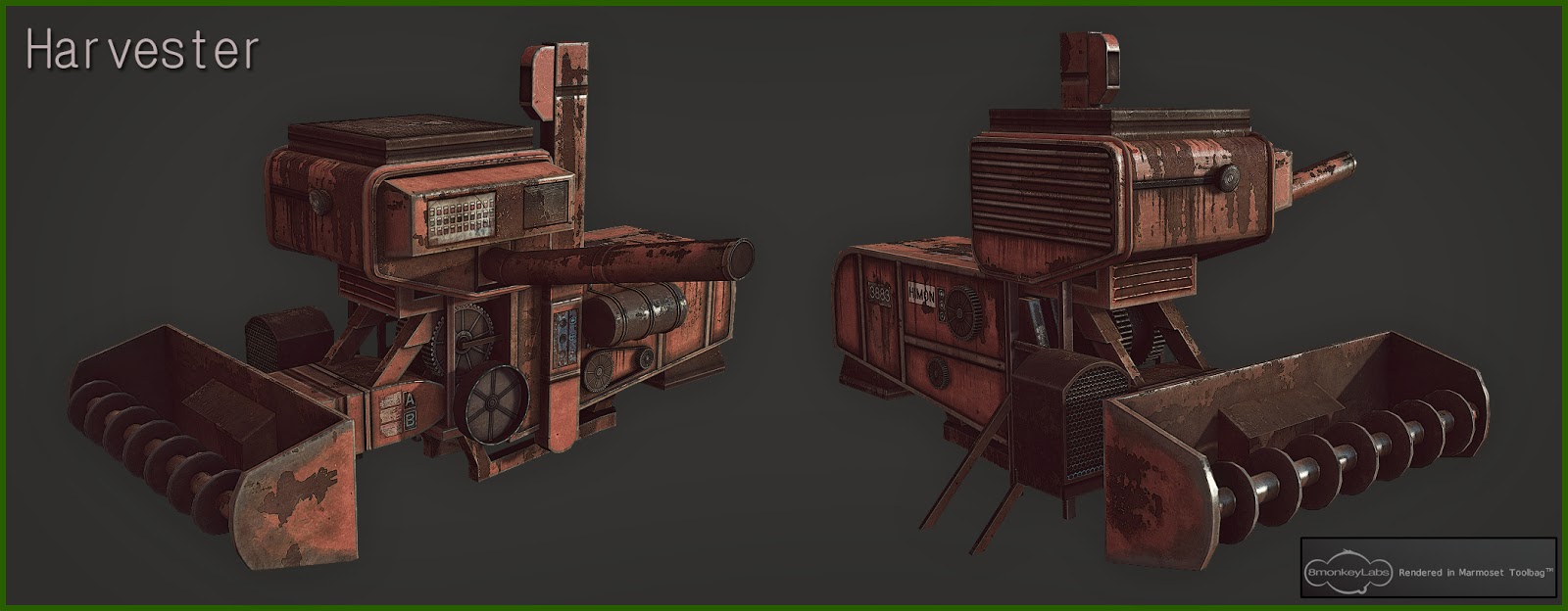


Hello guys
Here is some of Environment asset that was i done presently.
Softwares - Max, maya, Adobe photoshop, X-normal, crazybump & Marmoset.
C & C pls welcome Guys. Cheers guys
Replies
I think your presentation could use some work though. You have a bunch of different styles and fonts that you're using to show off your model, and it looks really inconsistant. I'd say come up with a solid style of presentation and stick with it. A consistent theme would really sell your work a lot better. I'd also like to see more wireframes and some maps as well to see how you're handling your polys and UVs.
For your ring gun, if you put a reference aside like that, you have to be accurate then, the trigger on top confused me because it looked wrong, and then I saw the reference and It indeed was very different. Now it looks like a grill or ironsights for ants, while the RL one looks like something you would pull, with that curved form and the different arc.
Also get some better backgrounds. Grey is boring and uninspired. decent gradients and decent use of color
AK is really special i get this carricature thing, but Id enjoy it a lot more if the barrel was a bunch ticker, it feels weak in the current state, its so thin. The front part is not so aesthetic with the front ironsights included, the rest is pretty cool.
Be consistent with your presentation, your highpoly pic is not even consistent with itself. The borders and the pics are not aligned