Roman Demon General

greentooth
So i´ve been working on a new char for some time, and i thought its time to get some crits in here and share my progress so far.
Its some kind of demon general with lots of influences from roman armordesign. thought it fits with the whole imperialistic mindset and everything.
added a little making of the skin composition at the bottom.
thats his current status:
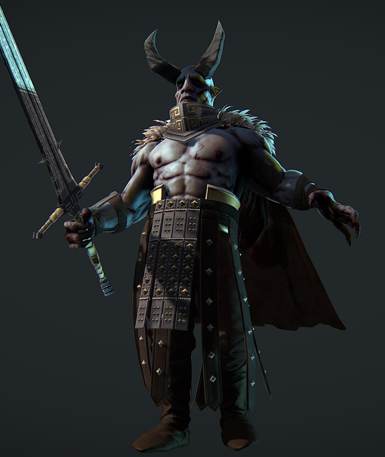
So this is my basic idea for the design right now, the spiky stuff will be some kind of fur or pelt hes wearing, like the legionaire wolfpelts.
its still in a pretty uncertain state, i may be changing the design of some parts, like the shoulder armor.

here his sword, and the parts for his weapons belt.

and some bodyshots:


Its some kind of demon general with lots of influences from roman armordesign. thought it fits with the whole imperialistic mindset and everything.
added a little making of the skin composition at the bottom.
thats his current status:
So this is my basic idea for the design right now, the spiky stuff will be some kind of fur or pelt hes wearing, like the legionaire wolfpelts.
its still in a pretty uncertain state, i may be changing the design of some parts, like the shoulder armor.
here his sword, and the parts for his weapons belt.
and some bodyshots:
Replies
Wayne Barthalow's Inferno book may help.
thats gonna eat some days of more research, thx panda this is awesome!
I know it's probably too early too crit but watch out for how thin those feet are. Maybe emphasize the slope of the foot from the inner to outer sides. (Totally forget the name of that damn slope if you know what I'm talking about) I usually save feet and hands for last myself =/
i tried something more experimental with the horns, but they are kind of selfcontained so this was rather easy.
with the armor and everything its a bit harder to implement all those weird designs, without completely throwing my original concept of balance.
anyhow there is still plenty of room to abstract and improvise.
feet are still incoming, still have to do something with the shoes. they are kinda floating in the room right now.
except the skin, the skin is perfect imo.
- its mainly his legs make them longer and he should look fine, and a more powerful general.
@luke
i suppose its a bit late for this now. originaly i planned him to be not that serious, so i went for a bit more comical proportions, his head is also pretty large etc. didnt think he would turn out that evil in the end
@kmactastic
thx, you are right about the threads on the cape. although i dont think they realy need to be aligned with the flowing direction it would give the cape propbably a more grounded look. if i havent collapsed the layers allready i will change that.
@frell
thx
just going in and sculpting in some folds like i feel ends up looking rather crappy, so i usually look at some folds on someone elses model i like, and gues wich fabric they could be made of and then google for real world references.
for this one i wanted the pants to be a bit wider and the cloth to be rather thick, something like jeans fabric.
as for the actual sculpting i recorded some progress of the shoes.
[ame="
i block in the folds in a low subdiv mostly using the standart or dam standart brush. if you are blocking out the folds they start looking natural pretty quickly, if not i take a closer look at some more reference and redo them.
after that its mostly just polishing on a higher subdiv with trim and smooth brushes.
also having some fixed points holding the cloth like belts etc makes finding believable angles for the folds a lot easier. just having freely hanging cloth like with this char makes finding a neutral position for the folds very challenging. for example sculpting the cloth for my last char was a lot easier.
thank you shakeyy, i realy love those, so yeah they were an imortant inspiration.
so i don´t know if i´ll maby go over the proportions. maby i´ll play around and look if i get something more epic out of them.
in the meantime, i gues i am rather finished with the rest:
I used the marmoset skin shader with the dermis being white and an almost 100% red for the subdermis.
scattering is 1.0 and subdermis depth is 0.4 no scatter smoothing.
for translucency i gave him a saturated orange color, strength is 0.45 catching shadows.