Warhammer 40k Plasma Pistol
So i've been trying to improve my work in generally recently and this is the first piece i've been that happy with that I want to show it off and ask for criticism.
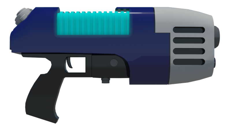
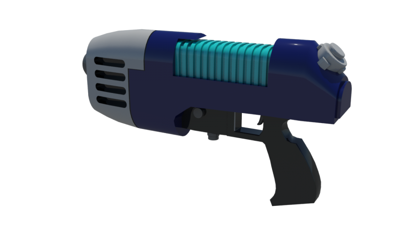
Originally I had intended to texture this in a realistic manner, however after applying a simple diffuse colour I really like how it looked, and thus decided to stick with it. I'll probably end up doing the chainsword in a realistic style to get the contrast between the two pieces.
Any criticsm or tips on improving it are welcome. In addition I have a thread over in Digital Sketchbooks if your intrested in more of my work
http://www.polycount.com/forum/showthread.php?p=1894127#post1894127
Replies
Firstly I found it quite aesthetically pleasing to look at compared to my other work. In addition I found the cartoony feel to it contrasted nicely to any of the other texturing work i've done in the past.
The second main reason is probably because I don't really understand how to get the texturing correct. I'm watching Racer445's texturing tutorial now for the shotgun, but my lack of texturing ability is another discussion entirely -_-
Texture it. I'm gonna be blunt and say a plasma pistol that looks like this from 40k looks boring. Take it to finish to get it looking portfolio/game ready.
Is this meant for a FPS? Who was its user? Did they fight in the 1st Company of the Ultramarines who met the Tyranid Hive Fleets in personal combat? Is it stained with the blood of the Emperor's enemies, treasonous and heretical hordes of Chaos following daemons? Was it rarely used as an ornamental weapon of a presitigous Inquisitor? Or was it looted by a lucky Ork, using it now for a new Waagh that'll make all dem humies thing twoice about dubba crossin' dis Warboss?
It wasn't originally, but I was considering bringing it over into CSS and UDK just so I have the experience of having done that.