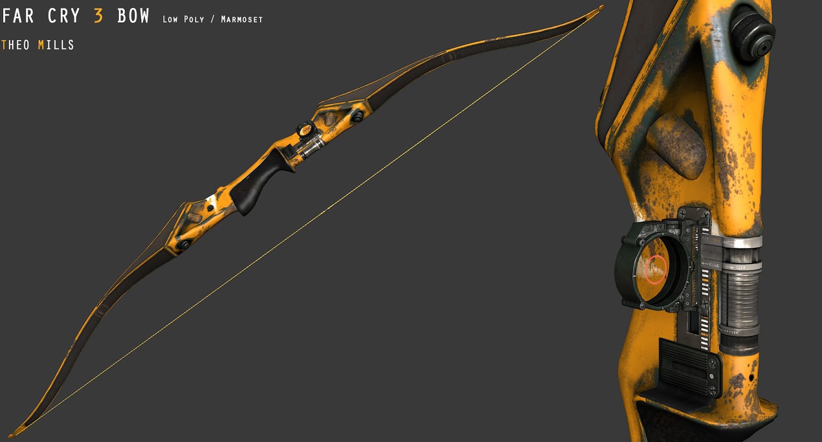
I Made one of my favorite weapons/models over the last few weeks , the Far Cry 3 bow , I'm calling it finished for now although there's still some more work I want to do on it. I figure it's good to take a break from it and come back with some fresh eyes.
Looks awesome, can't really think of anything that is wrong with it right now. Maybe adding some dirt or rust to the metal parts above the grip would make it look more realistic considering other parts of the bow are really worn out. Overall you did a great job on this, I personally think it looks better than the in-game bow.
Look awesome, I love using the bow, especially considering I shoot in reality. COuld I ask how you make your materials look so good? Your Maps look very similar to mine but I really struggle to get a convincing look to my Materials.
in this pic right from the sightview there is this rusted yellow thing. at the wireframe it looks like a quarter of a oiltank and simply sticks into the bowframe. Also the texture don´t hide this really good. Adjust the rust and occlusion so it fits together and seem like one element
Looking good, looks like just the right amount of polys, good job on that
There are some things to crit tho, mainly that half cylinder on top of the bow that is not connected. If you managed to connect that properly with the actual bow to get a proper transistion it would have been a lot better. Its that part that drags the rest down somewhat, also the texture on that part make it even more obvious it is floating and no part of the mesh.
The original one is connected + very darkened at the connecting spot, while yours has very weak wear and AO there.
Also the most important thing, the very best on that bow design are the curves. You need to use them to your advantage. Convexity is always different than a flat surface. Accent the curves, highlight them, give them wear. Bake down a light or even a couple from a lightsetup in your 3D program into your diffuse (with low opacity obviously) so you can use that to get lightness variance into your mesh or even as selection for other stuff like wear.
Also your lighting is alright but could be better, everything is evenly lit + your background is grey. No art director will enjoy a grey background. Show that you have taste and go for a analogous or complementary sheme. (analogous to yellow is orange and red p.ex. complemetary would be a nice darker blue or forest green here, well you got it right on your texture, take the same green on a darker tone for your background with a very decent circular gradient maybe.
Presentation is key
Its a good texture, but you can make this excellent
@Auldbenkenobi : I would take a look at this --> http://www.marmoset.co/toolbag/learn/materials, it was a really great help in getting materials set up in Marmoset. For this model its all in the spec and gloss in terms of material definition. not that the diffuse and normals aren't important. If you want a more detailed answer let me know !
@MrNinjutsu : I whipped up some hi poly/ wire frame renders, the wire frame is pretty tight in the more detail areas, so apologies for the blurriness,I didn't want to post a 4k image haha.
@JHS,@Shrike : I see exactly what you mean, the AO isn't strong there at all, looking at my references its hard to tell if it's supposed to be one continuous piece of metal or not, at some angles there's a definite edge but others it looks seamless, but either way I'll definitely address that.
@Shrike : Great tips on the presentation front, this is really the first asset that I've tried to make portfolio style renders for, so I'll definitely try what your suggesting. Adding wear on the curved areas is a good idea to , and baking specific lights is something I haven't done before and worth checking out !
@Grimm_Wrecking : did you want just a render with diffuse only, ie without spec/normal etc ? like this
@nKsilver5 : The first thing i did when starting this project was searching polycount for anyone who had done it as well ! I took a look at your thread and it definitely informed how i planned out the low poly modeling stage, it was a great help to see how someone else interpreted the bow , so here's a late thanks for that haha !
Ah, I actually meant a diffuse flat, I just said naked meaning without the spec/gloss/norm overlay so I could get a good look at your uv packing. Mine suck so I've been digging for as many that are done well to reference as I can find.
I had considered making the texture fully symmetrical to give it more density, but with the shape of the bow and all the other objects It didn't really increase the density all that much.
Replies
in this pic right from the sightview there is this rusted yellow thing. at the wireframe it looks like a quarter of a oiltank and simply sticks into the bowframe. Also the texture don´t hide this really good. Adjust the rust and occlusion so it fits together and seem like one element
There are some things to crit tho, mainly that half cylinder on top of the bow that is not connected. If you managed to connect that properly with the actual bow to get a proper transistion it would have been a lot better. Its that part that drags the rest down somewhat, also the texture on that part make it even more obvious it is floating and no part of the mesh.
The original one is connected + very darkened at the connecting spot, while yours has very weak wear and AO there.
Also the most important thing, the very best on that bow design are the curves. You need to use them to your advantage. Convexity is always different than a flat surface. Accent the curves, highlight them, give them wear. Bake down a light or even a couple from a lightsetup in your 3D program into your diffuse (with low opacity obviously) so you can use that to get lightness variance into your mesh or even as selection for other stuff like wear.
Also your lighting is alright but could be better, everything is evenly lit + your background is grey. No art director will enjoy a grey background. Show that you have taste and go for a analogous or complementary sheme. (analogous to yellow is orange and red p.ex. complemetary would be a nice darker blue or forest green here, well you got it right on your texture, take the same green on a darker tone for your background with a very decent circular gradient maybe.
Presentation is key
Its a good texture, but you can make this excellent
@Auldbenkenobi : I would take a look at this -->
http://www.marmoset.co/toolbag/learn/materials, it was a really great help in getting materials set up in Marmoset. For this model its all in the spec and gloss in terms of material definition. not that the diffuse and normals aren't important. If you want a more detailed answer let me know !
@MrNinjutsu : I whipped up some hi poly/ wire frame renders, the wire frame is pretty tight in the more detail areas, so apologies for the blurriness,I didn't want to post a 4k image haha.
@JHS,@Shrike : I see exactly what you mean, the AO isn't strong there at all, looking at my references its hard to tell if it's supposed to be one continuous piece of metal or not, at some angles there's a definite edge but others it looks seamless, but either way I'll definitely address that.
@Shrike : Great tips on the presentation front, this is really the first asset that I've tried to make portfolio style renders for, so I'll definitely try what your suggesting. Adding wear on the curved areas is a good idea to , and baking specific lights is something I haven't done before and worth checking out !
thanks again guys!
http://www.polycount.com/forum/showthread.php?t=119595
Good job !
@Grimm_Wrecking : did you want just a render with diffuse only, ie without spec/normal etc ? like this
@nKsilver5 : The first thing i did when starting this project was searching polycount for anyone who had done it as well ! I took a look at your thread and it definitely informed how i planned out the low poly modeling stage, it was a great help to see how someone else interpreted the bow , so here's a late thanks for that haha !
I had considered making the texture fully symmetrical to give it more density, but with the shape of the bow and all the other objects It didn't really increase the density all that much.