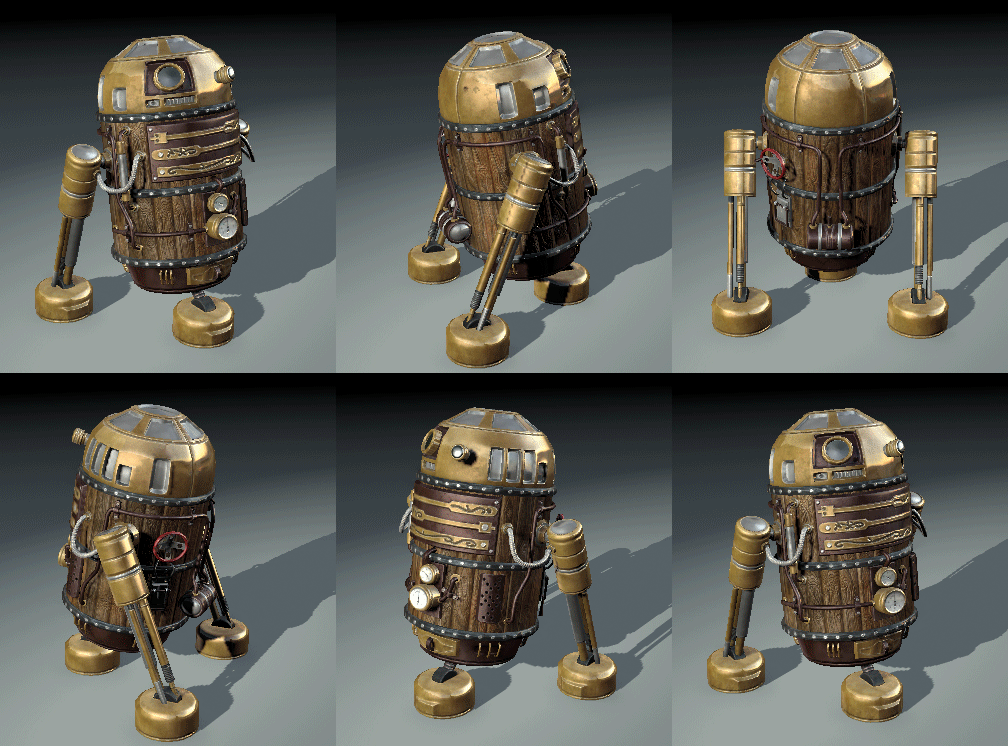
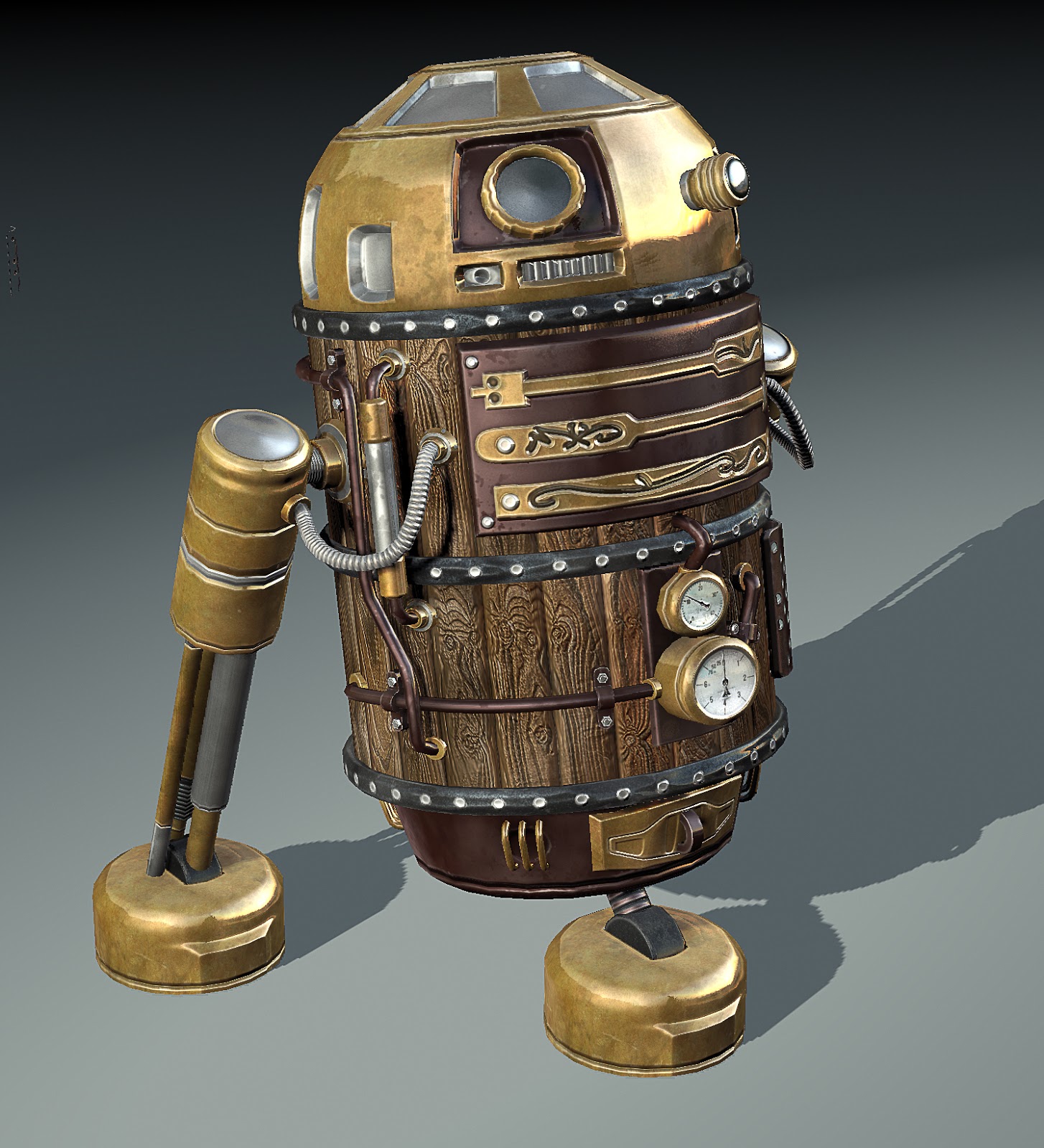
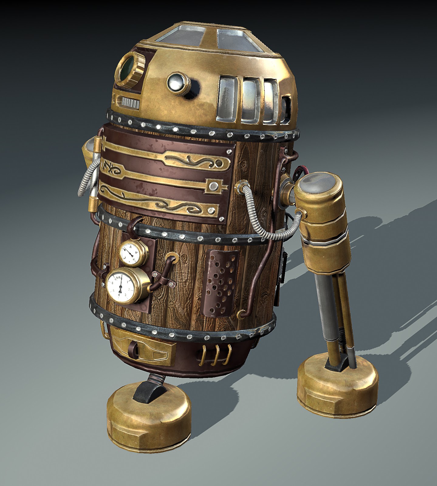
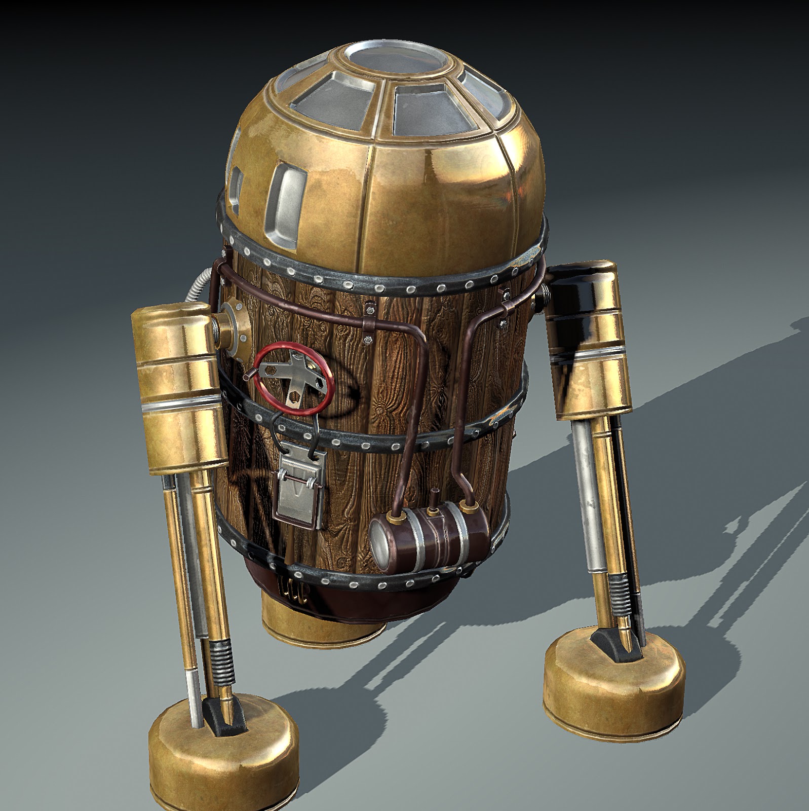
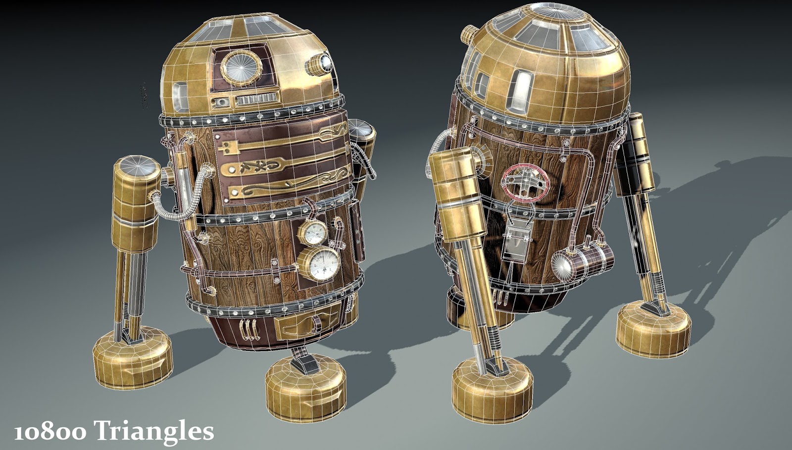
Mesh is looking good, a little more geo on some places wouldnt have hurt tho, mainly the upper legs. Also im not so sure with the gold reflections & specularity, you could try out a little more there.
The presentation is a big letdown here. Black to grey gradients scream "cheap viewport grab" and they drag your object down a lot. Grey does nearly not exist in real life, it is always tinted, and gradients with huge color differences are ugly in 95% of the cases.
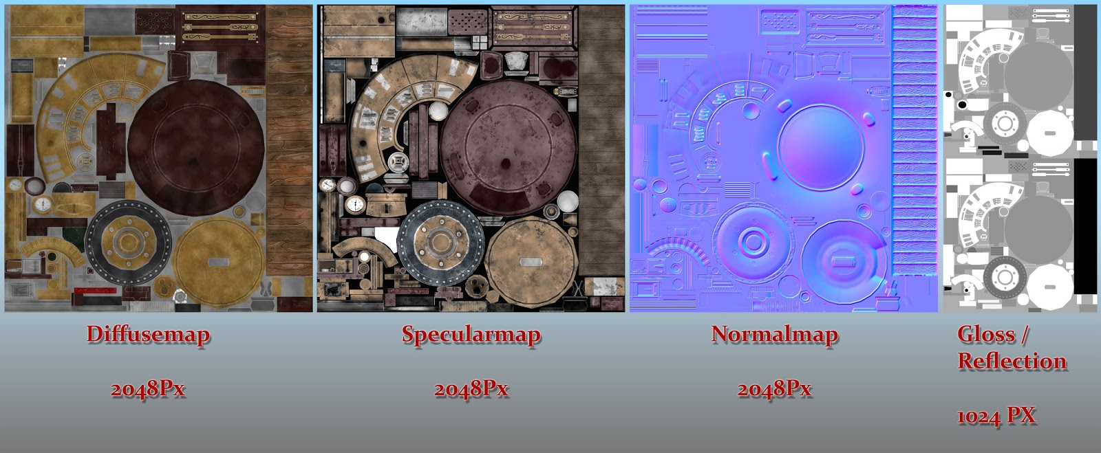
Your texture sheet is even more unappealing. The grey is unfitting, and the red text with white stroke (why?) + drop shadow dosnt go with anything else. Keep layer styles simple. Take White or black as text color, or go with a complementary to your asset sheme.
Right now, your asset is yellow / brown-ish, so the best color to pick would be a shade of purple or blue or around that probably - complementary
I took the first best gradient ive found, you can easily get a better one
If you have the right complementary color found, you can adjust the saturation as you think is appropriate. This now is 100%.
Also you can crank up the contrast a little with curves in photoshop on your textures
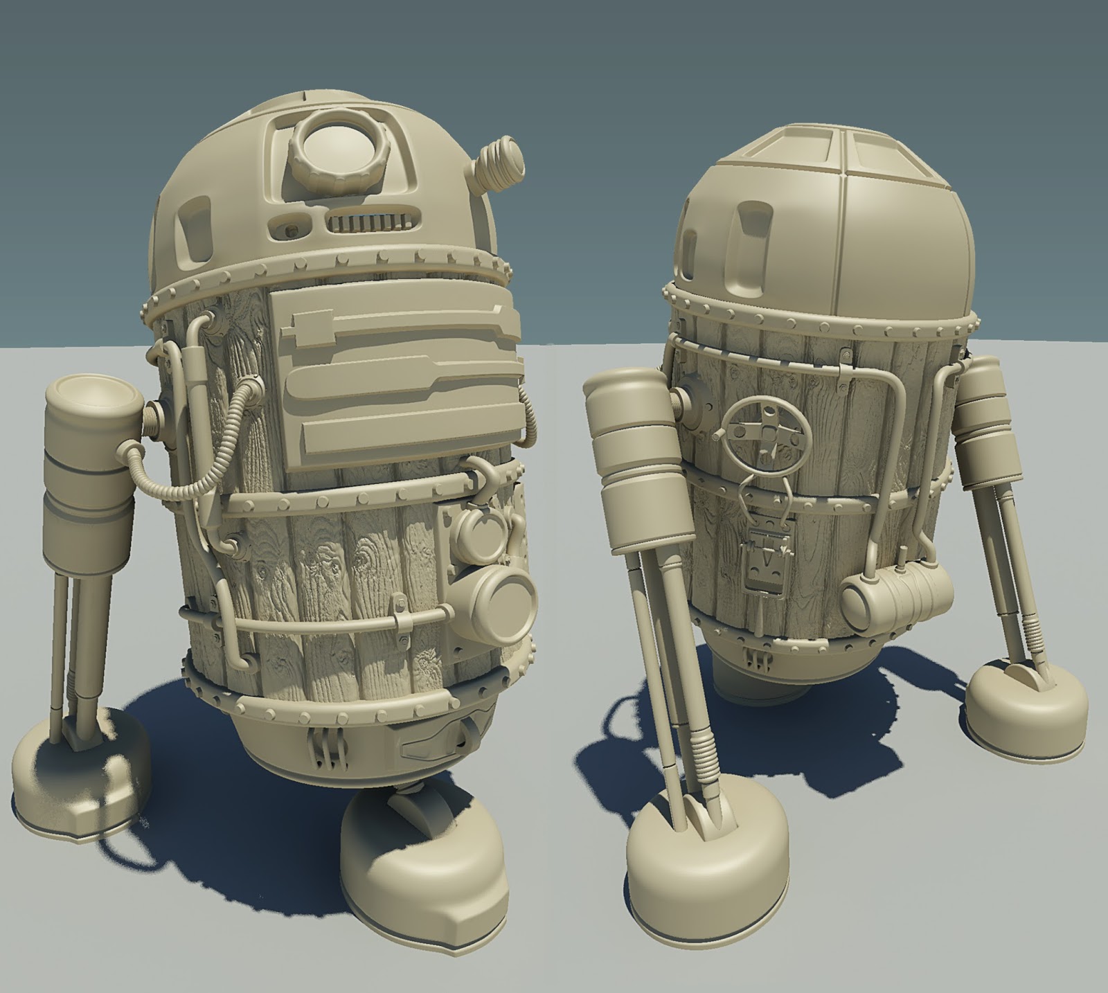
The pinching on the head is a big distraction for me, I think you should work a little on cleaning up your high-poly so you can bake a cleaner normal. The texture also looks a bit off, it's terribly clean atm, remember that steampunk often comes with an industrial revolution setting, everything is oily and caked in soot and coal powder. Maintained and built by hand or crude machinery, everything leaks. You have a little bit of discolouration going on but it really needs some locational wear, and signs of use.
Nice Work. The normal map on the head of the high res model has some issues. Not a big fan of the wood grain either. I looks more like a plastic mold or something. Just my personal observation though.
Otherwise great stuff. I love the steampunk genre.
Shrike: Wow, thank you a lot that you've taken the time to give such wide feedback to my presentation. I'll definitely go over it again, trying to transcribe your suggestions.
KartoonHead: Yep, texture is very clean, but I was supposed to look not to dirty/used. But I'll give it a try
SeveredSon: I'm not sure about the wood too, maybe some hours of sleep will open my eyes
Got to check my highpoly again, like KartoonHead has mentioned aswell
nice idea... think the execution could do with a bit of work though.
firstly the bits and bobs look a bit stuck on... and could do with bedding in a bit more adding dirt or oxidised areas of metal in the occluded parts.
secondly the wood looks like its been sandblasted the temptation is to add lots of nice normal detail here but i think it doesnt work very well, and would be better suited to a fine mahogany with much less graining
thirdly the top doesnt work well the inserts feel a bit...there for the sake of it
what about replacing it with something that could add another material/colour. your colour scheme is yellow to brown and it feels like you need a strong accent colour to make the design really come together. stupid idea but what about green leather inserts on the top
like:
Replies
The presentation is a big letdown here. Black to grey gradients scream "cheap viewport grab" and they drag your object down a lot. Grey does nearly not exist in real life, it is always tinted, and gradients with huge color differences are ugly in 95% of the cases.
Your texture sheet is even more unappealing. The grey is unfitting, and the red text with white stroke (why?) + drop shadow dosnt go with anything else. Keep layer styles simple. Take White or black as text color, or go with a complementary to your asset sheme.
Right now, your asset is yellow / brown-ish, so the best color to pick would be a shade of purple or blue or around that probably - complementary
I took the first best gradient ive found, you can easily get a better one
If you have the right complementary color found, you can adjust the saturation as you think is appropriate. This now is 100%.
Also you can crank up the contrast a little with curves in photoshop on your textures
Otherwise great stuff. I love the steampunk genre.
Shrike: Wow, thank you a lot that you've taken the time to give such wide feedback to my presentation. I'll definitely go over it again, trying to transcribe your suggestions.
KartoonHead: Yep, texture is very clean, but I was supposed to look not to dirty/used. But I'll give it a try
SeveredSon: I'm not sure about the wood too, maybe some hours of sleep will open my eyes
Got to check my highpoly again, like KartoonHead has mentioned aswell
Thanks a lot guys!
firstly the bits and bobs look a bit stuck on... and could do with bedding in a bit more adding dirt or oxidised areas of metal in the occluded parts.
secondly the wood looks like its been sandblasted the temptation is to add lots of nice normal detail here but i think it doesnt work very well, and would be better suited to a fine mahogany with much less graining
thirdly the top doesnt work well the inserts feel a bit...there for the sake of it
what about replacing it with something that could add another material/colour. your colour scheme is yellow to brown and it feels like you need a strong accent colour to make the design really come together. stupid idea but what about green leather inserts on the top
like: