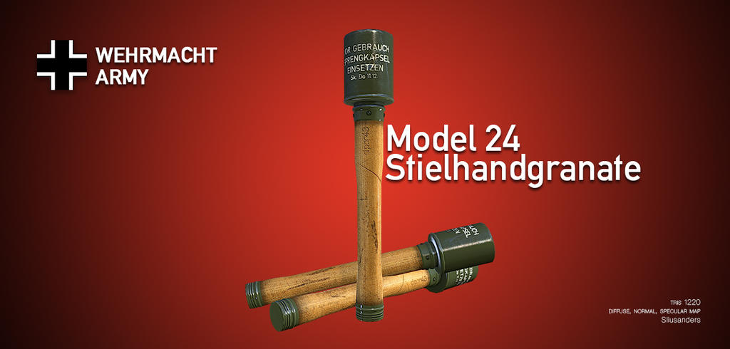
Presentation is really nice, but there is some tweaking to do
The grenade text should be on the top right on the same height and distance from the border as the wehrmacht logo, text needs space and your model the same
The font choice and layer styles make me think its a modern grenade, so if you planned on it beeing a WW2 asset, I would go for a way less modern graphical representation. Also maybe rething how the grenades are on your image. If its a vertical image, why go for a horizontal layout ?
Asset is looking good, the bottom looks a little strange to me when having the same color. Maybe add a small detail there if you go for such a thing as portfolio piece. Its the small things making the difference.
The handle appears much too thick, and doesn't have the distinct profile. Also, the disc at the base of the warhead should be more distinct. The paint was also a matte finish, rather than a gloss. In many ways, it looks like a model of a reproduction/replica grenade.
I'd probably keep the text in German, replacing 'Army' with 'Heer'. You should also switch to an appropriate font - either antiqua (officially required after '41) or fraktur (common before '41).
I'd have to agree that the vertical presentation is odd on a wide-screen image; either a horizontal or angled grenade would be more efficient, allowing a much larger model.
Replies
The grenade text should be on the top right on the same height and distance from the border as the wehrmacht logo, text needs space and your model the same
The font choice and layer styles make me think its a modern grenade, so if you planned on it beeing a WW2 asset, I would go for a way less modern graphical representation. Also maybe rething how the grenades are on your image. If its a vertical image, why go for a horizontal layout ?
Asset is looking good, the bottom looks a little strange to me when having the same color. Maybe add a small detail there if you go for such a thing as portfolio piece. Its the small things making the difference.
Also a little tweak to the models:
I'd probably keep the text in German, replacing 'Army' with 'Heer'. You should also switch to an appropriate font - either antiqua (officially required after '41) or fraktur (common before '41).
I'd have to agree that the vertical presentation is odd on a wide-screen image; either a horizontal or angled grenade would be more efficient, allowing a much larger model.