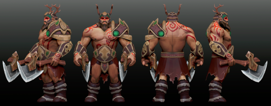
Thanks Salmojuan, i dont know, i really enjoy play with windrunner and drow ranger, but i like the silhouette of Axe and Dragon knight ... i can play a lot with this heroes , so many ideas .... thanks for your comment !!!
The main issue I have with this is that it'd really over saturated for lack of a better word. There's no calm areas where the eye can rest or even be attracted to.
the character in essence is over saturated, the color palette of Windrunner is very green and yellow ... is dificult to work with this color pallet ... and if you try to break this adding more darker colors you easily lost the valve pallet
i understand very much what you are telling me, and i´m realy divided about break the color pallet ratio and pray for valve understand it ... or keep the ratio and remove the saturation on the mask1 and mask2 configuration
I feel like losing the orange of her hair is a huge change to her appearance. Im not entirely sure how I feel about it.. also I think Spudnik has a good point how everything is quite sharp and high contrast between the bright greens and sharp blacks, maybe work having a mess around with textures and making it a bit mellower at least in some areas.
Some good advice is to make the key areas very smarp and contrasting, and then compliment them with smoother and i guess "duller" and more muted colours on the rest.
I agree the orange is very important on the pallet ... but was being a Pain to find some mayan orange concept thing to compose the Set, but like i said ... the material give a lot of contrast and less saturation on the final piece ... this image is not the final piece i need to tweek more the material by is going to a great solution
Replies
Thanks a lot guys ... and plz, give some like on my creations
i understand very much what you are telling me, and i´m realy divided about break the color pallet ratio and pray for valve understand it ... or keep the ratio and remove the saturation on the mask1 and mask2 configuration
Some good advice is to make the key areas very smarp and contrasting, and then compliment them with smoother and i guess "duller" and more muted colours on the rest.
here´s my entries
Bird of Paradise set by Gaston