VG Remix Blaster Master
This thread is to document my downward spiral of failure. Sounds fun so let's get started!
There were so many good choices and it was hard to decide but ultimately I picked Blaster Master. The game was hard as balls and I barely got anywhere when I was a kid, but it kept drawing me back if only to drive that awesome tank. That feedback noise sound effect when you got hit was also delightful.
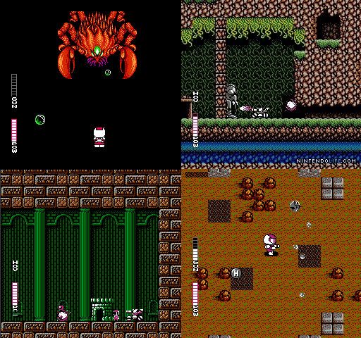
So I'm not very good at designing vehicles and took a really long time coming close to drawing something I liked. I realized if I wanted to get done everything I want to do for this contest I needed to start on the meat of the project.
Anyway, here's some sketches and other garbage.
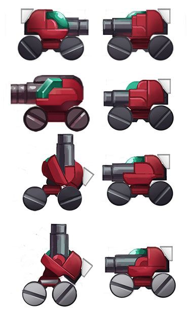

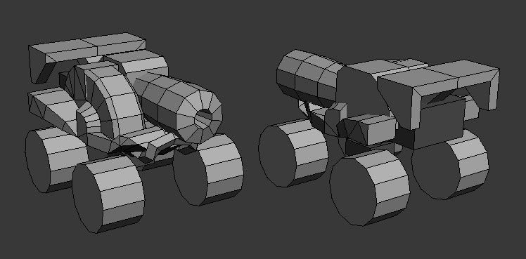

There were so many good choices and it was hard to decide but ultimately I picked Blaster Master. The game was hard as balls and I barely got anywhere when I was a kid, but it kept drawing me back if only to drive that awesome tank. That feedback noise sound effect when you got hit was also delightful.

So I'm not very good at designing vehicles and took a really long time coming close to drawing something I liked. I realized if I wanted to get done everything I want to do for this contest I needed to start on the meat of the project.
Anyway, here's some sketches and other garbage.


Replies
TOAD! Wouldn't be Blaster Master without Jason's toad! Got some sloppy textures on the tank, but I'm still not feeling the design. Likely going to make some more significant changes to that and Jason's gun. Everything is subject to change! Also need to get started on the actual diorama...oy, so much work left.
64x64 for the gun and toad
128x128 for Jason
256x128 for Sophia
Made one of the bosses. He's definitely heavy on the tri's, but he's going to take up a fairly large portion of final. Now I need to get everything onto a diorama and start working on the environment. I'll try and get everything in a Sketchfab for you guys to fly around in.
128x128 for the body
64x64 for the claw sections
32x64 for the arm balls
Threw it all together and worked out a composition. Everything is in the scene, so now it's just a matter of finishing textures and making it look purdy!
Because this game will WRECK YOUR SHIT!
[SKETCHFAB UPDATED BELOW]
Everything is awesome looking, but I think the frog is my favorite part.
How much is lost if you drop the 256/128 to a 128/128? As that was the size given for hero pieces.
Daniel Duy: Done?! There's always room for improvement!
Shiv: Yeah, that was something I was struggling with. Ideally I'd drop it down to a 128 square, but I'm worried about pixel density and uniformity across everything. I might be able to knock it down with some creative UV squishing, but I'm short on time so I don't think I'll get around to it.
Redid Sophia to look more like the original design and shrunk Jason's texture down to a 64x64 as the 128 was way too many pixels for his size. Also updated the Sketchfab with the newer, shinier diorama. Unless I see something that needs changing I'm probably going to call this done. Don't think I'll have much time to work more on it this week. This was a blast. I hope everyone else had as much fun as I did!
[sketchfab]2c034af8748f4345ac71094c7485babd[/sketchfab]
I said I was done with it, but I just couldn't help but fiddle. Added some dirt and changed a few other things around that people probably won't notice.
[sketchfab]2c034af8748f4345ac71094c7485babd[/sketchfab]