VG Remix Legend of Us
Hey everyone! All the ideas so far are really inspiring, and I can't wait to see what direction everyone goes.
I had originally thought of doing something "Last of Us" -related (because I'm loving it, you know?), but after noticing that other people were thinking the same thing I was trying to think of other games I've loved. I've been revisiting all my old classic favourites. Mainly isometric games like "Little Big Adventure," "The Last Ninja," and "Secret of Mana." While I was looking through all of the screenshots and art work, I just REALLY wanted to take the artistic style from the Secret and Legend of Mana series, and create a 16-bit inspired version of The Last of Us.
So, given that I would just be more excited at the thought of creating a classic old style isometric Diorama from a scene of The Last of Us, I'm giving in and making exactly that. Sorry to all the other Last of Us inspired peoples! Maybe our competing ideas will work in our favour?
EDIT: Adding Sketchfab Diorama
[SKETCHFAB]d3b0a4f3cd1d4895a37d0b402ed8ffa3[/SKETCHFAB]
Images from the Legend of Mana for inspiration:


Some more inspirational isometric art pieces:

Credit to Artyom Vlaskin
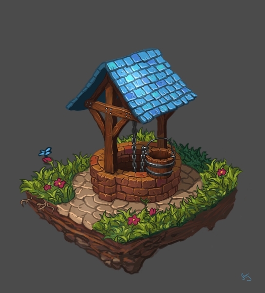
Credit to Ann-Jean over at deviantart
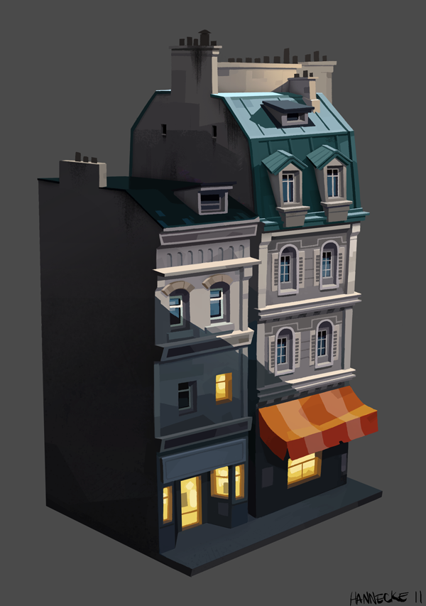
Credit to Matias Hannecke

I searched everywhere (including Google images) for the owner of this one, and couldn't find it. It looks like the original owner's account was deleted? If anyone knows, could you let me know so I can update the credit? (Thank you in advance...)
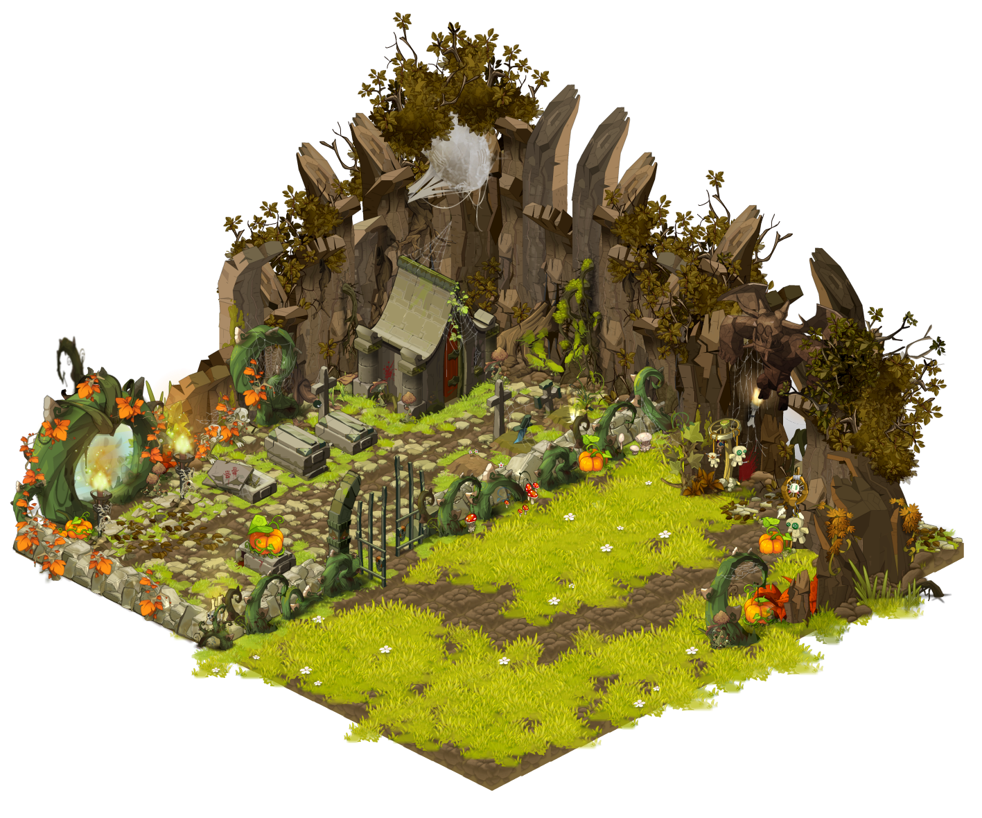
I was especially inspired by the foliage used here by Konstantinos Loannidis over on Deviantart.
I'm taking an early scene from The Last of Us, where Tess and Joel emerge from a diner into a small courtyard, search for a ladder, and make their way up into the opposite building.
I'll see if I can get some screenshots and add them to the post.
See you all around!
I had originally thought of doing something "Last of Us" -related (because I'm loving it, you know?), but after noticing that other people were thinking the same thing I was trying to think of other games I've loved. I've been revisiting all my old classic favourites. Mainly isometric games like "Little Big Adventure," "The Last Ninja," and "Secret of Mana." While I was looking through all of the screenshots and art work, I just REALLY wanted to take the artistic style from the Secret and Legend of Mana series, and create a 16-bit inspired version of The Last of Us.
So, given that I would just be more excited at the thought of creating a classic old style isometric Diorama from a scene of The Last of Us, I'm giving in and making exactly that. Sorry to all the other Last of Us inspired peoples! Maybe our competing ideas will work in our favour?
EDIT: Adding Sketchfab Diorama
[SKETCHFAB]d3b0a4f3cd1d4895a37d0b402ed8ffa3[/SKETCHFAB]
Images from the Legend of Mana for inspiration:


Some more inspirational isometric art pieces:

Credit to Artyom Vlaskin

Credit to Ann-Jean over at deviantart

Credit to Matias Hannecke

I searched everywhere (including Google images) for the owner of this one, and couldn't find it. It looks like the original owner's account was deleted? If anyone knows, could you let me know so I can update the credit? (Thank you in advance...)

I was especially inspired by the foliage used here by Konstantinos Loannidis over on Deviantart.
I'm taking an early scene from The Last of Us, where Tess and Joel emerge from a diner into a small courtyard, search for a ladder, and make their way up into the opposite building.
I'll see if I can get some screenshots and add them to the post.
See you all around!
Replies
Screenshots below showing some of the area (I haven't got a video capture card/thingy, so these are shots from a camera pointed straight at the screen). These are from a very early section of the game, and don't give away any story or plot points -
Potential spoiler alert!! - Bookmarking video for future reference, about 3 minutes of footage revolving around the section I want to work with. The rest of the video might contain spoilers depending on what story elements are important to any players.
I am one of the few you speak of. But tbh i kinda knew there would be a few people choosing the last of us. It's all just about how people remix it and approach it. Everyone worries when people choose the same topic or focus area, but in the end, they all look completely different.
I like the sound of yours though. I've got some ideas on how i want to blend tlou with one of my all time favourite games. I just hope that the other people hitting this game will do the same.
All the best of luck!
Not sure if you've been thinking on it but what kind of scale do you think your going for? Quite up close like in your reference images. The house with the water ways looks class. Would be so cool to have like a mini level. With recognisable props and stuff.
The mana series art is so good! That was my second choice for this project
DO IT
One question though, if you're going to use the Legend of Mana color palette how do you plan on getting across the dark/dirty/grungy feeling of the Last of Us?
I'm afraid the bright popping colors might take it a bit too far away from the game in overall tone
Can't wait for this though :thumbup:
@Alismuffin - I like your reaction! I definitely fell in love with that pixelated art when I was younger. So much more advanced than my first run in with Alex the Kidd
@polymator fear not! I know exactly what you mean though, but I think, I Think! I have an idea. When I came across the Dofus-like artwork (last image in my earlier post), it gave me an idea of how to get it to work. I think it will end up a little more....pastel? I'm not sure if that's the right word, but if you notice me making any horrible choices, let me know. I don't want to be defensive and precious about my project if anyone can see me making unforgivably bad work.
On that note, I had originally started blocking out my diorama starting with the room underneath the Pizzeria. That way, you could see this glimpse of it sticking out of the side of the Diorama when spinning it around. I was using Joel as a ruler to get all the scales as accurate as possible. The idea was to start off by recognizing all those details that I love about The Last of Us, and letting those details fill in the large shapes (I already hear what's wrong with that....)
The next section was the inside of the Pizzeria, where I had the underground passage connect up underneath the fallen door, then all the tables and props that filled it out. I was hoping this would help me work out exactly where everything was placed on the grid, scales and proportions, and subsequently, positioning.
Once I had these areas sussed out, it was easy to get the Joel-ruler, and start lining up the rest of the set.
It was at this point that I realized...well....
A) Big shapes first! and,
I did also try using a longer lens to pull everything together into the isometric style, which I think fixed part of the problem, BUT isn't really a solution (since it's being viewed in Sketchfab, and not through a rendered lens).
For now, I'm happy with my choice of area, and will start squishing my scales down to get that right kind of style that I'm aiming for. After that, I should probably do a quick paint over, so that I have a little bit more information to refer to.
And naturally, less boxes
I'm gonna be taking on a pretty large scale diorama with smaller details in the textures. I hope
Block out is looking good so far dude!
This -
translates to that -
Since I'm currently using the Joel-ruler to measure my Last of Us set, and assuming Joel and Drake are about the same size, then I think I'll scale my set down to fit something like a Vinyl Drake figurine. Or in this case, Vinyl Joel and Tess figurines. That would bring it more in line with the chibi-scale-style of the Mana series.
End note.
Now end note....
Finally had a chance to try out Sketchfab, very cool. While I was playing around, I decided that I would keep the shop and building fronts, and cutaway the back ends and part of the roof to show some of the interiors seen in the game. Hopefully this will help with some of the camera blocking that happened from some angles.
Will need to do some serious optimization soon to get it under budget, and have a think about where detail should be modelled and/or textured. Also wondering about how I'll handle the debris, but will leave that till the main stuff has been done.
AO shots below -
After that, model cleanup, and then texturing. Can't wait!
Some quick AO renders from lunch today -
A little concerned about where I should and shouldn't model detail, but as I get the model to where I think it should be, I'll come back to scrutinizing my polycounts and optimize it to the guidelines. I like to think I'll have room for additional props/decorations and rubbish, but will leave it for the dressing pass.
Oh! and woe is me, I'll have to play the game again (woohoo! *ahem*), so I can double check what details I want in the apartment-block cross-section. I think I might cut it off at the back wall, so only everything from the windows back to the pool table are visible.
Which reminds me - Note to self - Silhouettes/tangents!
I'm deliberately leaving some proxy shapes in there so I can revisit them once I've tested my tiling textures and modular model parts. Some stuff just needs to wait to see how much time I have at the end...
hmm...feels a little crowded in the middle area....maybe I need to part the buildings a bit....
The tree looks a bit funky. I think the tree is fully spread out at about where the 2nd and 3rd floor meet, so I guess it looks too tall to me.
I'm looking forward to the textures as well. They will bring the whole thing together. Those renders look nice though. Keep up the good work!
On that note, my sister-in-law had her baby, so I didn't have as much time as I'd hoped this weekend, BUT I did start UVing and texturing, and some very heavy editing of my meshes. Adjusting to low-LOW resolution meshes wasn't as seamless as I assumed, so I'm posting some wireframes just in case anyone has time to crit my progress. It's crunch week though so no obligations! (^_^)b
Also identified where all my repeating meshes and textures would be (with extreme thanks to whoever invented the UV tiling texture I've been using).
Images below -
At the moment, the mesh and textures are all snapped to a grid (so in this last image, the textures are all exactly the same scale, just to start with - I'll adjust them once I get the hang of how I'm going to stay under budget with everything, and still have a nice looking set).
Back to work!
thinking thinking!
[SKETCHFAB]d6041c99a7f74e529f5b538e9b0c8953[/SKETCHFAB]