Viking Demon [Character Design WIP]
Last update:
Hello Polycounters!
I've just finished my degree and now it's time to do a complete character design. Whereas this is not my first 3D character, I've never done a complete "walkthrough" to the whole process (Concept Art + HighPoly + LowPoly + Textures) so I'm pretty excited with this project!
That's why I'm opening this thread, because Polycount is full of knowledge and experience and I really need a bit of that. I'm willing to get a good portfolio piece, so comments and critics are very appreciated and DEMANDED Overpaintings are also great.
Now let's get down to work
The brief:
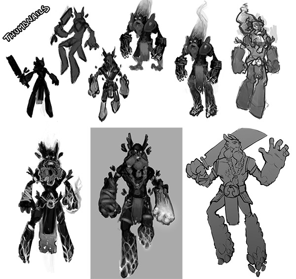
Here I did some thumbnails in order to figure out the character:
Now that I have the general idea, let's throw some color:
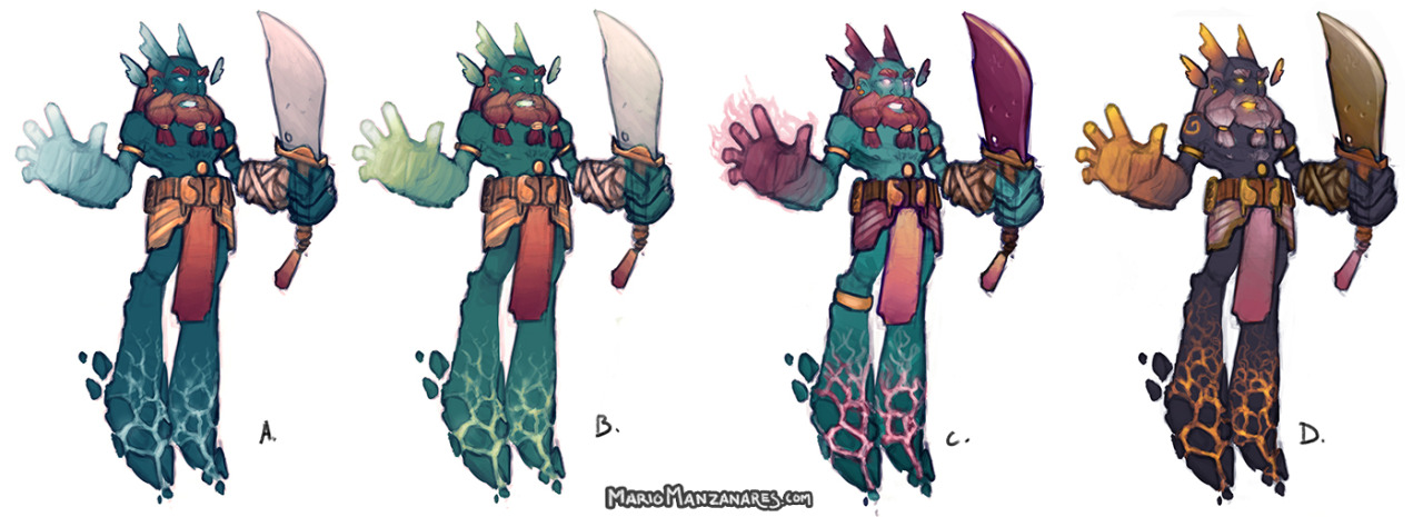
My favorite one is the C (blue & pink), but I can decide... Suggestions?

Hello Polycounters!
I've just finished my degree and now it's time to do a complete character design. Whereas this is not my first 3D character, I've never done a complete "walkthrough" to the whole process (Concept Art + HighPoly + LowPoly + Textures) so I'm pretty excited with this project!
That's why I'm opening this thread, because Polycount is full of knowledge and experience and I really need a bit of that. I'm willing to get a good portfolio piece, so comments and critics are very appreciated and DEMANDED
Now let's get down to work
The brief:
- A stylized character inspired by Dota 2 style
- Viking references
- Big and strong. Oversized limbs.
- Non-Human colored skin (I wanna try sth different)
- Melee but magic user
Here I did some thumbnails in order to figure out the character:

Now that I have the general idea, let's throw some color:

My favorite one is the C (blue & pink), but I can decide... Suggestions?

Replies
My favorite is D. C. is also nice, but I don't like that the hand is darker then on all other variations, because I love that glowish feeling.
I would never get to demon viking tho while looking at the images
Also maybe just a little more stomach, he looks like a skinny shaman, the bottom right image of your thumbs had it quite well. The concepts are definitely cool, but I think youve gotten a lof off from your goal of a viking demon
Each piece of armor or form conveys some kind of style or mood, like the gold rings around the arms, the spinning pattern on the shoulders and the open chest remind a lot of southern shamans, the belt and pads are hard to define, same as your weapon.
If you want something to look alike, you need to pick out certain pattern of a sheme.
Northern weapons would be more edgy and with runes, while the eastern one are smooth and curved per example. If the viewer has nothing he can relate to, then you can not convey your intention. Also you have backwards knees, like some animals or mechs have, and is on none of your thumbs, this is a very strong element and used with caution, It reminds me a little of my little pony because of that and the simplistic foot silhouette.
If you gave him per example an axe as weapon which is a easily recognized symbol, then people would see "oh axe, beard - I get it" despite the lack of other things conveying the viking theme. Bottom right thumb has clothing that is spot on, so I instantly see he is viking, despite the unusual weapon as example.
It looks like some kind of Elemental avatar now to me which could appear in world of warcraft or something similary themed.
If you dont care what your original intention was, then dont mind, its definitely interesting , like A and D the most
I think you may want to take a look at the proportions and design of some similar DOTA 2 characters. If you look at Axe or The beastmaster for example, they have much more human/realistic looking propotions. They are stylized for sure, but they have necks and proper underlying structure. At the moment, your concept looks like a Chibi version.
Look forward to seeing what you come up with!
Beyond that, I'd say, as the others are saying, you've not quite captured the DotA 2 style. You're close, but you've compacted his torso a bit much. I think, among the original concepts, the one surrounded by grey pretty well nails the proportions of Dota. Take the drawing I quoted, extend the head and torso just a bit, trim down the belt to match the stomach, and you should have something to work with!
edit: and for the color, my eye goes straight to C and D, so those are my votes.
Heres just a ref image of Ifrit from FF that has similar proportions.
http://images.wikia.com/finalfantasy/images/archive/3/3f/20111128015558!Ffix-ifrit.jpg
Also, I would probaly rethink the sword thingy. I thinks it's a bit off character
-Brutal appearance and weaponry
-Axes
-Disproportionately large torso (when stylized)
-Heavily Muscled
-Classic viking beard
-Those non-historical viking helmets (horns, wings, etc)
Beyond that, there are many stylized versions that are more celtic, more demonic, more sinister, more top-heavy etc, etc. 'How to Train Your Dragon' had some great stylized vikings that build upon these classic traits.
Yours has the beard, but only hints at the helmet. The other traits are simply not there.
Demon Traits:
-Horns
-Wings
-Possibly some piercings
-Hooves?
-Satan tail (goat hair tip)
Demons are more open to interpretation and differ based upon the region of the world it's tailored for. Your horns aren't reading as 'demonic' to me.
Summary: Colour-wise, you want reds and blacks to get that demonic look, so D looks best. However, your basic forms don't read as particularly demonic or 'viking-ish' to me. I would currently say it's a Djinn with a western twist, if I had to guess (shapeless bottom, golden rings, etc).
Keep it up though. This character looks awesome, it just doesn't match the description you gave initially. I'd still be interested in seeing this iteration brought to life.
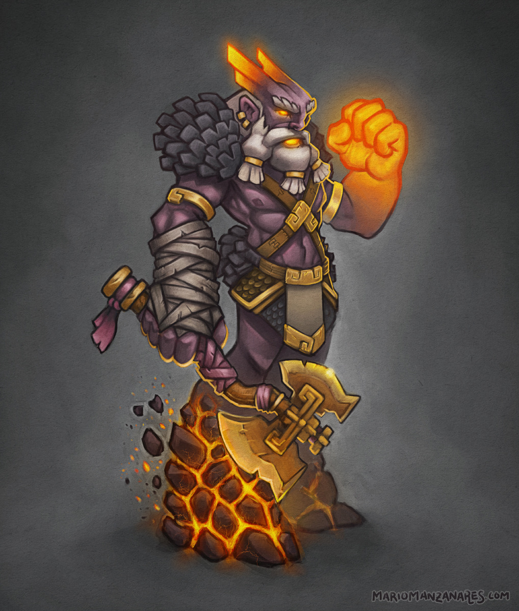
So here's my new approach. I've worked in the silhouette, pattern and colors. What do you think? I'm pretty happy with this one and I can't wait to render the concept and work on the lighting.
Here's the axe concept art. I can't wait to sculpt it in Zbrush. Some advices?