Need help texturing weathered car paint

polycounter lvl 14
Hello, some time back i started working on a model from i concept i found on deviant art.
I was mostly satisfied with the piece until i started texturing it, and that's where i hit a wall and started going in circles, no matter what i did i couldn't get that old and matted car paint look.
So it seems i don't know what I'm doing with this ( obviously ) i would like to ask for help on getting that car paint to show up properly ( or at least not look like a toy car plastic )
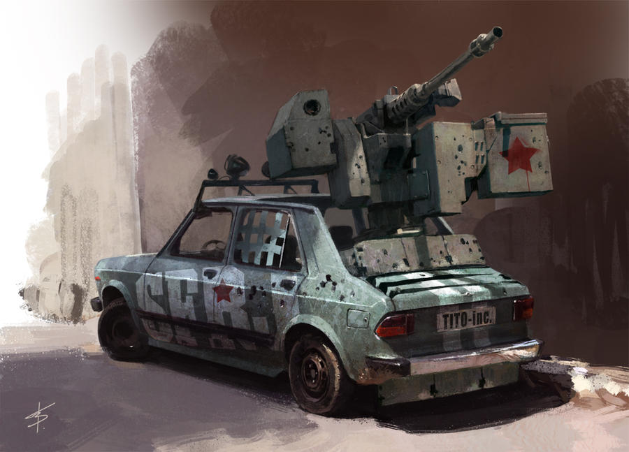
concept:
My "interpretation" :


And here are the textures:

Also i should say that these images were rendered in marmoset without any post processing so you could get a clearer picture of the mess I've made
Again any help would be greatly appreciated
I was mostly satisfied with the piece until i started texturing it, and that's where i hit a wall and started going in circles, no matter what i did i couldn't get that old and matted car paint look.
So it seems i don't know what I'm doing with this ( obviously ) i would like to ask for help on getting that car paint to show up properly ( or at least not look like a toy car plastic )
concept:
My "interpretation" :
And here are the textures:
Also i should say that these images were rendered in marmoset without any post processing so you could get a clearer picture of the mess I've made
Again any help would be greatly appreciated
Replies
Then make the gloss map a bunch darker and make the light spots on the specular a little lighter and the medium and dark tones a bit darker
Stuff like dirt shouldnt catch any light, make them almost black on gloss and specular
You gotta think that the rougher the surface is , the less light it reflects. The more aged paint and wear it has, the less it reflects. The bullet holes which show the blanc metal would reflect a lot more, or the scratches where the paint is off.
https://www.google.com/search?q=JUNKYARD&tbm=isch&tbo=u&source=univ&sa=X&ei=YZvqUcfrCYKOyAHkiYHADg&ved=0CHEQsAQ&biw=1680&bih=925
hope i will have an update soon
ty again
Added some rust, dust, scratches and weathered paint onto the base paint layer, that junkyard images really helped me to understand goes on with the painted metal when it's exposed to the sun for a long time
Oh, and there is one more thing, does the color look more blue or more gray-green-blue? ( two monitor issue, i think i need to calibrate them or do something )
And here are the specular and diffuse maps, didn't use gloss map this time
Would be nice to hear some critique/feedback from you guys.
Is the cartoon look intentional? Because the concept art seems a bit more realistic. If it is intentional then it's pretty good, but I would like it even more with realistic style.
Keep it up! ^^
The thing is metal/paint and car surface looks like galvanizes metal ( at least to me ) which makes little sense when you think about it, but ill try to implement that in some "makes sense" way
Will also crank up the Ambient occlusion on the diffuse it has it now but it does have little effect now that you mentioned it.
And i will definitely put that "WASH ME" somewhere
Thank you guys for feedback ill be back soon as i have something new to show
diffuse only look, from certain angles, i am missing something big here but i can't pinpoint
what...
My guess is the light source is washing out my spec map from certain angles, and i understand
that it is normal but it is washing out almost all of the specular property of the material...
Maybe adding more light or adjusting settings of the existing ( 1 light ) would help ?
Also the car paint material now looks ... better
Maybe it's just me, I've been looking too much at it and overloaded, need your critique on this
one, and any other comment and critique you might have are very welcome
This last image shows the issue... nothing "happens" with the materials ( maybe but "maybe" wheels ) bare metal around bullet entry points is, or rather should be
reflective... but if that were the only issue i would be happy.. looks like diffuse
only.
Sorry for the long post, and as always any comments and critiques are very much
welcome.
It would be nice to see your new texture maps.
From what I can see your maps are using flat colours and havn't enough variation. You need to add some noise to them. Find an image of noise for the material you are creating and layer this over your texture.
Below is an example from a quick google image search of what I mean by noise. That is noise from a metal material.
http://www.google.co.uk/imgres?hl=en&biw=1404&bih=959&tbm=isch&tbnid=DcmQ5KDtOsMGAM:&imgrefurl=http://thesludgelord.blogspot.com/2012/03/merdarahta-are-back.html&docid=MHZG65By3OU7CM&imgurl=http://f0.bcbits.com/z/34/22/3422505497-1.jpg&w=350&h=350&ei=4TwzUqhG5sTsBvWqgfAI&zoom=1&ved=1t:3588,r:3,s:0,i:89&iact=rc&page=1&tbnh=174&tbnw=194&start=0&ndsp=32&tx=79&ty=53
more noise, and variations in diffuse.
It is my considered opinion that whatever it is it should be some subtle change, like you
suggested, to give it more metallic look, since i ( think
Anyways here are the flats Diffuse and Specular ( no gloss )
Should have uploaded these before .... After all i was asking for texture correction
Maybe this will help
them that good, every time i implement them i get some dulling results ( cause I'm not using them properly ) spec map controls how "shiny/reflective" surface is and gloss controls the sharpness of the reflected "image/reflection" ??? or am i totally off here ?
Thank you for the image of surface defects, its gonna come in handy when i revise the
textures, and hopefully implement gloss maps ( have to go back and research those in depth )
Thank you all for the feedback and help, i wanted to get this piece done but I'll put some more
time in it to make it better
Regarding the gloss map yes you are along the right lines. In Marmoset you can test out the way the gloss works in a very basic sense to get a feel for what it does. The gloss map is the equivalent of the specular sharpness slider. What I sometimes do is move the specular sharpness slider until I get a level I like. If this is a low number then the gloss map needs to be dark if it's a high number then light. So a dark map means low gloss - large highlights. A light map means high gloss, sharp highlights.
I'm going to link you to Racer's texturing tutorial because I learnt everything from this. http://oesterkilde.dk/racer445.html
I know I'm always linking this in these forums - but it's just so good!
I've been busy with some other work in the past... two months, but now I'm back on this one (again).
All of the C&C were very much welcome and i think I've managed to implement them to "some" degree into the texturing process, and while i am aware that it does not look like the textures improved very much from the last post ( which was almost a month ago ) i have learned a lot about material properties ( mainly gloss ) but somehow i just cannot implement it right.
Also what may be causing the problem is the fact that this is a very low poly, with lack of "physical" details ( details are 90% of the time just normal map, like door handles ) and its 1024x1024px in size.... but then again people ( on this forum at least ) have proven that better results can be achieved with even smaller textures.... soo no excuse there
On the note of low poly, maybe I'm taking screenshots too close, and that 1024 is popping out?
I will definitely spend some more time on this one fiddling with the textures and so on, but as always comments and critiques are more than welcome, after all that's why i am posting the images
And here are the flats, this time with gloss map
it didn't have as much grunge and damage, but i guess the tiny details such as rust and
scratches were not meant to be in the concept, so i guess it's ok ?
Also I've learned a lot from doing this piece, ( after all it's been a few months
generally full of bad practices, such as bad UV's too much low poly in some places and parts
such as the machine gun it's essentially only a square with a some floating geometry here and
there and the list goes on, but it's not in vain since i know now what to pay attention to next
time i start something.
-@ Alemja -Ah yes, the text on the side, i didn't have the right font in the beginning so i
skipped that part until i get the font, still looking for the font, looks like some sort of slab-serif but i can't find the right one, looks like ill have to contact the concept artist and ask him about this, i think the colors would benefit from some more white and definitely from that red to break up the blues and give some more material/color variation
-@ ToffeApple - Thank you, and yes everything gets another "pass" since i would like to include the gloss maps ( nothing except car chassis has them at the moment ) and make some more material differences, the gun, wheels and even the inside of the car will get some more attention
Thank you all for comments and critiques