Home 3D Art Showcase & Critiques

Gun Modelling Practice

polycounter lvl 12
Offline / Send Message
Leinad polycounter lvl 12
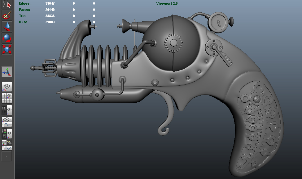
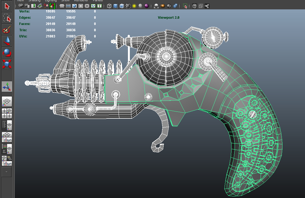
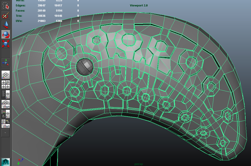
So I decided to change things up and model a gun inside maya. While googling I came across a wonderful concept art done by Greg Broadmore. So I had nothing to do with the design, only modelling. Feedback would be awesome!

The current version is not an exact replica of the concept, this was done intentionally to ease the modelling/animation (will be animating small pieces after I finish the model).

Here is the concept (not done by me):
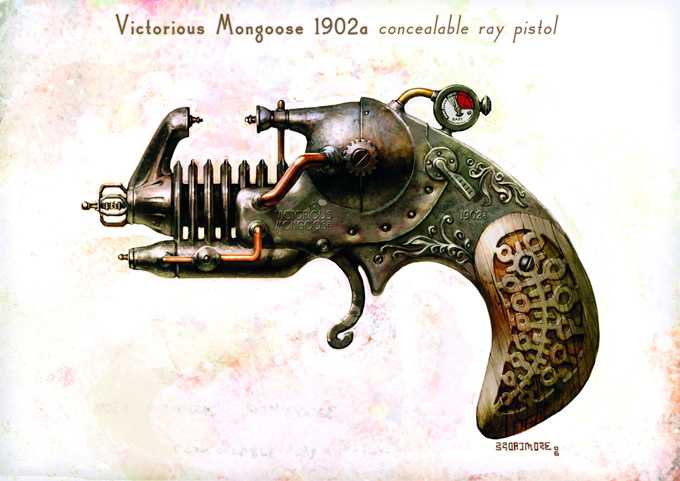
greg+broadmore+gun.jpg

WIP:
image_1.jpg
image_2.jpg
image_3.jpg

Replies

  • haz3y
    The only nit-pick I can muster would be that some of the cylindrical/pipe pieces are a bit thinner than what appears in the concept. Other than that, I'd say this is really coming together. Looking forward to updates.
  • PyrZern
    Offline / Send Message
    PyrZern polycounter lvl 12
    Are you gonna make a lowpoly to bake normal map ?
  • Leinad
    Offline / Send Message
    Leinad polycounter lvl 12
    Hey guys sorry for the long delay on an update. I recently picked this back up, like 2 days ago, and brought it up to a point where I felt it needs to be posted on polycount. Here it is, I'd love to hear what you think of it.

    Marmoset_ScreenGrab.jpg

    Wires.jpg

    All_Maps.jpg
  • Joltya
    Offline / Send Message
    Joltya polycounter lvl 10
    Cool concept! I think the biggest problem is that there really isn't that much variation in the specularity, especially on the handle. You have a lot of metal on here, which means you should have a higher specular than what you have.
  • Leinad
    Offline / Send Message
    Leinad polycounter lvl 12
    Yea, I am still grappling with fully understanding spec and materials in my models. I'll definitely revisit it and make some adjustments. Thanks for the feedback Jolt! :)
  • Kroma!
    Offline / Send Message
    Kroma! polycounter lvl 9
    Yes similar to JoltZero, but I feel that the main bulk of the green diffuse needs more variation. Compare it to the concept and you can see it has browns, reds and yellows. Bringing some of these in combined with the specular variation and it will break up that flat look. :)
  • Sardu
    Offline / Send Message
    Sardu polycounter lvl 5
    Looks great but you should probably get a little more aggressive with the coloring on the main part of the gun. A lot of your details are getting lost because they look so light, making the texture seem a bit bland.
  • Leinad
    Offline / Send Message
    Leinad polycounter lvl 12
    Last night I decided to revisit this asset and do a PBR pass with some of the new methods I've learned. So here is what I have now, I'd love to hear what you guys think. I am using 2 versions on my site, one is modified in post in photoshop, and the other is an unmodified version (screengrab from marmoset 2).

    beautyShot.jpg

    ScreenGrab_Marmoset.jpg
  • DWalker
    The materials in your version and the concept seem very different. The metal in the concept looks to be aged bronze with serious verdigris. The wooden grip is a much paler wood (overall), which provides more distinction between the metal & wood. The overall feel from the concept (at least to me) is of an aged piece.
  • Leinad
    Offline / Send Message
    Leinad polycounter lvl 12
    I agree, they do look different (it's challenging to get it right, still working on it). My main concern in the revision was to make sure the materials were well defined. For example, making sure the metals look like metal and the wood like wood. I allowed myself some artistic license to make the process more enjoyable. The lighting conditions could be a big part of why the bronze doesn't look like bronze. I am still trying to figure out this whole PBR thing. =P

    If the choices I've made reduce the overall appeal of the model, I'll make the necessary changes. I wasn't a big fan of the light wood color of the original concept so I changed it.


    CombingingMaps.jpg
  • Leinad
    Offline / Send Message
    Leinad polycounter lvl 12
    I figured I'd post this here as well. I revisited texturing this gun using substance painter. Like usual, feedback/critique would be awesome!

    Color.jpg

    Wires.jpg

    Maps.jpg
  • nickcomeau
    Offline / Send Message
    nickcomeau polycounter lvl 4
    Hey! As for the most recent shots, I'd say you're materials aren't looking very accurate yet. Even just the coloring, not even thinking about the spec yet. To be fair they're not spectacular in the reference but still. Also, I would personally use a metalness map approach for this object instead of a spec map approach for this particular object. It could give you some really nice results!
  • Leinad
    Offline / Send Message
    Leinad polycounter lvl 12
    Thanks for the feedback Nick.

    The model is using Metalness workflow. The metalness map is in the bottom right corner of the texture sheet I posted. It's the one that is black and white. The roughness is on the bottom left, normal is on the top left, and albedo is on the top right.

    I've been going back and forth on how much of the concept I want to follow. I've seen Weta studios interpretation of the concept, and used that for reference as well. They didn't quite follow it too closely either. Granted, I did have more of the original color in place, however after playing around with different colors I thought this version looked a bit better.

    My main goal on this model revision (the most recent update) is making sure the metals look like metal and the wood looks like wood. On personal projects I leave a little room for happy accidents. Granted, if the model clearly looks worse due to the chosen colors, then I would definitely make adjustments accordingly.

    Here is what Weta did:

    drgvmongoose01blrg2.jpg
  • Leinad
    Offline / Send Message
    Leinad polycounter lvl 12
    Here is another image that may more properly illustrate the materials. I may need to play around with the environments in marmoset to better show off the model.

    The previous chosen environment had a lot of diffused lighting which may be washing away a lot of the material surfaces.

    Let me know if this looks better. This is the same exact model and settings, just a different pbr environment in marmoset.

    Edit: I just noticed some artifacts in the normal map when I changed the lighting environment... Made me cringe lol! Gotta fix it now!

    screenshot095.jpg
  • Nosslak
    Offline / Send Message
    Nosslak polycounter lvl 12
    I think you should remake the grip as it doesn't match the concept very well (it should be wider than the metal it touches and the insets need to be deeper and/or bevelled better). The grips wear need to be tuned down a lot, both in the size of the wear and the opacity as it's just too much right now. The base wood needs to be a lot darker as well.

    You should also add some localized dirt as well where the different pieces touch each other.

    It's a good start but the wood needs a lot more work. Wood is very difficult to get right with PBR (IMO) so keep at it.
Sign In or Register to comment.