3D NOOB looking for crit.
Hey Polycount!
So I decided in early June that I wanted to become a 3D modeler and texture artist for the game industry. I have a BFA in furniture making, so I have a solid foundation in the traditional arts, but have never modeled/textured before in my life before this June. I am posting the first 3 things I have put together so far, and would love some feedback on
-The models themselves (Suggestions on best practices, shapes, etc.)
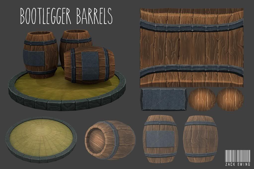
-Textures (I am still not satisfied with my wood texturing, but I think it is getting there.)
-Page layouts
-Whatever you notice, as I said I have been doing this for about 6 weeks, so I have no idea what I am doing right/wrong.
I have been all over the Wiki, which has been invaluable, and I have just scratched the surface.
Thanks for being such a strong community, it has been awesome to read through these forums for inspiration, advice, etc. over the last few weeks.


Replies
I myself just started 3D about a year ago, and I've learned SO much... and still have such a loooong way to go! And... I reallly need to post some 3D stuff..argh!
So in detail...
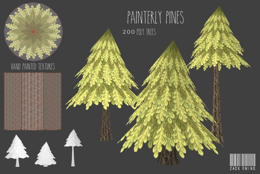
The trees leaves could use more love, more shadows and light, more color variation, less "outlined" feeling, more painted. The bark seems a little noisy and doesn't read very well as bark (but bark is really hard to do, I know...) I'd love to see that tileable in a bigger version to give you some critique (if I have something that might help)
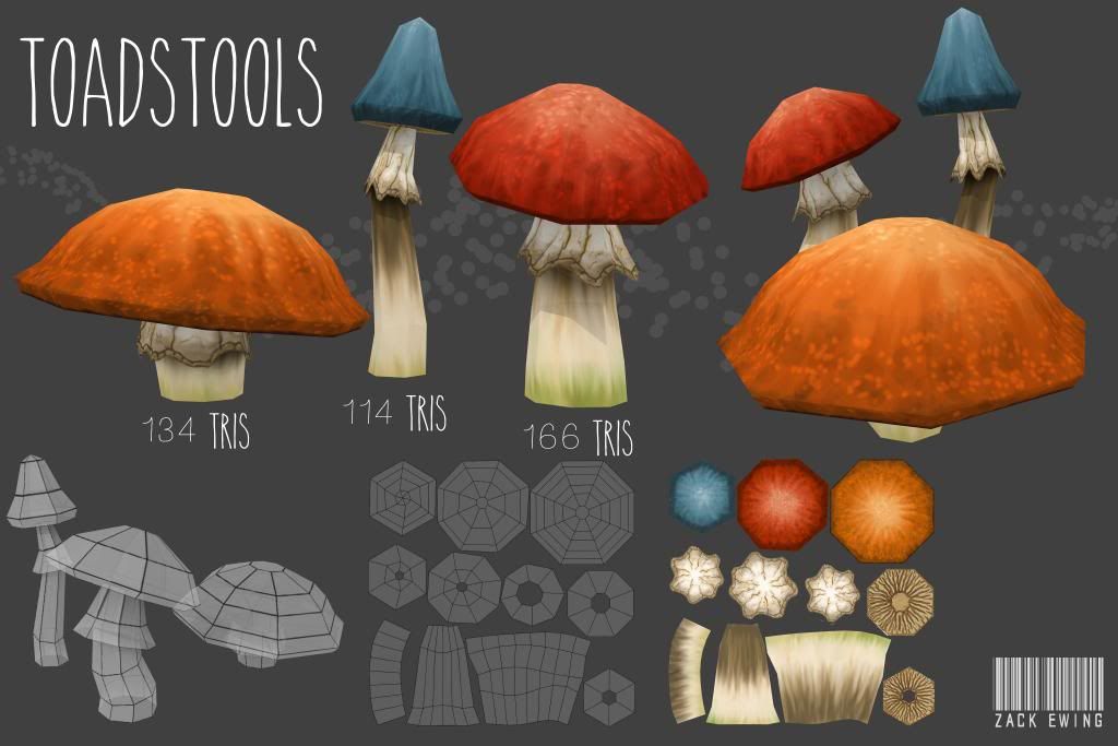
Those tiny silhouettes look really sweet to me! (trough with the alpha applied the shape is a little different!)
Those shrooms look really damn sweet to me. I love those shapes, and the texture are also great.
And for those barrels... I'd love to see an encarving into the metal... like a brand or so =D
Everything else looks fine.
All in all, great work, keep it up.
Like the others the only thing that bugs me is the tree, which is looking quite good already, but the leaves shading look a bit "flat" I think, which contrasts with your other works.
The tree's bark looks ok to me but the tiling is quite visible because of this little "bevel" I think:
I'd go with a more square texture tile (I think yours is a bit more rectangular) and do a bit more variations so you don't feel the tiling so much.
If you are planning to do some normal map you could always give the Nvidia Texture tool for Photoshop a try to give more depth to the bark
I'm a noob myself though so it's just my personal feeling :poly136:
Keep up the good work!
Right now my big focus is on creating MORE stuff rather than really refining some of the stuff I have already thrown up, I think once I have a good 10 complete models under my belt I will go back and give the trees some new love.
Thanks again for all the advice, and thanks Yedp for the NVIDIA plugin suggestion, that looks like a bitchin' tool.
Any feedback is welcome and appreciated!