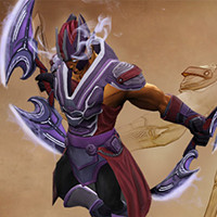
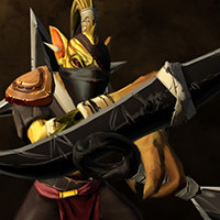
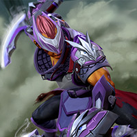
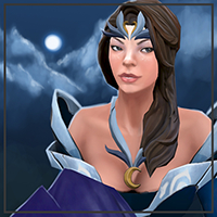
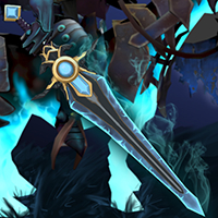
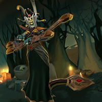
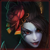
The other thing I thought I'd start with doing is documenting a little of my progress. I started as a 3d artist on forums, so usually I have a WIP thread somewhere I can refer people to. This time I neglected that, so I thought I'd take the chance to show a little of what I have.
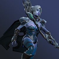
So for the Drow set, I started with concepting, blocked out the shapes I wanted using subpatches in Modo, and then built the high poly meshes using either subpatches or sculpting in Zbrush. I'd love to have done all the high poly meshes in Zbrush, but I feel subpatches still give me more control and cleaner meshes than Zbrush does. Something I'll be looking to work on.
Converting most of the high poly meshes to game meshes was pretty easy, just a simple retopology. I almost always came in within budget as well. In some cases I had to redo the low poly to get a better normal map baked.
There were some which were a real pain though, like the bow.
I'm not sure how many times I redid this nearly from scratch, 4 maybe? I guess the problem was that the forms were too "low frequency", and weren't easy to get into single polygons without spoiling the silhouette and losing detail. Thankfully it comes out pretty well in game and in the latest marketing images, but I definitely feel that I could have used another 20-30 polys for the bow.
The other bit I had to redo was the cape.
I don't have the old normal map any more, which I would have liked to upload and show, but the retopology which should have been really simple created a ton of problems with the normals. For my second try I decided to put all the polygons on the dense subpatch edges which defined the cape, and that gave a much flatter and more even map. After that I sculpted the low poly slightly to give it shape.
The final in-game models look like this when rendered in Modo.
I definitely think I need to work on the texturing and sculpting aspects. Probably a lot could be improved.
And as a side note on style, I've had several comments telling me the set isn't crazy enough. It's not different enough from the default Drow set for them to consider buying it apparently. Personally I think that this more subtle style fits better into Dota 2's requirements, but everyone will have their own take on that. That's certainly not to say that I'm against using other awesome colours or the like. My next set if I start on it will be a be a little more dramatic. I'm was (and am) a little worried that the voters wont take to it, but the reaction so far as been quite positive. I'd love to hear your thoughts on style and such.
Not to mention seeing Valve's animations bring the model to life was extremely gratifying. Great experience.
Have uploaded a couple of alternative blades for the Spec set.
Items are here:
Also, I've been doing a bit of concepting/painting practice. Playing around with different workflows, trying out stuff I've seen other people doing, trying to get better lighting into my textures. Probably will turn this concept into a DK weapon. Inspired by Lenny's SK and CK blades
Yup! I realised after reading a couple of posts here today that the files I'd worked with were about 20% smaller than the in-game model, so I've updated the workshop item and preview images with the latest version.
Check it out on the workshop - link in the first post. It's much bigger and longer now.
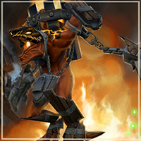
Warlock golem progress images! Most of these images were posted in the Workshop Thread before, so I'm just compiling them here for people who want to see the process in full.
The original concept:
The idea was to create a demon patched together with battlefield remnants into a golem, something like the Draugr from The Witcher 2. That didn't really come across in the concept though, and even though I added more odds and ends to the final model, it didn't really come across there either. I just let the model go the way it seemed natural for it at the time.
A couple of sculpt base variants:
I chose the first one, and this is the near final sculpt from it, just missing the rune thing on the back of the lock, which I added in just before I uploaded it to the workshop:
A lot of people wondered how I was going to retopo the chains whilst I was sculpting them, so here's the LOD0 in Modo. I had to cut nearly 1k polygons to get to the LOD1, a lot of which came from the duplicated chains and fingers. The bakes came out really well, so that helped a ton. Leftmost is the plain mesh, middle with normal maps, final with diffuse and normals.
You can see the final model in-game via the workshop link in the first post of this thread.
As a bonus, slightly up-res-ed version of the near final promo art.
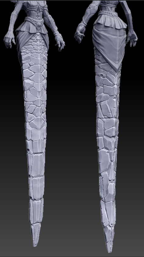
Realised I'd never finished the WIPs for my medusa tail, so here they are.
Couple of test bakes:
And what the near final item looked like in-game. The animation worked out pretty well, you can see that on the final submission, which I've added to the first post.
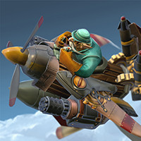
I've also been working slowly on a Gyro set that I hope to finish somewhere within the next one or 2 weeks. I'm more or less done with the wings and prop, and have been making headway on the rocket launchers.
I'm hoping I've not overdone the techy detailing on the rocket launchers, since I basically just let myself concept and sculpt it on autopilot almost. Think it should still fit into the overall theme, and not be too high tech for Dota 2. I'm also thinking of just finishing the missle next and leaving the headslot as default; Don't think I've got too much to add to that piece.
I think this Gyro set is looking pretty cool, my only concern is with the wings. Have you check it against the alt idle animation? The wing falls off and he pulls it back on. Looking at these wings it might look like he uses the force to reattach the wing
Most of the idle alt is fine, just a little bit at the end where the hand is slightly further out than the wing when he reaches down a second time, but it's not too bad.
Long overdue WIPs! Had meant to put these in the thread the week after the Gyro set went into the workshop. Link to the workshop item is in the first post.
I'm really proud of the set even though it didn't get much attention in the workshop. That seems quite typical of non-sponsored gyro items, but nevertheless I don't have high hopes.
And the final set in marmoset for the promo:
Since then I've been slowly working on a single QoP hair piece for Fox.
Some updates for the models I've been working on these last few months.
First, the Flor de Flamenco QoP hair I did with Foxclover, who's also responsible for the lovely promo image. More images are in the steam workshop page linked in the first post of this thread.
Promo Image:
Showcase View:
I also finished up a sort of experimental Bounty Hunter set with Mimeo who did the 2d sketches. I finished up the rest whilst trying to translate his sketch to the Dota 2 style without compromising either. Also worked on getting the colours and textures right this time round. Fairly satisfied with the technical qualities of the result, though I think I have a ways to go in terms of making really appealing designs by myself. Especially for 2d promo images. The community's reaction has been divisive as is normal with most of my submissions.
Kunai Sculpt:
Shuriken and Man Catcher Sculpts:
Mask Sculpt and Bakes:
Yukata/Pads Sculpt:
Promo Image:
As before, in-game images are in the steam workshop link on the first post. The set also has quite a few alternative items that didn't get their own sculpts, so those can be found on the workshop as well.
Is that the final diffuse or just the colors? If it's the actual diffuse, I think some more color variation and gradients would help a lot. It does look much better ingame, and maybe that's just personal preference, but I'd like to see some extra color gradients on stuff like the blade, the shoulder padding and perhaps some scratches on the chest metal, just to make them less flat and even.
Still, I gotta say I love the set. All of the different materials look incredibly stunning put together, specially the whole armor piece. The visor is also straight up badass.
How did you sculpt the shoulder padding material by the way? You used an alpha, or just made the whole pattern by hand?
Hey man. Can you detail your texturing process a bit more. I am very interested.
I'll do up a tutorial when I have time, but as it stands that's probably going to be after New Bloom ends. In a nutshell there's very little hand painting - that's only for the highlights on the blades and for the white dragon motifs. The rest is colours with an ambient occlusion bake set to multiply, matcap bakes set to overlay and soft light, and a cavity map on soft light. All the texturing comes from the matcap bake (so all the texturing comes from the sculpt).
Is that the final diffuse or just the colors? If it's the actual diffuse, I think some more color variation and gradients would help a lot. It does look much better ingame, and maybe that's just personal preference, but I'd like to see some extra color gradients on stuff like the blade, the shoulder padding and perhaps some scratches on the chest metal, just to make them less flat and even.
Still, I gotta say I love the set. All of the different materials look incredibly stunning put together, specially the whole armor piece. The visor is also straight up badass.
How did you sculpt the shoulder padding material by the way? You used an alpha, or just made the whole pattern by hand?
Thanks for the comments! That's the final diffuse actually. I think the reason why it looks better in-game is because I've used the masks to influence the gradients that you see on the blade and such. I've kept the colour map as much for colour only as I could. All the lighting/spec based gradients are in the masks, as are the metal effects. If you look at the loadout view the front armour has a subtly scratched look which blends into a nice gradient in the game view.
I'll keep the comments in mind though. The blade looked much better after I introduced some colour gradients, so I'll consider looking at that for stuff like the pauldron. I've actually got the gradients in the .psds already, I'm just not using them.
Oh, and the padding material is a noise alpha. Though I did additional sculpting along the padded edges.
I'll do up a tutorial when I have time, but as it stands that's probably going to be after New Bloom ends. In a nutshell there's very little hand painting - that's only for the highlights on the blades and for the white dragon motifs. The rest is colours with an ambient occlusion bake set to multiply, matcap bakes set to overlay and soft light, and a cavity map on soft light. All the texturing comes from the matcap bake (so all the texturing comes from the sculpt).
Thanks for the comments! That's the final diffuse actually. I think the reason why it looks better in-game is because I've used the masks to influence the gradients that you see on the blade and such. I've kept the colour map as much for colour only as I could. All the lighting/spec based gradients are in the masks, as are the metal effects. If you look at the loadout view the front armour has a subtly scratched look which blends into a nice gradient in the game view.
I'll keep the comments in mind though. The blade looked much better after I introduced some colour gradients, so I'll consider looking at that for stuff like the pauldron. I've actually got the gradients in the .psds already, I'm just not using them.
Oh, and the padding material is a noise alpha. Though I did additional sculpting along the padded edges.
Nope. You'd get the same effect (or potentially an even better effect due to ZBrush's lighting) if you used his method and stitched the different maps together, but I'd like to think my method takes a lot less time. Mine bakes the entire matcap at once in Modo.
My method is, because Modo does the baking. If you have a 3d software that supports matcaps then you probably could just do the same thing by dropping a matcap on and pressing bake. Might be able to do it in Blender.
If not you're out of luck as far as this process goes.
Hey man, Do you have Skype? I am doing some baking tests in Modo, and im having a hard time to make a metalic texture for the armor im working ;(
I do have skype, but I don't use it much any more.
Check out the Creating Point Light maps tutorial in the first post of this thread. That process will bake metallic lighting into your low poly for you. I'll get round to putting this new process into a tutorial when I've got a bit more free time.
Okay, ill just ask the lighting process of yours. Are you baking it allof them in Modo alltogether? or one by one? cause i tried to bake them parts by parts, separate the head to the shoulder armor, to the torso armor. etc. then the lighting doesnt match to each. cause everytime i baked them by parts, i need to move the light to get some nice reflections. Do i need to baked them all together first in Xnormal, then baked the lighting in Modo??
I bake all the items individually in Modo. Even within single items I separate the items into components and bake them separately so there won't be artifacts from overlapping components.
With the pauldrons on the AM set for e.g. there's 2 parts: The top purple padding and the combined side padding + armour. I bake the top padding separate from the side padding in Modo and then combine them together in Photoshop.
My lighting looks even because I choose very carefully which direction of lighting I use to bake. In some cases I will even bake lighting from a few directions and then photoshop them together to make a nice evenly lit bake. This was the case for the hair piece that's in the AM set on the workshop (the picture of the hair in this thread is outdated).
I don't think you need to bake them in XNormal and then in Modo. Either everything in XNormal or everything in Modo would be fine. I find that XNormal and Modo don't bake in the exact same way using default settings, so I suggest not mixing maps baked by both unless you know how to accurately control your bakes.
Hi SnowStorm, Thank you for the reply. Im really having hard time to use the lights cause i never make lowpolys before, (flatshade) color, And its really hard for me to make some lighting on the texture. Hope you can do more tutorials on how you use point lights in Modo, regarding in all of the armors of the character.
Updates and preview. The bake looked pretty good, but ultimately I still needed to do some manual corrections via painting.
And here it is in-game. The ribbon over the back of the hair is kinda obscured, and I chose not to mirror the ribbon and ended up sacrificing a lot of UV space because of that.
Overall I think I'm decently pleased with how it turned out. It's a little underwhelming from the showcase view, and also because the arrows obscure so much of the already low res ribbon. Had to bend the ribbon inward because of the arrows too, which kinda reduced the interesting silhouette of the hairstyle. Need to work more on my UV layouts.
Replies
So for the Drow set, I started with concepting, blocked out the shapes I wanted using subpatches in Modo, and then built the high poly meshes using either subpatches or sculpting in Zbrush. I'd love to have done all the high poly meshes in Zbrush, but I feel subpatches still give me more control and cleaner meshes than Zbrush does. Something I'll be looking to work on.
Converting most of the high poly meshes to game meshes was pretty easy, just a simple retopology. I almost always came in within budget as well. In some cases I had to redo the low poly to get a better normal map baked.
There were some which were a real pain though, like the bow.
I'm not sure how many times I redid this nearly from scratch, 4 maybe? I guess the problem was that the forms were too "low frequency", and weren't easy to get into single polygons without spoiling the silhouette and losing detail. Thankfully it comes out pretty well in game and in the latest marketing images, but I definitely feel that I could have used another 20-30 polys for the bow.
The other bit I had to redo was the cape.
I don't have the old normal map any more, which I would have liked to upload and show, but the retopology which should have been really simple created a ton of problems with the normals. For my second try I decided to put all the polygons on the dense subpatch edges which defined the cape, and that gave a much flatter and more even map. After that I sculpted the low poly slightly to give it shape.
The final in-game models look like this when rendered in Modo.
I definitely think I need to work on the texturing and sculpting aspects. Probably a lot could be improved.
And as a side note on style, I've had several comments telling me the set isn't crazy enough. It's not different enough from the default Drow set for them to consider buying it apparently. Personally I think that this more subtle style fits better into Dota 2's requirements, but everyone will have their own take on that. That's certainly not to say that I'm against using other awesome colours or the like. My next set if I start on it will be a be a little more dramatic. I'm was (and am) a little worried that the voters wont take to it, but the reaction so far as been quite positive. I'd love to hear your thoughts on style and such.
Not to mention seeing Valve's animations bring the model to life was extremely gratifying. Great experience.
For convenience, if you'd like to see the individual items in-game the Steam workshop link is here:
http://steamcommunity.com/sharedfiles/filedetails/?id=155958475
Comments, critique etc are all welcome.
Here's one of the concepts I'm exploring to see if I can find something that looks nicer. Lemme know what you think!
I've drawn up some other concepts too, but they go against the look of the set. More Luna than Drow maybe. The one above is my favourite so far.
Updated the drow set a week or so ago with new boots and reworked bracers.
URL for the set is in the above posts.
Also, a preview/WIP of the Spectre set I'm working on.
--edit-- blade with shaders and textures applied
High Poly Renders, Zbrush sculpts + subpatch:
A concept vs final high poly comparison. Think I got most of it into the final model
Final model wireframe:
The set's not without its problems - I'm hoping Valve will get back to me on how to fix this purple lighting effect:
Items are here:
Also, I've been doing a bit of concepting/painting practice. Playing around with different workflows, trying out stuff I've seen other people doing, trying to get better lighting into my textures. Probably will turn this concept into a DK weapon. Inspired by Lenny's SK and CK blades
(I hadn't moved the crown at the time I made the white hair pic)
Thanks! Fingers crossed that it'll get in. But looking at the quality of submissions nowadays it'll be difficult.
In the meantime, submitted the Abaddon sword.
The reception for the CM hair has been utterly amazing. I still don't know what made it so popular lol. I guess people really love CM.
And a new jugger sword WIP:
Check it out on the workshop - link in the first post. It's much bigger and longer now.
(that's what she said)
The original concept:
The idea was to create a demon patched together with battlefield remnants into a golem, something like the Draugr from The Witcher 2. That didn't really come across in the concept though, and even though I added more odds and ends to the final model, it didn't really come across there either. I just let the model go the way it seemed natural for it at the time.
A couple of sculpt base variants:
I chose the first one, and this is the near final sculpt from it, just missing the rune thing on the back of the lock, which I added in just before I uploaded it to the workshop:
A lot of people wondered how I was going to retopo the chains whilst I was sculpting them, so here's the LOD0 in Modo. I had to cut nearly 1k polygons to get to the LOD1, a lot of which came from the duplicated chains and fingers. The bakes came out really well, so that helped a ton. Leftmost is the plain mesh, middle with normal maps, final with diffuse and normals.
You can see the final model in-game via the workshop link in the first post of this thread.
As a bonus, slightly up-res-ed version of the near final promo art.
And also taking the chance to update this thread
Realised I'd never finished the WIPs for my medusa tail, so here they are.
Couple of test bakes:
And what the near final item looked like in-game. The animation worked out pretty well, you can see that on the final submission, which I've added to the first post.
I've also been working slowly on a Gyro set that I hope to finish somewhere within the next one or 2 weeks. I'm more or less done with the wings and prop, and have been making headway on the rocket launchers.
I'm hoping I've not overdone the techy detailing on the rocket launchers, since I basically just let myself concept and sculpt it on autopilot almost. Think it should still fit into the overall theme, and not be too high tech for Dota 2. I'm also thinking of just finishing the missle next and leaving the headslot as default; Don't think I've got too much to add to that piece.
I think this Gyro set is looking pretty cool, my only concern is with the wings. Have you check it against the alt idle animation? The wing falls off and he pulls it back on. Looking at these wings it might look like he uses the force to reattach the wing
Awesome, can't wait to see it all together
I'm really proud of the set even though it didn't get much attention in the workshop. That seems quite typical of non-sponsored gyro items, but nevertheless I don't have high hopes.
And the final set in marmoset for the promo:
Since then I've been slowly working on a single QoP hair piece for Fox.
First, the Flor de Flamenco QoP hair I did with Foxclover, who's also responsible for the lovely promo image. More images are in the steam workshop page linked in the first post of this thread.
Promo Image:
Showcase View:
I also finished up a sort of experimental Bounty Hunter set with Mimeo who did the 2d sketches. I finished up the rest whilst trying to translate his sketch to the Dota 2 style without compromising either. Also worked on getting the colours and textures right this time round. Fairly satisfied with the technical qualities of the result, though I think I have a ways to go in terms of making really appealing designs by myself. Especially for 2d promo images. The community's reaction has been divisive as is normal with most of my submissions.
Kunai Sculpt:
Shuriken and Man Catcher Sculpts:
Mask Sculpt and Bakes:
Yukata/Pads Sculpt:
Promo Image:
As before, in-game images are in the steam workshop link on the first post. The set also has quite a few alternative items that didn't get their own sculpts, so those can be found on the workshop as well.
Final Sculpts:
Bakes (Ambient Occlusion, Matcap/Diffuse, Cavity)
Final Colours (After quite a few days of experimentation):
In-game with the whole set:
Belt and visor are due for remakes as well.
Still, I gotta say I love the set. All of the different materials look incredibly stunning put together, specially the whole armor piece. The visor is also straight up badass.
How did you sculpt the shoulder padding material by the way? You used an alpha, or just made the whole pattern by hand?
I'll do up a tutorial when I have time, but as it stands that's probably going to be after New Bloom ends. In a nutshell there's very little hand painting - that's only for the highlights on the blades and for the white dragon motifs. The rest is colours with an ambient occlusion bake set to multiply, matcap bakes set to overlay and soft light, and a cavity map on soft light. All the texturing comes from the matcap bake (so all the texturing comes from the sculpt).
Thanks for the comments! That's the final diffuse actually. I think the reason why it looks better in-game is because I've used the masks to influence the gradients that you see on the blade and such. I've kept the colour map as much for colour only as I could. All the lighting/spec based gradients are in the masks, as are the metal effects. If you look at the loadout view the front armour has a subtly scratched look which blends into a nice gradient in the game view.
I'll keep the comments in mind though. The blade looked much better after I introduced some colour gradients, so I'll consider looking at that for stuff like the pauldron. I've actually got the gradients in the .psds already, I'm just not using them.
Oh, and the padding material is a noise alpha. Though I did additional sculpting along the padded edges.
Are using Pior's method for matcap baking?
If not you're out of luck as far as this process goes.
I do have skype, but I don't use it much any more.
Check out the Creating Point Light maps tutorial in the first post of this thread. That process will bake metallic lighting into your low poly for you. I'll get round to putting this new process into a tutorial when I've got a bit more free time.
With the pauldrons on the AM set for e.g. there's 2 parts: The top purple padding and the combined side padding + armour. I bake the top padding separate from the side padding in Modo and then combine them together in Photoshop.
My lighting looks even because I choose very carefully which direction of lighting I use to bake. In some cases I will even bake lighting from a few directions and then photoshop them together to make a nice evenly lit bake. This was the case for the hair piece that's in the AM set on the workshop (the picture of the hair in this thread is outdated).
I don't think you need to bake them in XNormal and then in Modo. Either everything in XNormal or everything in Modo would be fine. I find that XNormal and Modo don't bake in the exact same way using default settings, so I suggest not mixing maps baked by both unless you know how to accurately control your bakes.
Thanks man!
Sculpt's pretty much done at this point.
And here it is in-game. The ribbon over the back of the hair is kinda obscured, and I chose not to mirror the ribbon and ended up sacrificing a lot of UV space because of that.
Overall I think I'm decently pleased with how it turned out. It's a little underwhelming from the showcase view, and also because the arrows obscure so much of the already low res ribbon. Had to bend the ribbon inward because of the arrows too, which kinda reduced the interesting silhouette of the hairstyle. Need to work more on my UV layouts.