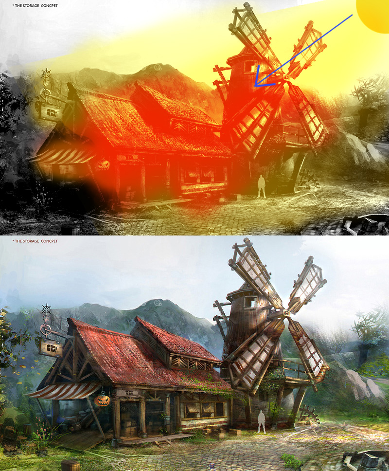
I'd suggest giving the roof a bit of a dip or sag to show some age and wear and tear. The side hut also look tall than the one in the concept, so maybe scaling the height will bring it closer. Also the wind blades or what have you is too far forward; it could be the perspective though.
Great progress so far and I love the clutter inside really gives life to the piece; just those few tweaks will help the piece. Keep it up and I look forward to more.
Your lines are way too straight at the moment. I think you really need to push some of the shapes and really look for where the bends are in the concepts. Other than that it's looking promising.
Here is my progress so far on this environment. I am going to be refining the assets and making the textures. Nothing here is final, as I add more details to the assets and textures things will probably be changed around. But I am excited with the progress. I probably will not be posting next week since I will be gone most of the week to celebrate the 4th.
@ Mr Significant Ohh. I did see that but I assumed that was from the perspective and not the shape of the building itself. However, that image you have is from my week one post, i added the curve to the roof in my week 2 post.
DWalker Yeah they are a bit narrow now that i see them, I will thicken them a bit, Thanks
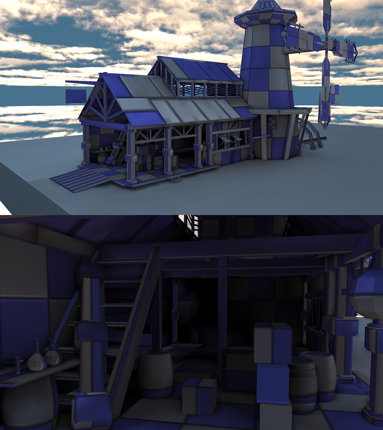
Easily distracted and slow workflow, however it's coming along. Here is my progress on the this environment. I haven't changed the post processing chain or added lights. I am just trying to finish up the last bit of textures and models. Help/Critique is always welcomed.
amile duan: Sorry I didn't do the concept, I found it on polycount.
Snafubar7: That sounds like a good idea, I'll give it a try.
Mr Significant: I haven't touched the background at all yet but thanks for he heads up. The yellow-ish cubes are stacks of paper, I am still working on the material and texture.
Hey Iamar McHaney
I see with one of the earlier posts you made, you mentioned that the concept wasn't yours. That's fine but just a heads up for the future you should really state that the very first time you post the concept. And it would probably be good to mention it is Zhang Hang's work with a link of where to find more of his work. Maybe he already said you could post it without mentioning him? But just in case he didn't I thought i would bring up this courtesy.
I agree with everyone else, in that, I see you curved the roof but the spline would look better with a curve as well. Also pulling out the peak of the roof in the front would match the concept more. I also think that the windmill blades could still be pushed further. They could be even fatter at the ends and much longer if you are trying to get the personality of the concept.
That was my mistake and sorry if i offend anyone. I found the concept in the Noob monthly challenge Thread, which is hosted every month. I didn't think it would be a problem posting the image however, I understand why I should have mentioned the artists name. I will make sure to mention the artist's name in the future. Thank you the courtesy and the critique, I will start working on those changes.
I am at my final stages of this piece. I am going to be fixing and adding some last minute stuff, then work on my post processing render to finish this off.
So, I fixed somethings that were pointed out to me. The main thing being the blurry terrain textures. I added a couple of shots because my roommate suggested I show the rest of the things I added to the environment.

Replies
Great progress so far and I love the clutter inside really gives life to the piece; just those few tweaks will help the piece. Keep it up and I look forward to more.
Keep it going! Subscribed
DWalker Yeah they are a bit narrow now that i see them, I will thicken them a bit, Thanks
amile duan: Sorry I didn't do the concept, I found it on polycount.
Snafubar7: That sounds like a good idea, I'll give it a try.
Mr Significant: I haven't touched the background at all yet but thanks for he heads up. The yellow-ish cubes are stacks of paper, I am still working on the material and texture.
I see with one of the earlier posts you made, you mentioned that the concept wasn't yours. That's fine but just a heads up for the future you should really state that the very first time you post the concept. And it would probably be good to mention it is Zhang Hang's work with a link of where to find more of his work. Maybe he already said you could post it without mentioning him? But just in case he didn't I thought i would bring up this courtesy.
I agree with everyone else, in that, I see you curved the roof but the spline would look better with a curve as well. Also pulling out the peak of the roof in the front would match the concept more. I also think that the windmill blades could still be pushed further. They could be even fatter at the ends and much longer if you are trying to get the personality of the concept.