Home 3D Art Showcase & Critiques

Another: m4a1 wip, asking for feedback

Hi all,

This is my second work I post here and.. I do realize all of you are tired of people posting their AR-15 rifles and stuff :). However, I'm practicing and learning subdivision modelling in Modo on this one. It's part of my little job anyway so I don't waste my time and I put more and more effort into things, just to develop my skills and techniques.


So: It's a project of a full AR-15 style set, from standard "old" m4a1 to latest block II sopmod with vast choice of accesories.
It's my first model I make with subdivision modelling, so the topology might not be perfect- I do realize it. However, if you have any tips on how I can improve it, please, comment.
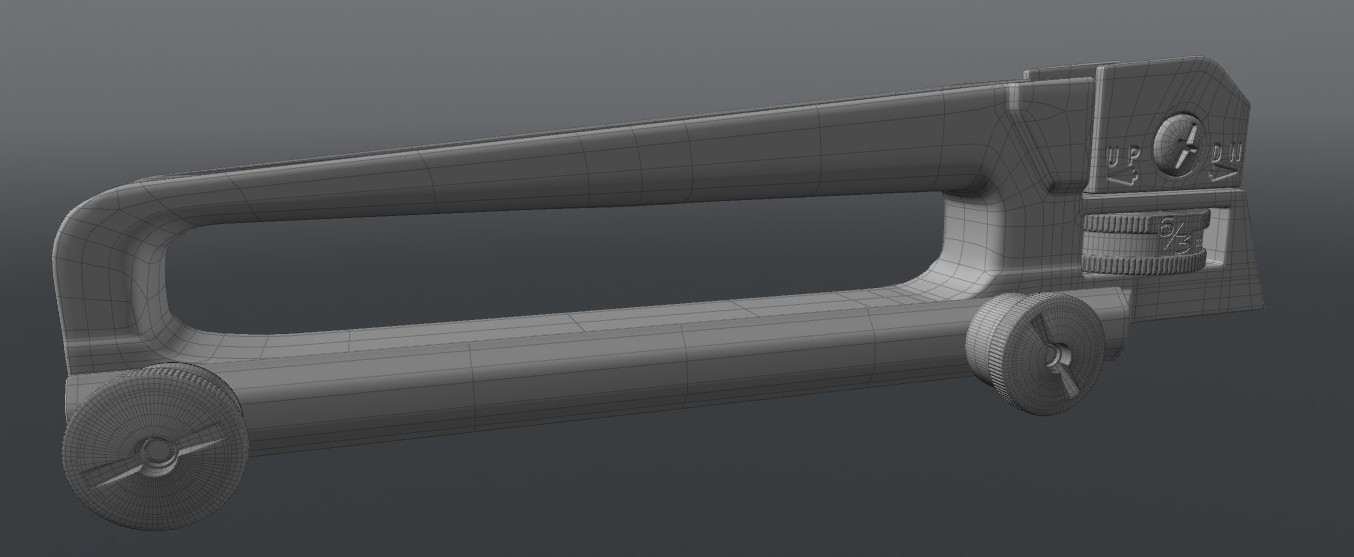
21.jpg


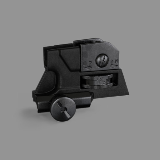
Also applied some basic materials to have some basic view on the model texture:
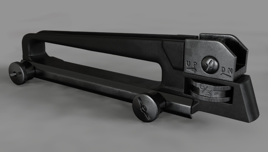
18.jpg
20.jpg
17.jpg

Thanks in advance!

Replies

  • gametime
    Offline / Send Message
    gametime polycounter lvl 8
    holy cow those shots look fantastic. mind sharing your "basic material/basic view" technique.

    the topology looks fine to me, tho it depends on whether this is for game design or purely hp. if it is for cgi, then you might want to consider incorporating those floaters into the main body.

    cheers
  • MultiCamil
    The model is about to be baked onto the lowpoly. There is no floating geometry on it. The text is made with a bumpmap, on partially UVmapped elements of the model but I already tested and the bumpmaps are baked onto the normal map too. (If that's what you mean by floaters :P)

    I don't mind sharing that basic set, but as I said, I work in luxology modo (unlike most of people here I guess), so it's a mix of material with gradients, noise and some greasy normal map applied to the whole model (it kind of works like a specular map) that adds the greasy noise.
  • gametime
    Offline / Send Message
    gametime polycounter lvl 8
    ha that's interesting. i'm using 3ds max, but i guess the methods can be transferred.
  • MultiCamil
    The material setup is easy, I just set material specularity to 20% and diffuse amount to 40% for all- sights, screws and the handle piece itself. The more metallish pieces are set to 5% on reflection amount (blurry reflection type in modo) and the handle part (darker piece) to 1% with 20% fresnel (not sure what's the terminology for it in 3dsmax).
    Also, both the pieces have some simple noise that is set as bump, to add them some roughness and matt feel.
    Also I used a trick (that you propably all know already). I added a cubically projected NORMAL map(was too lazy to UVmap it), properly adjusted, so no repeats are visibl, with 3% opacity. It gives that greasy look that everyone likes that much :)

    normal_all.jpg

    And that's all about materials. Then just the global illumination (default modo setup), environment map taken from an office photo for the reflections and 2 additional weak directional lights (they messed up the shadows under the model) with 35 degrees spread. Oh, and shadowcatcher plane. It's renderred with alpha layer, so I just placed grey layer in photoshop, to cover the bad quality photo of the background :)

    No idea how useful it can be for you. And no idea if it makes any sense for 3ds users.
  • gametime
    Offline / Send Message
    gametime polycounter lvl 8
    thanks. i think i will be able to apply those tips and tricks the next time im gonna render a weapon.
    i, for one, didnt know that normal map trick :)

    cheers
  • Amsterdam Hilton Hotel
    Offline / Send Message
    Amsterdam Hilton Hotel insane polycounter
    that's actually a pretty neat render, but it's not very good for judging the model. accuracy is looking good but from the wireframe i think you have some wonky edges being hidden by the strange render. with game art, the HP isn't the final result, so it can be wise to keep the presentation simple and workmanlike - imo.
  • MultiCamil
    Thanks a lot, I'm sure the topology isn't perfect on the first piece. I will continue on the rest and hopefully get some experience and increase my pace of work. Yes, it's only HP to be baked onto the low-poly. I was also wondering whether I should make the edges even more rounded. From what I've read in some threads here, a lot of people were suggesting to make edges more round so the normal map works better.
  • gametime
    Offline / Send Message
    gametime polycounter lvl 8
    personally i think this is bogus. the only reason to do this would be to avoid someone reposting that "breakdown" of the eotech sight.
    They make their edges round, so that the normal map is visible from afar. But if your model has hard edges then keep them that way. if the m4a1 is far away in real life, you won't see much of an beveled edge why should you see it in game then?
    It will just look funky and cartoonish.

    cheers
  • MultiCamil
    I think it's matter of the glossiness acting on the rounded edges a bit different than sharp corners. So its all about underlining that gloss from the distance. And I entirely understand it. However yes, while modelling, I try to get all the curves and "hard" edges as hard as they are supposed to be in real life. Then, we will see whether I should change it or not for the normal map.
  • Racer445
    Offline / Send Message
    Racer445 polycounter lvl 12
    i can already see there's some funny geometry being hidden. there's a few poles on the front curve that especially stands out. a simple dark material with bright low gloss specular highlight will help you judge if the edge widths are enough.
    gametime wrote: »
    personally i think this is bogus. the only reason to do this would be to avoid someone reposting that "breakdown" of the eotech sight. They make their edges round, so that the normal map is visible from afar. But if your model has hard edges then keep them that way. if the m4a1 is far away in real life, you won't see much of an beveled edge why should you see it in game then? It will just look funky and cartoonish. cheers
    stop smoking crack
  • gametime
    Offline / Send Message
    gametime polycounter lvl 8
    Racer445 wrote: »
    i can already see there's some funny geometry being hidden. there's a few poles on the front curve that especially stands out. a simple dark material with bright low gloss specular highlight will help you judge if the edge widths are enough. stop smoking crack

    what's your problem?
  • Racer445
    Offline / Send Message
    Racer445 polycounter lvl 12
    achieving photo-realism does not always mean making things exactly as they are in real life--especially in something with as many dirty hackjob rendering techniques as video games. making edge widths as tight as they are in real life generally results in poor bakes, poor readability, aliasing, and just looks worse since there is less light being visibly caught. it does not look cartoonish, you just need to be careful not to make them so wide that they become blobby.
  • Clark Coots
    Offline / Send Message
    Clark Coots polycounter lvl 13
    +1 with Racer445
  • gametime
    Offline / Send Message
    gametime polycounter lvl 8
    if your cage is good then you get flawless results thus eliminating poor readability and aliasing. of course both extremes aren't good (i think we can agree on that).
    If you use it in a reasonable manner, i guess it can look good, too, but the problem is similar to worn assets: people add excessive grime to the textures, because they think a lot will help a lot. tho keeping it as it is and not over exaggerating something (like edges or grime (unless it is intentional)) is the more photo-realistic approach.
  • Racer445
    Offline / Send Message
    Racer445 polycounter lvl 12
    the projection cage has nothing to do with readability and aliasing.
  • MultiCamil
    i can already see there's some funny geometry being hidden. there's a few poles on the front curve that especially stands out.
    Yup. Front upper part of the curve and not only that. I will fix itm thanks. I saw it too, but I somehow.. neglected it.

    And I totally understand both- gametime and Racer445. I've done some high poly models before, just without using subdivision tools. Usually I had to make the edges more round than they use to be in real. Key is not to overdo it. It can brings-as gametime said- cartoonish result and on the other hand, give better feel of the lights on it.
    (...) and just looks worse since there is less light being visibly caught. it does not look cartoonish, you just need to be careful not to make them so wide that they become blobby.

    That's basically it. I will work on the roundness later, when I get to make some test bakes.
  • s6
    Offline / Send Message
    s6 polycounter lvl 10
    gametime wrote: »
    if your cage is good then you get flawless results thus eliminating poor readability and aliasing. of course both extremes aren't good (i think we can agree on that).
    If you use it in a reasonable manner, i guess it can look good, too, but the problem is similar to worn assets: people add excessive grime to the textures, because they think a lot will help a lot. tho keeping it as it is and not over exaggerating something (like edges or grime (unless it is intentional)) is the more photo-realistic approach.

    +1 @ Racer. Dude's got hot bakes, and sexy game models. He need not persuade with words. Post pics man :D.

    But yeah. +1 for wider edges, and simpler renders. And +3 for seeing racer drop a writeup.....:smokin:

    Edit: and possibly an explanation to why i keep thinking that other people are you cause dat GIF. ....Just sayin.
  • MultiCamil
    Hey!

    I haven't posted any update for a long time, but lately I finally found time and bought a new computer to work on. Decided to continue this project, as every gun modeller has to have a decent M4a1 in their portfolios. So should I! :P


    Here's plain model:

    render_5_by_multicamil-d74ke3n.png

    And lately had some fun with rendering stuff and Modo materials + postprocess. I have no idea what I'm doing.

    still_work_in_progress_by_multicamil-d74kd8z.png

    Hopefully I will finish it sooner than in another 6 months.
  • Heretic Interactive
    That material looks FANTASTIC. Good job, can't wait to see more!
  • woot
    Offline / Send Message
    woot polycounter lvl 5
    wow. all i can say really, keep up the awesome job. insanely detailed.
  • YakZSmelk
    Offline / Send Message
    YakZSmelk polycounter lvl 11
    Those renders look fantastic! Can't wait to see how this progresses. I have an M9 I've been letting sit until I'm ready to texture and I'm going to attempt to inject your method into the texture.
  • Ehsan Gamer
    Offline / Send Message
    Ehsan Gamer polycounter lvl 6
    Very nice so far
  • MultiCamil
    This weekend I had time to work on the right side of the receiver. Also added some details on the lower one. Still playing with materials.

    Simplier render:
    3fj9UJ8hEsctXKyPp6NFbVNKGcV3OSKkaNxqzMQnHag03J1Dwo0xU0dfGjrmDif9UpFIEMS9Yvk0q7o.png
    CmBkEtpZSGLt8J46ldnAFVCw5I6zSmCZHRve_j-PjQi05ehUXKo0yR_lTiQVTGQbuzX3nJOuHEY3fj9UJ8hEsctXKyPp6NFbVNKGcV3OSKkaNxqzMQnHag03J1Dwo0xU0dfGjrmDif9UpFIEMS9Yvk

    And with materials:

    UIIQYikoX9TuXL6JvfBrtsARMwbaH8Aigl2TdRg717PtBDo620GuFIaD4xmWBQeV9fRE9R5KHPY0ekj.png

    I know it's not perfect, but I can't help myself and I just play with those materials every day, having a dream of getting perfect, procedural metal material for my hi-poly models. :P
  • Fridock
    Offline / Send Message
    Fridock polycounter lvl 12
    i'd say it looks pretty damn perfect
  • programmer23
    Offline / Send Message
    programmer23 polycounter lvl 6
    Wow, this looks fantastic, and having that entire material be procedural is even more amazing.

    Does anyone know how a similar material could be achieved in blender?

    I look forward to more updates on this project in the future.
  • MultiCamil
    The big scratches on flat areas were made with big scratches texture projected on each side. The little scratches on edges were either occlusion layer in shader tree in modo plus some little ones made manually with painting tools. But that was like 1 minute painting, to add some unique elements. Except those few unique scratches, entire material was procedural. And thanks :) I still have tons of outsource jobs to do, so the progress might not be posted as frequently as I wish but for sure I want to finish it asap, as I got excited about it myself. :)
  • theSixtyEight
    Offline / Send Message
    theSixtyEight polycounter lvl 7
    ohh thats awesome man, that material is really procedural? or you ahve something also UVed?
  • commador
    Offline / Send Message
    commador polycounter lvl 14
    The amount of detail on this is pretty amazing. You either have an incredible amount of reference photos, or you have an AR you can look at. When you get around to baking this down, I can't wait to see the results!
  • MultiCamil
    @Paul68Rageous: as I wrote above, material is in 98% procedural, I just added few unique scratches on some edges with modo painting tools. The rear sight has several polygons UVmapped, so that I could add text decals, using a small normal map. On the other hand, SAFE, SEMI, AUTO is added with planar texture projection on the sides, so no UVmap there.

    @commandor: Lets say I've had a lot fun with AR styled carbines, mostly HK416 in the past and I know a lot of the details about mechanics and complete strip of the AR based guns. I needed, indeed, a lot of reference images to get all the proportions right.

    My inspiration was also Lonewolf. This guy has amazing models and I do adore his texturing. I want to make something spectacular too :)
  • MultiCamil
    So after finishing my work on the weaponry and enviro for Dying Light, I came back to the m4 model yesterday. Hopefully (again) I will have more time to work on it.

    6e345c1786303.54e67a2f1d782.png
  • Demonith
    Offline / Send Message
    Demonith polycounter lvl 6
    Jesus how did u made so good details :O :'(
  • Rumkugel
    Offline / Send Message
    Rumkugel polycounter lvl 14
    Looks good so far.

    Some minor things:

    Selector Markings (Safe, Fire etc), appear to buldge out?
    They are usually stamped or engraved.
    Stamping or engraving depends on the manufacturer.
    Issued Colt´s Markings are usually stamped and not as clean looking as engraved Markings on commercial receivers.

    The phosphated parts could use a bit more of a yellowish tint.

    Upper and Lower Receiver are usually also in different hues, due the eloxation process.
    And they arent entirely black, but have spec hues of blue and violet.


    0ekj.png
    Mistook that one for a RS shot. Nice.

    Keep it up.
    Might be the best AR i´ve seen so far.
  • MultiCamil
    Selector Markings (Safe, Fire etc), appear to buldge out?
    They are usually stamped or engraved.
    Stamping or engraving depends on the manufacturer.
    Issued Colt´s Markings are usually stamped and not as clean looking as engraved Markings on commercial receivers.

    The phosphated parts could use a bit more of a yellowish tint.

    Upper and Lower Receiver are usually also in different hues, due the eloxation process.
    Thank you very much!

    About the markings, they are normal mapped on planar projection, placeholder so far. About the receivers- They sometimes even come from different producers. The hue diferrence seems to be really small in this case (got the real thing on my desk) and I wouldn't even notice the difference if you didn't tell me. So thank you! The shaders should be a little different too. Seems a bit less roughness on the upper receiver. Will surely redo it for the final version. So far, I'm back to modelling. :)
  • Rumkugel
    Offline / Send Message
    Rumkugel polycounter lvl 14
    Aye. Cant beat the real thing :)

    Yeah the difference is subtle and mostly only visible in harsh lights.
    Gives a nice touch tho.
  • Urbanoutdoorsman
    Offline / Send Message
    Urbanoutdoorsman polycounter lvl 6
    Wow this looks great!
  • commador
    Offline / Send Message
    commador polycounter lvl 14
    Don't forget that magical third pin above the safety. Gotta be able to flip the giggle switch!
Sign In or Register to comment.