Character concept critique

polycounter lvl 9
Hey all,
I recently started this as a design for a potential client, but he said it wasn't what he was looking for. I'm completely cool with that, especially since it was a first pass and I'm always open to improve on my design. I definitely could have pushed the explosives part more and put more character into him, but I'm a little puzzled by the comparison the client gave me. To give you and idea of the brief here it is:
" I'm looking into getting an African American bounty hunter done with the build of someone like The Rock. Him arms should have tattoos, probably tribal or a unique design of your choice. Please avoid images as they won't really be noticeable when the game is playing. Age wise Vince is in his early to mid 30's. I like the flat color minimalistic style. But if you feel something will look better I say try it."
Vince White
Vince is Ex-Military explosives expert. After being evaluated by a Military Psychologist, he was deemed unfit for combat. In a selfish attempt to fulfill that need for violence, Vince became a self-employed bounty hunter. He’ll take any job and he does it well. The pay isn’t as important as the fulfillment he gets from kicking someone ass. His special weapon is a dynamite stick in a Zombie's mouth
-here is what I started as my first character deisgn for Mr. Vince.
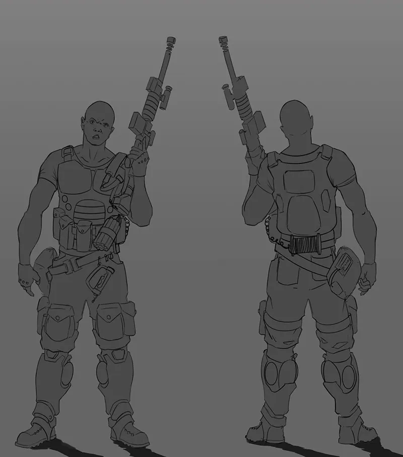
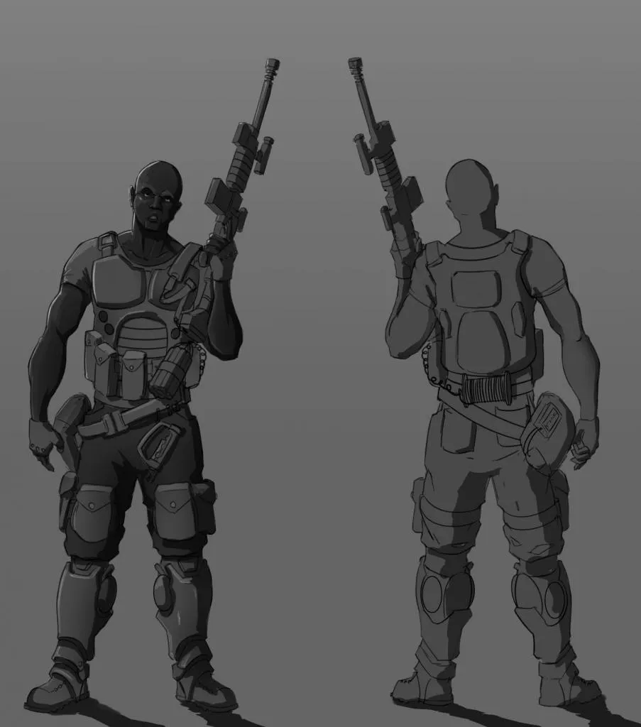

Definitely room for improvement, but the clients response kind of confuses me. Here it is :
"Not loving it to be honest. Its not a bad drawing just don't like the way he looks. His body type and appearance reminds me of Frozone from the incredibles more so than an ex military bounty hunter. So before you go any further I don't want you to waste time on this version. Just to be clear thr art itself isn't bad Thanks!"
Totally cool that he isn't digging it. That part I'm stuck on is the Frozone comparison. Is my design that skinny? Also while I'm at it, does anyone feel like this design plays too much on any particular stereo type? That's something I would like to avoid in character designs. Thanks!
I recently started this as a design for a potential client, but he said it wasn't what he was looking for. I'm completely cool with that, especially since it was a first pass and I'm always open to improve on my design. I definitely could have pushed the explosives part more and put more character into him, but I'm a little puzzled by the comparison the client gave me. To give you and idea of the brief here it is:
" I'm looking into getting an African American bounty hunter done with the build of someone like The Rock. Him arms should have tattoos, probably tribal or a unique design of your choice. Please avoid images as they won't really be noticeable when the game is playing. Age wise Vince is in his early to mid 30's. I like the flat color minimalistic style. But if you feel something will look better I say try it."
Vince White
Vince is Ex-Military explosives expert. After being evaluated by a Military Psychologist, he was deemed unfit for combat. In a selfish attempt to fulfill that need for violence, Vince became a self-employed bounty hunter. He’ll take any job and he does it well. The pay isn’t as important as the fulfillment he gets from kicking someone ass. His special weapon is a dynamite stick in a Zombie's mouth
-here is what I started as my first character deisgn for Mr. Vince.


Definitely room for improvement, but the clients response kind of confuses me. Here it is :
"Not loving it to be honest. Its not a bad drawing just don't like the way he looks. His body type and appearance reminds me of Frozone from the incredibles more so than an ex military bounty hunter. So before you go any further I don't want you to waste time on this version. Just to be clear thr art itself isn't bad Thanks!"
Totally cool that he isn't digging it. That part I'm stuck on is the Frozone comparison. Is my design that skinny? Also while I'm at it, does anyone feel like this design plays too much on any particular stereo type? That's something I would like to avoid in character designs. Thanks!
Replies
I'd say try for a heroic chin!
The "Body type and appearance" thing might just mean that they want him bulked up a little bit more as well. He's pretty bulky already, but that could go a little further without seeming absurd. Try that too.