Pirate Motel WIP
Hi guys,
this is my first thread on polycount, I´m quite new in this forum.
I´m a student and I´m currently working on my portfolio because it´s my last semester and I want to share some of my work with you.
A few month ago I made this concept just for fun.
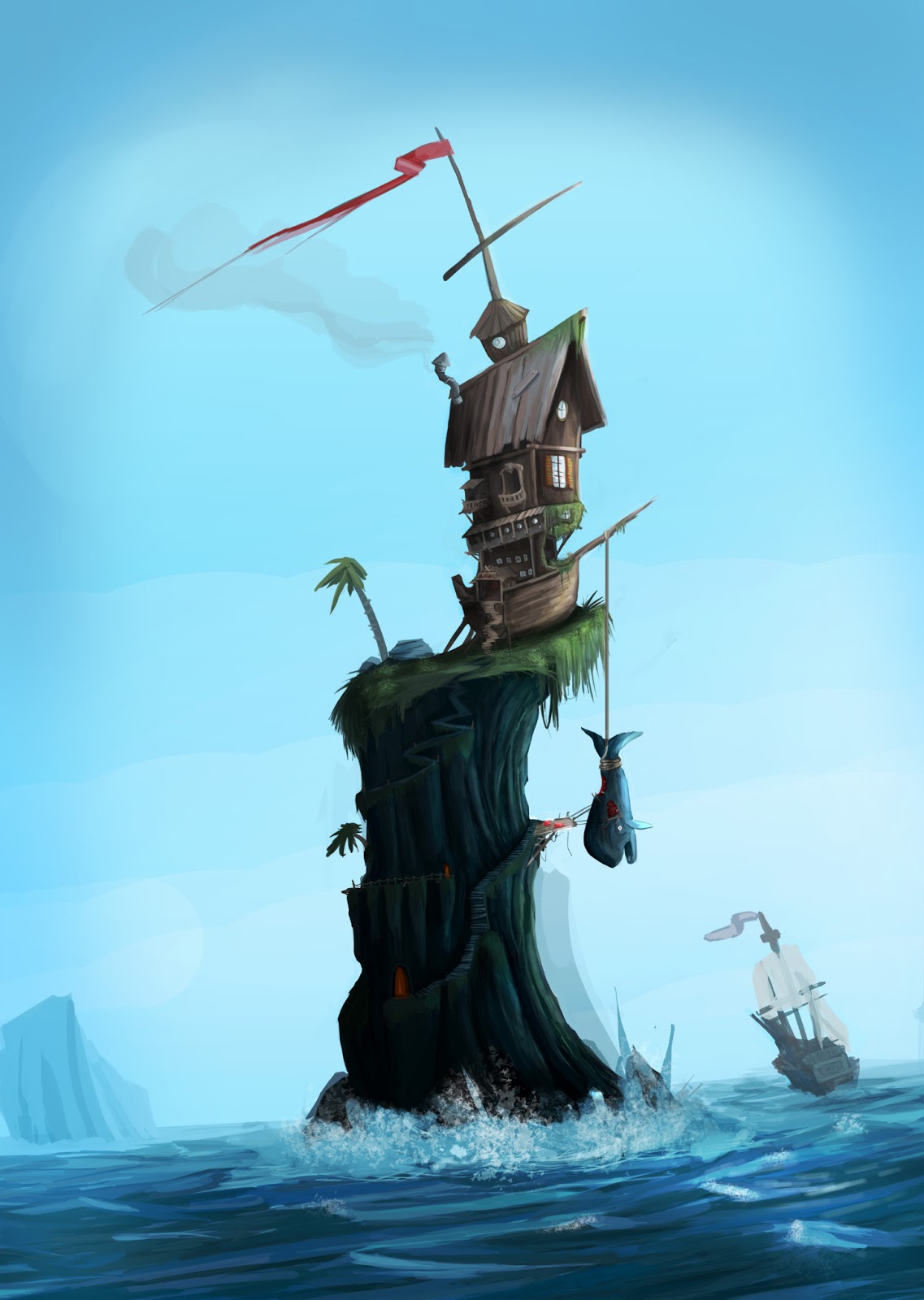
The feedback was very positive so I decided to make this as a 3D environment.
And this was the first blockout:
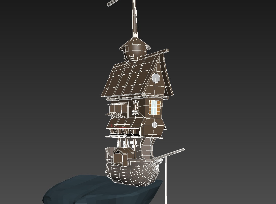
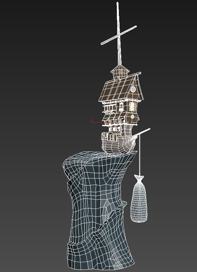
(The topology of the rock is very bad on this pic, I fixed this in the meanwhile)
After the first blockout I realized that some things, which work in the concept pretty well, doesn´t do that in 3D.
So I made a few changes, and this is the current status of my scene.
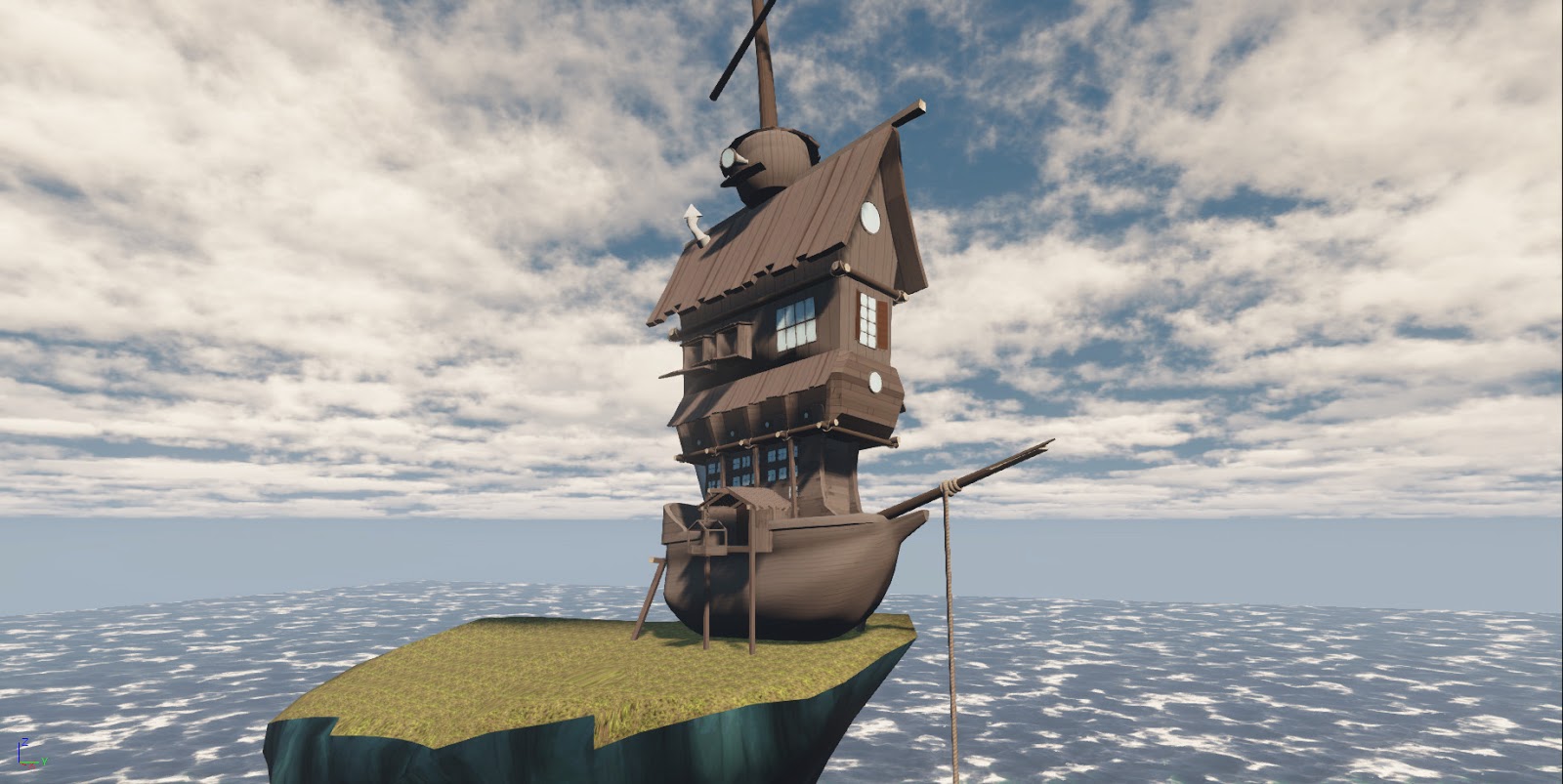
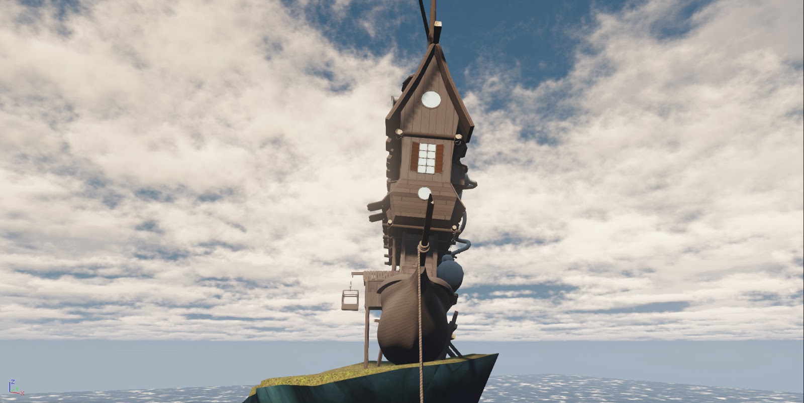
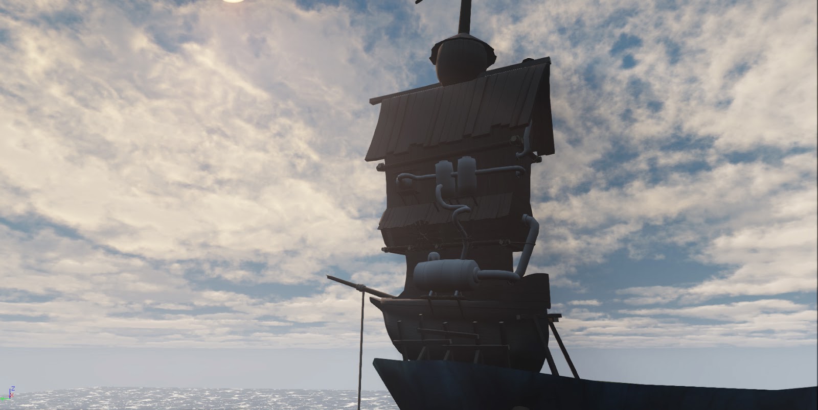
On the images there are no normal and spec maps assigned yet.
These are a few tileable textures I use.
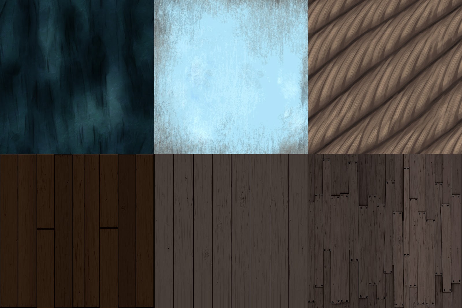
I´m not completely confident with the textures yet. I think I´m gonna tweak them with some handpainting.
So this all I got to show at the moment.
Hope you are interested in this thread and I would be very glad if I get some feedback, ideas, critic etc. !!!:)
this is my first thread on polycount, I´m quite new in this forum.
I´m a student and I´m currently working on my portfolio because it´s my last semester and I want to share some of my work with you.
A few month ago I made this concept just for fun.

The feedback was very positive so I decided to make this as a 3D environment.
And this was the first blockout:


(The topology of the rock is very bad on this pic, I fixed this in the meanwhile)
After the first blockout I realized that some things, which work in the concept pretty well, doesn´t do that in 3D.
So I made a few changes, and this is the current status of my scene.


On the images there are no normal and spec maps assigned yet.
These are a few tileable textures I use.

I´m not completely confident with the textures yet. I think I´m gonna tweak them with some handpainting.
So this all I got to show at the moment.
Hope you are interested in this thread and I would be very glad if I get some feedback, ideas, critic etc. !!!:)

Replies
Maybe you should change the texture scale on the ship hull, scale it up, think that'll fit better to the comic look.
I already liked the concept way back when you posted it on your blog, so I think it is a great idea that you turn it into a 3D portfolio piece.
The silhouette and shape is very nice, in particular the cartoony and wonky feel of the building.
I agree that the textures look a bit bland at the moment, using blend shaders seems to be a good idea. As you stated yourself, some moss for the wood planks and some algae for the cliff texture will do wonders in terms of variety.
Not sure what you have in mind when it comes to props, but a fence to make the place safer seems reasonable.
So far it looks very appealing and interesting and I am looking forward to see more progress
@Bao92: Yeah there will definitely be blend shaders. Only have to make some blend textures
For the dirt I tink I make some decals.
Thank´s guys for the feedback!
I already liked the concept way back when you posted it on your blog, so I think it is a great idea that you turn it into a 3D portfolio piece.
The silhouette and shape is very nice, in particular the cartoony and wonky feel of the building.
I agree that the textures look a bit bland at the moment, using blend shaders seems to be a good idea. As you stated yourself, some moss for the wood planks and some algae for the cliff texture will do wonders in terms of variety.
Not sure what you have in mind when it comes to props, but a fence to make the place safer seems reasonable.
So far it looks very appealing and interesting and I am looking forward to see more progress
I created some vegetation as you can see.
Next I´m gonna make some rocks
http://lostmoya.files.wordpress.com/2008/04/crysis-screenshot-3.jpg