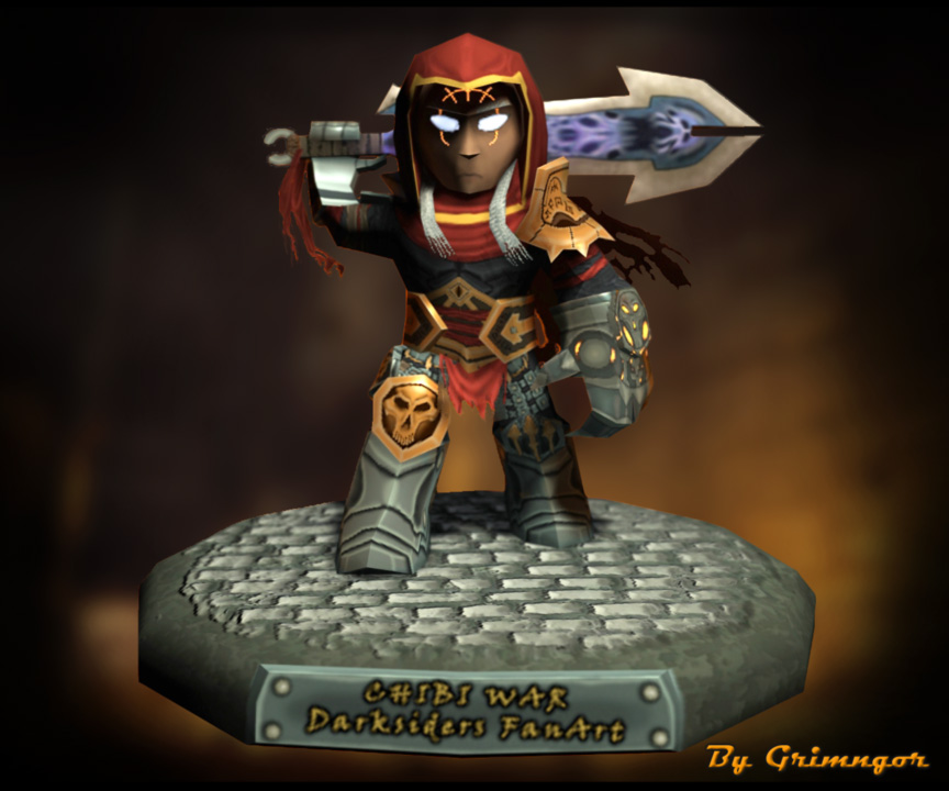
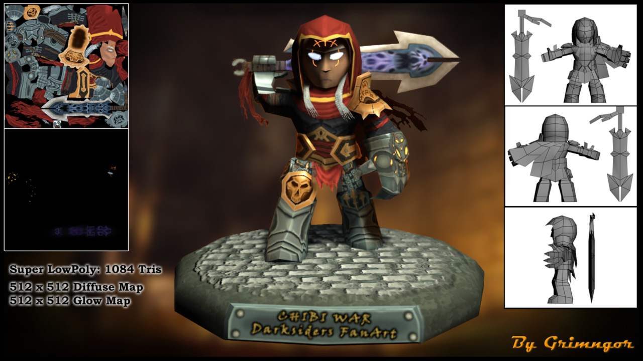
Chibi War Darksiders Fan Art
Hi all, I´ve finished this character, just a couple of days ago.
I did it for a job offer, trying to fit better their requirements with this character piece. It is super LowPoly, modeled in 3Ds Max and polypainted in Zbrush, I´ve also used UV Layout for the unwraping and Photoshop for the final compo.
It was quite challenging mainly the hand painted textures and my first time with both Glow and Opacity maps, with a result I am very proud of!")
C&C welcome!
I did it for a job offer, trying to fit better their requirements with this character piece. It is super LowPoly, modeled in 3Ds Max and polypainted in Zbrush, I´ve also used UV Layout for the unwraping and Photoshop for the final compo.
It was quite challenging mainly the hand painted textures and my first time with both Glow and Opacity maps, with a result I am very proud of!
C&C welcome!
Replies
Also I'd say the mouth is a little low on your model, which elongates his face and kinda deviates from the original design. Texturing on the legs and glove looks cool though, just think it could be pushed a little further!
(Oh yeah, and this is being really nitpicky, but you could probably lose the 'Super' in Super Low Poly and just have Low Poly... just for presentation sake
His silhouette is way off, even accounting for the chibi. Don't use chibi'ing as an excuse to sloppy silhouette.
War, in Darksiders, is primarily defined by his massive shoulders, then boots. In your version, his shoulders are one of the least emphasized things on the model.
You´re completely right with mos of the critics, thank you very much!
Torch:
About the color in the face I´ll definetly tweak it a bit. About the eyes... I don´t know to be honest, I know they´re big, but that´s the point isn´t it? I mean it is a cartoon version of War, I made it on purpose. And about the UVs, while I think you´re right, it´s my first time with a LowPoly of this level and actually I didn´t know how to handle the 512 map correctly.
The problem is that changing the UVs will broke the entire maps...
Is there any way to change the Uvs while changing the maps accordingly at the same time?
Vertucio:
Thanks for the advise, I think you´re right, sadly I think I lost the "perspective" in the process of doing it more cartoon, It could be an easy tweak for giving more presence to shoulder/bots, so definetly I´ll have a look. I just see one problem. As a chibi/cartoon character he should have this big head, that means I cannot reach the exact design of the original War (With big shoulders and tiny head) because I will lose a part of the cartoon look... Right?
But definetly I will look into it!
I really appreciate your feedback guys, honestly! Even when it made me feel a bit "overwhelmed"....
But thanks to your advices I could be able to improve a lot! ;D
I finally found the time to tweak this character following your advices!
I modified the size of shoulders, chest and boots. I painted the face again increasing the contrast between lights and shadows. I moved the mouth a bit upwards. Removed the glow map for the eyes. I hope you like it!
As always any comments or crits will be welcome!
I've seen artists who use that as an excuse for their work, and it doesn't help usually, nor do I usually care when they preface their work with that. Just lets them think they have more time then they do. Just a warning.
A bad looking portfolio website is not excused by "I'm not a pro." It better look as clean and readable as a person in the industry, because frankly, working towards those standards is what'll get your foot in the door, from what I see.
OF COURSE, though, we're all learning constantly, so there will always, ALWAYS be critique.
Paint in the shadows and light on the face, and heck, everywhere else. I think you're relying too much on the rendering engine to do the work. With the number of polys you're using, any lighting system will not have much to work with.
I would also balloon the shoulders by 200%. Make them half the size of this whole body.
For your hues, don't just crush your red to black and call it "That's in shadow." Shadows have colors. Are your red shadows cool or warm? Same for your gold. If you see in the game SS, the gold actually outright has brown areas if you color pick.
Look to World of Warcraft's models for painting reference. Pour over their stuff, see how they deal with painting leather, metal, etc.
Nice presentation set up, though I'd give him more of a hunch to account for the weight of the sword.
In any case, thank you very much for taking your time on correcting me!
And thank you for the references in the blog, definitely they will help me a lot in the future!!