Cyborg- critique required
polycounter lvl 7
Hey everyone, I have been working on a cyborg character that is presented in UDK as a project and I was hoping to get some feedback on what people think about it, whether this feedback be on what I did well or what needs more work, all critique is welcome. Thanks in advance.
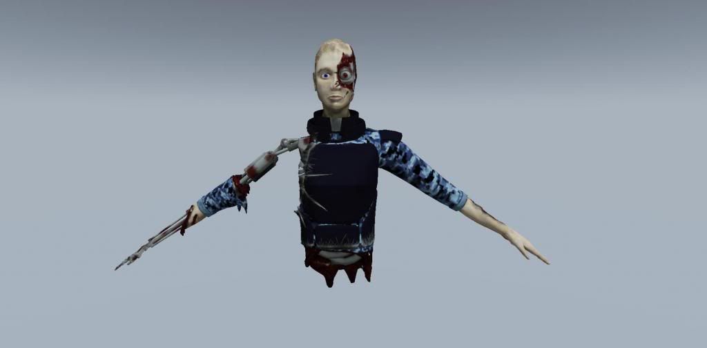
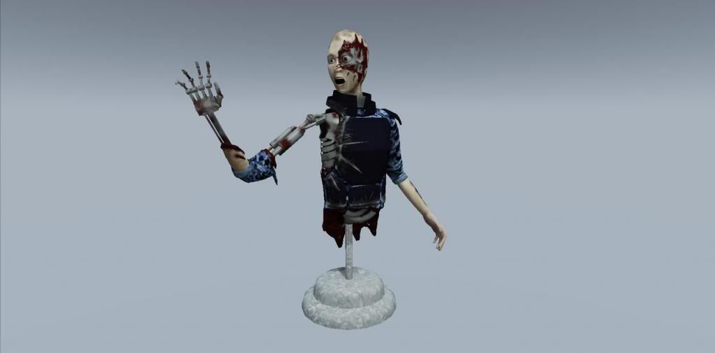
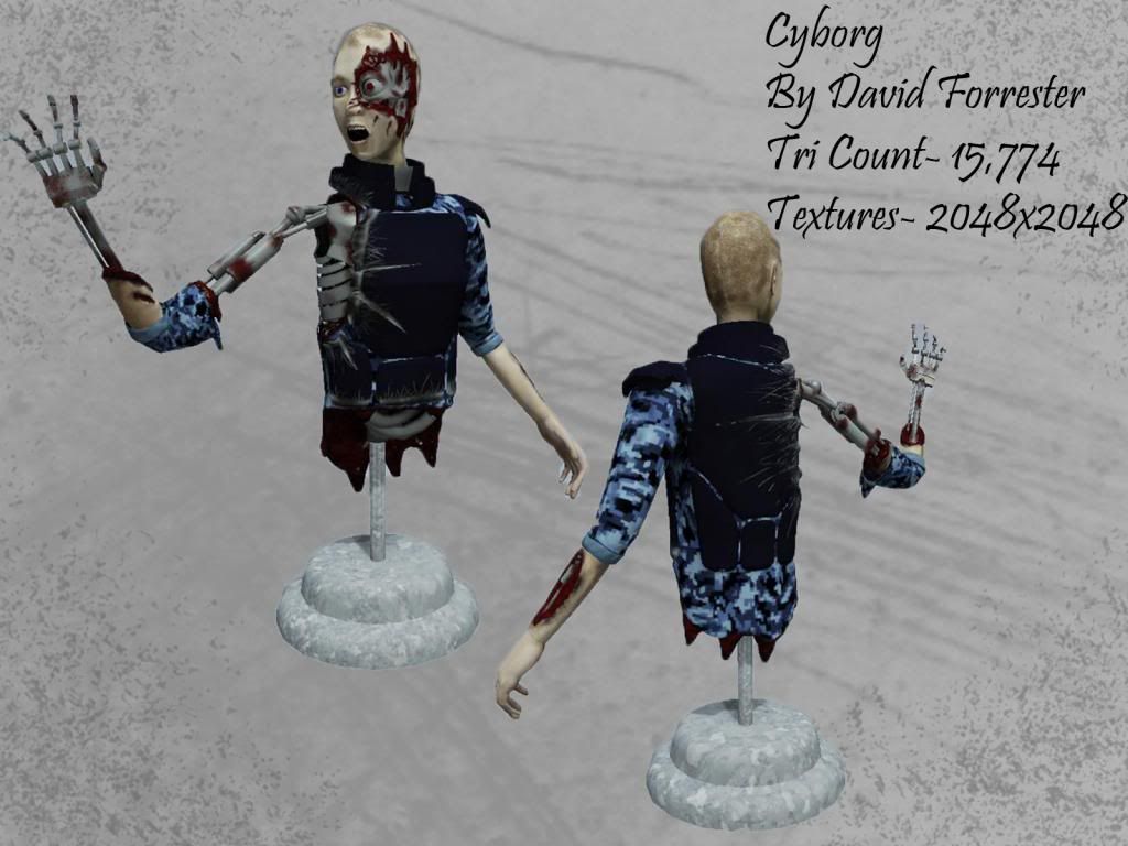
Cyborg
Tri count- 15,774
Texture sizes- 2048x2048
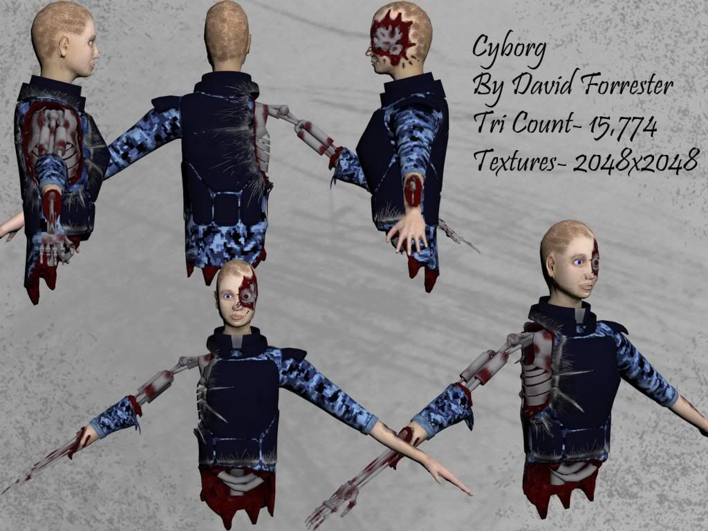
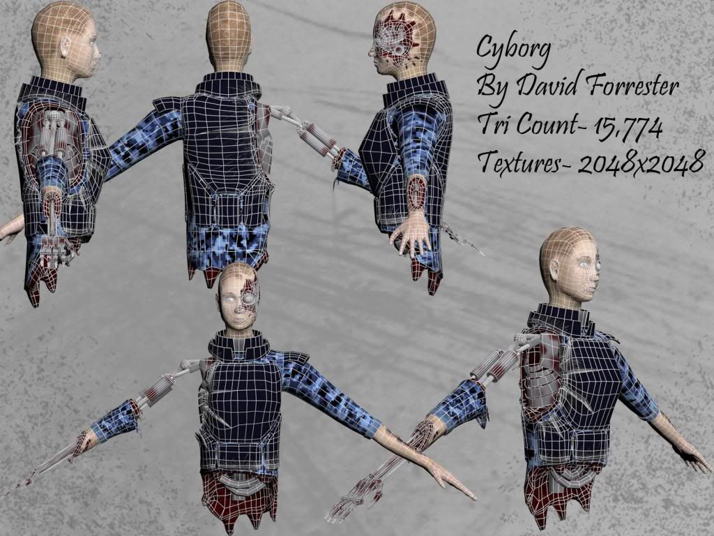
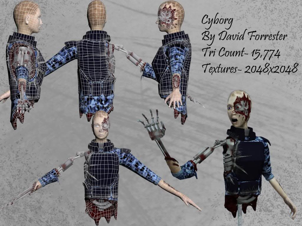
Cyborg
Tri count- 15,774
Texture sizes- 2048x2048
Replies
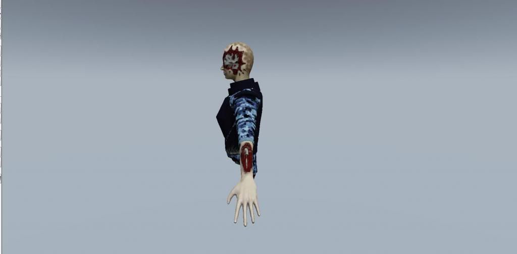
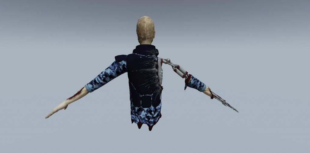
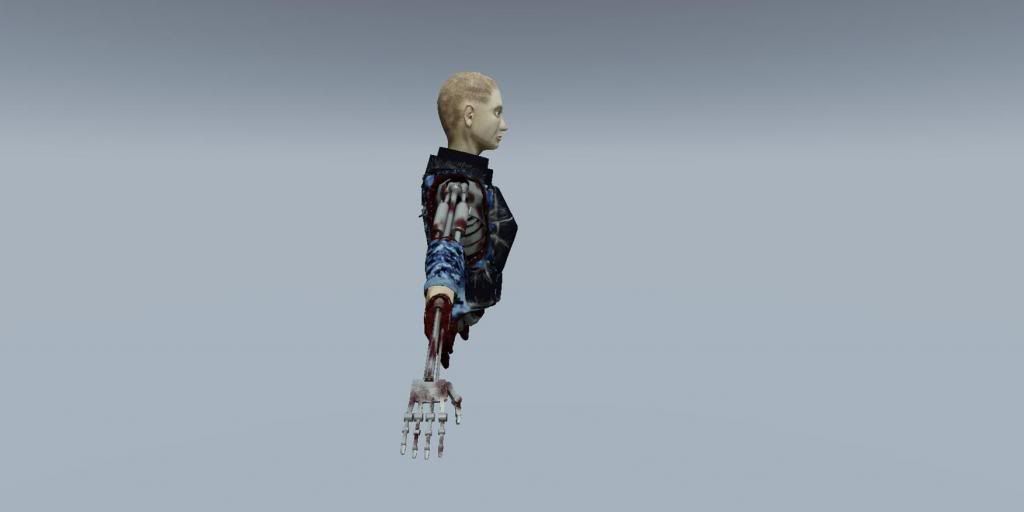
There are a lot of poly's that you don't need, especially on the chest and back areas.
It's textured quite well and i like the glitch camo jacket but i think that you could probably push the quality of your maps in a few areas, based on the 2K size for the half man.
Nicely posed. The final image does it justice.
i also personally find it amusing that you chose a typical naked robot chick as an ideal model. if you're pro, i'm sure you can reference better subject matter than that.
That being said- he's right. being able to see those differences and properly critique yourself will benefit you in the longrun. So probably want to check out the wiki and look at topology and modeling reference as well as materials and rendering. Additionally presentation is really letting you down.
http://wiki.polycount.com/
With that said don;t take it personally- we've all been there- just push through and show you can learn from our mistakes. Good luck
Everyone start's somewhere...
There's a difference between offering a critique that someone can use and just being a flat-out dick. Your post is falling into flat-out dick territory. It's not offering anything helpful for Davefozza. Instead, it's basically just flinging insults at someone who's obviously trying to get better. Pull the stick out of your ass and try to offer helpful advice instead of just saying something is terrible.
Davefozza:
Your model does have some problems, both with proportions and things like texture and material definition. I'd suggest looking at anatomy books and master paintings to get good references for anatomy.
In addition, I'd suggest doing a lot of research into the types of materials you're trying to represent. For example, you should look around Google for images of bullet-proof vests to get an idea of what sort of colors and specular values you should use.
Another thing you should probably look at is presenting your model with better lighting. There are some good tutorials and information on the Marmoset homepage that can be applied to a lot of different software packages.
This is what a good critique looks like. Do you see the difference and why yours looks so bad?
I cannot believe I have seen someone on here with this sort of attitude. It's sickening. I hope no one ever gives you a job with those sort of criticism skills.
I've edited your post to remove your abusive comments. While not everything needs to be presented with sugar, spice, and everything nice... everyone here deserves a certain level of tact and respect. You are encouraged to offer critical feedback, but keep the nasty comments to yourself. This is your warning.
@Everyone else:
Please do not contribute to the derailing of Davefozza's thread. Thanks!
@Dave
Don't let it get you down, you gotta start somewhere.
I would suggest before modeling a character, to spend some time figuring out the personality and attitude. Is this a cyborg that's freaked out, what's the story??
Then work the silhouette, lighting and pose to fit that feel. Also, like everyone else has mentioned, get tons of reference and go through tutorials on the process.
Good luck!