Failed ArenaNet character art test
polycounter lvl 13
Hey guys,
As the thread title suggests, I got a rejection email from Arenanet's HR as well as John Stumme indicating that I didn't get the internship - I was one of the (many) people who took their character art test this year (we've all seen those anet threads).
Here's the entry that I submitted back in March:


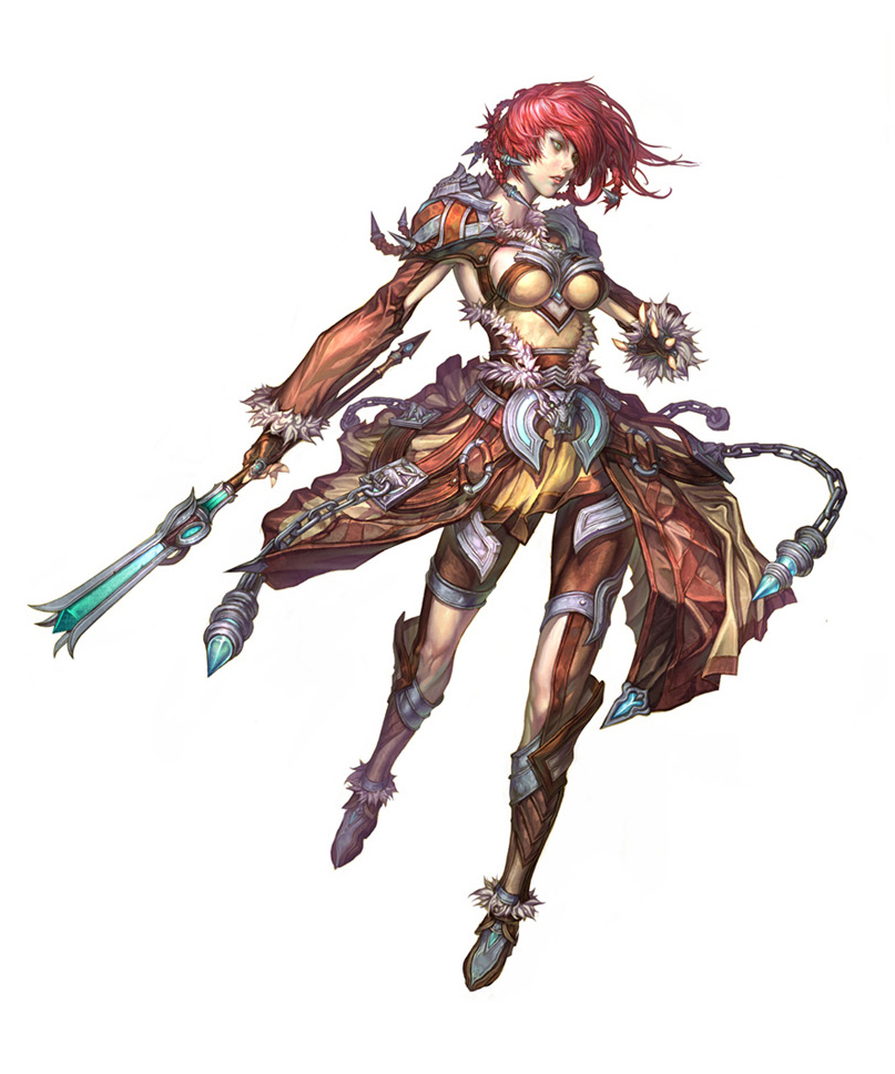
Concept here
(successful entry here)
Any clue on what went wrong with this Norn chick, I'm all ears. General feedback/comments would be appreciated as well.
Extremely disappointed I didn't land the intern gig considering I just got my U.S. passport and was eager to relocate to WA but I guess that's how it goes sometimes...
As the thread title suggests, I got a rejection email from Arenanet's HR as well as John Stumme indicating that I didn't get the internship - I was one of the (many) people who took their character art test this year (we've all seen those anet threads).
Here's the entry that I submitted back in March:
Concept here
(successful entry here)
Any clue on what went wrong with this Norn chick, I'm all ears. General feedback/comments would be appreciated as well.
Extremely disappointed I didn't land the intern gig considering I just got my U.S. passport and was eager to relocate to WA but I guess that's how it goes sometimes...
Replies
In terms of comparisons to the guy who got the intern-ship I think the texturing is better, its cleaner and simpler but looks good. Slightly truer to the concept art in regards to the points I mentioned previously and the presentation of the finished piece is better; nicer lighting and posed like the concept piece.
Yours is good but I guess it's the little things like these that make all the difference for such a contested position!
Edit: I also think the the other guys is much more interesting from behind
The highpoly looks quite solid to me!
It isn't as pronounced on the high poly, so maybe it is some sort of optical illusion from the materials.
You should have used alpha planes for the chains, and made them smaller. The amount of polygons you spent on the chains could have really helped out her hair, fur, and shoulder pads. Fur and hair makes for interesting silhouette changes, but your silhouette is really flat in those areas. The shoulder pads are also a lot more complicated in the concept that you made them because of the lack of polygons. I think your actual body and anatomy are more successful than the other persons you posted, but his armor, use of polygons, hair, and faithfulness to the concept are probably why he got it.
You have no weapon, and I think that is the biggest downfall. It is in the concept, so you should have made it.
A better pose would have helped a lot. The concept has a super dynamic pose that shows all her dangling parts of her armor off really well. You put her is a really boring pose that doesn't show that off at all.
Hope that helps a little.
@DKK Oh absolutely man, I could've just made it much simpler by baking the straps onto the skirt and not making them separate. Now looking at it, I think I should've done just that since the straps don't make that much of a silhouette change.
@BARDLER Hey, appreciate the detailed feedback - that helps a lot!
@pixelpatron Words of wisdom right here, thanks man!
@Boozebeard Yeah, I had not idea what to put in the back so I just kept it simple. Could've been more interesting for sure, especially since players would see the back of the character most of the gameplay time.
@bigphun The reason for that is I've looked at other successful applicants who got the internship and not all of them had their characters posed, in fact quite a few were in a simple zero-g pose like shown here. Also, it didn't say in the instructions to have the character posed, otherwise I would've done it.
1. The wireframe shots. Yours look a lot 'messier'. I know its not the best word to use, but cant think of a better description. I know you have yours showing actual tri's, where the winner is showing it as polys. I know your version shows more accuracy, but the winners just looks cleaner. For only having a 10 tri difference, your wireframe looks to have a couple hundred more.
2. The diffuse texture. You have a lot of black space in your diffuse, where the other entry has none. Instead, they have filled up the empty space with a skin tone. Again, I know on a practical side of things, its not a huge difference, however on a presentation side of things, it goes a long way.
And to echo the comments already made, about pose and materials.
I'm not a character artists, but I consider myself to have an aesthetic eye for things. And honestly, I think a good portion of this is down to overall presentation. I know its hard to take a step back and look at your own work, to try and find issues, after you have worked on it for a while.
Still, overall a great attempt IMO, and at least you can take away some good experience from it all.
If its any consolation your models face is vastly superior to the winning entrys.
@Ex4000 Her skirt is one-sided and is actually yellow in color all around (you can see a clear example of that in the 3rd image), it is actually the spotlight behind her back that has a green tint to it.
In my opinion, I don't think it's artistically at fault, it's an intern position not actual character artist.
It seems you forced yourself to go down a few polycounts to match it. You could have reduced it a lot of areas, and also could have used more alpha planes.
Here have a good laugh, this was my entry for Arenanet that I worked on the 3 days extension they put out.
Obviously mine isn't as good as yours at all. Mine looks like one of those badly rendered DAZ characters you see on deviantart.
2 days on highsculpt, last day I reached a "fuck it" point and created low poly, set UVs, baked and textured everything within divided schedule so I can at least send it on time. Embarrassed to even post it.
Stronger AO that has color would've been great to see as well, and pinking hues from where the fabric meets the skin would have been great to see as well. Most of your piece also lacks AO.
Your spec is lacking also, especially on the leather bits. It needs variation, especially on the leather that shines.
Your folds on the arms are too small, not enough big form and some just doesn't look correct.
Honestly tho, you anatomy, especially the face is a LOT better than the one that got the internship. That other one has a wonky face. With hat alone, I wouldn't have given them the internship.
Good luck!