WHO - Fantasy Sword
polycounter lvl 13
- Fantasy Sword
Original Concept Art by: War Hammer Online
Update 2 - Sketchfab test
Shader is funky, not loading the diffuse half the time. Also its making the model super shinny...
[SKETCHFAB]zSlqkXzUrqxtaTUQA81rewHjp14[/SKETCHFAB]
LINK
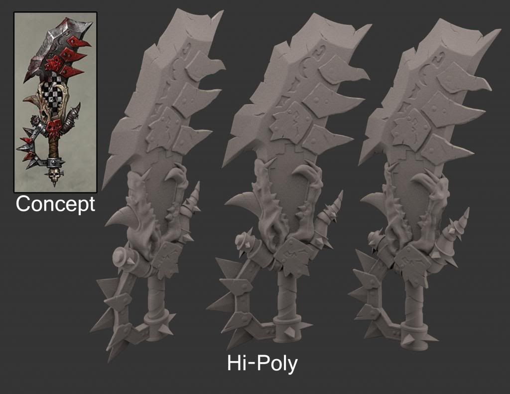
I rendered the HP with Vray, first time using Vray so they came out abit grainy
Update 1
Original Concept Art by: War Hammer Online
Update 2 - Sketchfab test
Shader is funky, not loading the diffuse half the time. Also its making the model super shinny...
[SKETCHFAB]zSlqkXzUrqxtaTUQA81rewHjp14[/SKETCHFAB]
LINK
I rendered the HP with Vray, first time using Vray so they came out abit grainy
Update 1
Replies
#1: As with the rivets comment, the skull would probably need some sharper detail, it's kind of soft right now...this of course may be fixed with texture, idk, just something I see. I'd also suggest making the transition between the flat side of the blade, to sharpened point sharper (I don't really know what to refer to this as, but it's the edge just after the runes etched into it).
#2: I'm curious as to why you indented the checkerboard? I personally see that as a paint job, or painted metal slapped ontop of it...either of those would actually cause it to extrude from the mesh, not be embedded into it...just seems odd to me, but maybe I don't know something (I know very little about this universe)
#3: One I'm very positive of, is the silver metal spikes on the handle...they look like 4 sided chunky spikes jutting out from the metal (total of 3), with the red bits of jagged metal bolted on. Your silver spikes are currently bolted on the opposite side. Judging from the concept and how accurate you have made your mesh, I'd suggest fixing that (make them similar to the ones sticking out at the base of the hilt)
Great job dude
1. I see what you both mean, the skull needs more work, and I agree the transition from the flat side to the blade is to soft.
2. I don't know honestly, as I was modeling it I was thinking of how I wanted to do it. When I got to the checkerboard part I thought it "might" be interesting to indent it in, giving the feel of a different material. Painted metal didn't feel all that interesting to me.
3. Now that I take a second look your right. The silver ones feel flat were the image gives them more depth. When I looked at the picture it felt they were on the other side. Now it seems they are in the middle.
Thanks for the critique! Very helpful!
You only get better by playing with the best!
You are not far off from what I can tell. Match up the Zbrush material with what they are using and start pouring over the details. You'll get there a lot quicker than you think!
I didn't mean to discourage you >.< You don't have to match it, what I try to remember is it's personal improvement that matters. Don't compare what you have done to the insanely talented artists on the net, compare it to your last model. As long as you push yourself to improve then you are making progress.
What you have so far is awesome. I just posted the image to maybe give you some ideas, the wear and tear on it is pretty nice. Wear and tear isn't too hard in zbrush with the Orb crack brush + trim brushes.
Oh and generally people use a glossy grey material to render their high poly models, I use this MR material plus a faintly blue light, faintly orange light and a skylight.
Uh yeah, sorry for the rambled advice that you probably didn't want >.< It's 7am and I am putting off sleeping or having another attempt at this damn annoying shape I am stuck on.
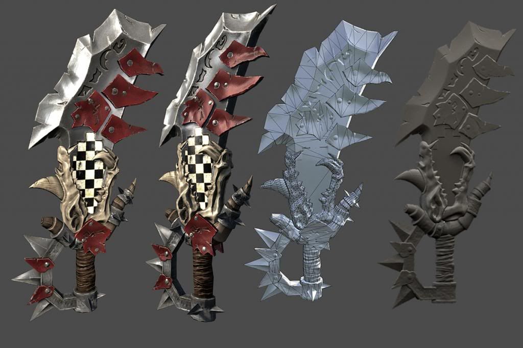
LP done, Texture is getting there. Spend alot of extra time on the HP. I know its not exactly like the concept. Thanks everyone for all the critiques thus far, and also for rooting me on after my "FML" moment from another artists high-poly. Looking forward to the new critiques. Rendered in marmoset, going to throw it into UDK soon.
[SKETCHFAB]zSlqkXzUrqxtaTUQA81rewHjp14[/SKETCHFAB]
+1 would cleave skulls with.
The Orcs of the warhammer(40k) Universe use it. Its not the Mainsign of the clans but common ornament.
http://wh40k.lexicanum.de/wiki/Stamm_der_Schwarz%C3%A4n_Killaz#.UZp9v5xrFhE
Sketchfab chose my model for the Staffpicks, first model Ive ever uploaded.
Stop kidding yourself, its F-basic, put work in it.