Gotham Car Ad
polycounter lvl 18
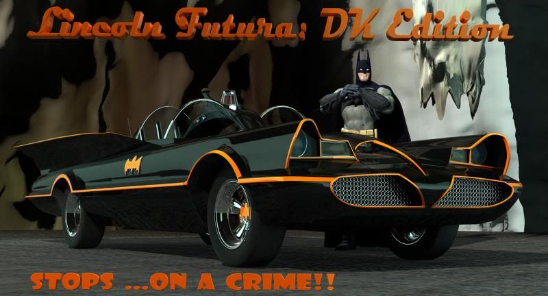
This is a project I did for props modelling class in college a couple years ago. I modelled and textured the car from scratch. No interior as yet, as we had only two weeks on the assignment. The Batman model is courtesy of thefree3dmodels.com and rigged by me for another project. Please forgive the cave texturing. it was thrown in from a sad texture repository and came out just gross.

Replies
The background is really bad tho, and the groundtex is not nice either.
Batman looks like an action figure, and he is more blue-ish and dosnt really fit in your image, try color grading him a little.
Your usage of text and composition is not good. Id maybe think about another perspective on the car, think about where you place the text.
3D text dosnt fit with that 50s theme, graphic design that time was really flat and picturesque.
Dont use that font on bottom.
Make the text more dynamic maybe.
Edit:
Not the best paintover and i didnt want to spend too much time on it, but experiment a bit
try another composition
the fonts i used are not the best aswell, just took some i had