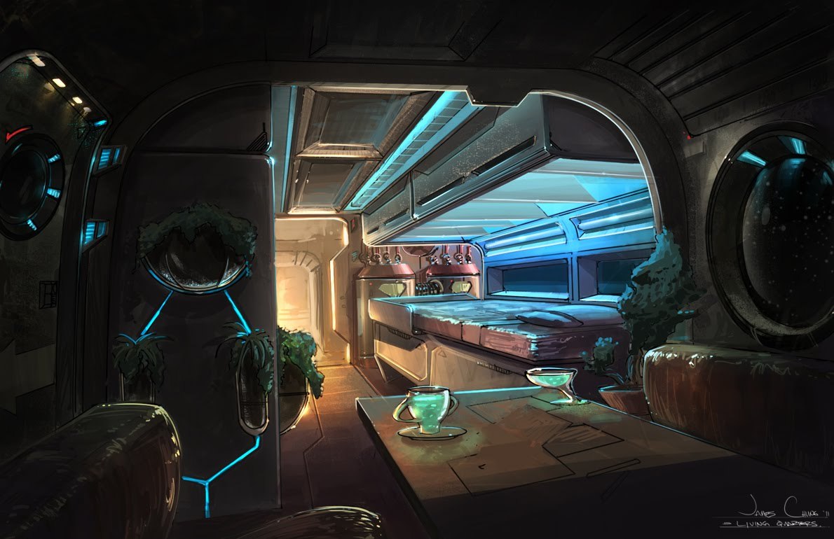
Space Station Quarters I think....
So I pulled this concept from that Concept art for 3D Artists post. Using it as an example for my modeling I students. Also trying to get them involved with Polycount right now in their first modeling class. But long story short loved the image so I am using it as my demo lecture.
http://www.polycount.com/forum/showthread.php?t=117027


Glass bubble window is a tad wonky right now just ignore it, its getting redone.
http://www.polycount.com/forum/showthread.php?t=117027


Glass bubble window is a tad wonky right now just ignore it, its getting redone.
Replies
Anywise did a test light bake in Unity. Kind of getting the effect I want but I think the lights in the back room are way to bright.
Second lighting test dropped intensity on central ceiling lighting by .5, light bounces are still at 2.
You seem to use the same number of sides for all circular objects - the main arches, the round window, the water heaters at the back, and even the small plant holders at the front. You should vary the number of sides based on the size of the object and on its relative orientation - cylinders seen only from the side require fewer sides than those seen from the end.
In the concept you can see that the benches are much like the plastic covered booths of a diner, and the pieces that you've put in would be the back support. In the concept just to the left of the middle you can see where the seat is going under the table.
Anyway keep it up looking wicked!